Voting!The 70th anniversary of the Shida University is about to be generated!
Author:China University of Petroleum) Time:2022.07.14
Extraordinary seventy years, a new era of sailing
October 2023
General Shi Ying usher in the 70th anniversary of the birthday
The school specially targeted at the school's teachers and students, retired employees
Alumni at home and abroad, people from all walks of life
Extensive collection of school celebration signs
A total of 76 works were collected
All works are ingenious, and the design is clever
Multi -angle presents the magnificent momentum of the 70th anniversary of the establishment of the school
Primarily
27 logo works enter the public selection stage
From now on, the work officially enters the voting link
Come and choose the best logo in your mind, right?
Deadline for voting:
24:00, July 21, 2022
End at the end of the article
No. 1
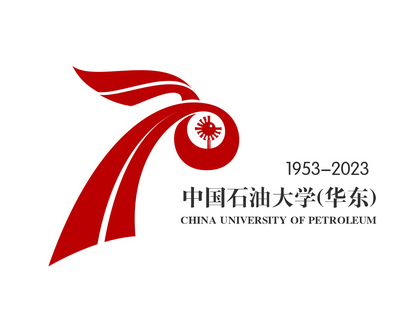
Identifier instructions
The words "70" formed the flying ribbon, which is festive and enthusiastic. The shape of the top is like the development of the sails, which fits the theme of "extraordinary seventy years, sails in the new era"; like the banner of holding high, symbolizing that the school is the flag of Chinese energy universities; Essence The upper left shape is like a "torch" burning on the drilling platform. The bottom shape is like oil and gas transmission pipelines, which meet the characteristics of the energy university of oil universities.
Two ribbons are entangled with each other, and they are independent. They use the solar elements in the school emblem to reflect the school's energy attributes and spiritual characteristics.
No. 2 works
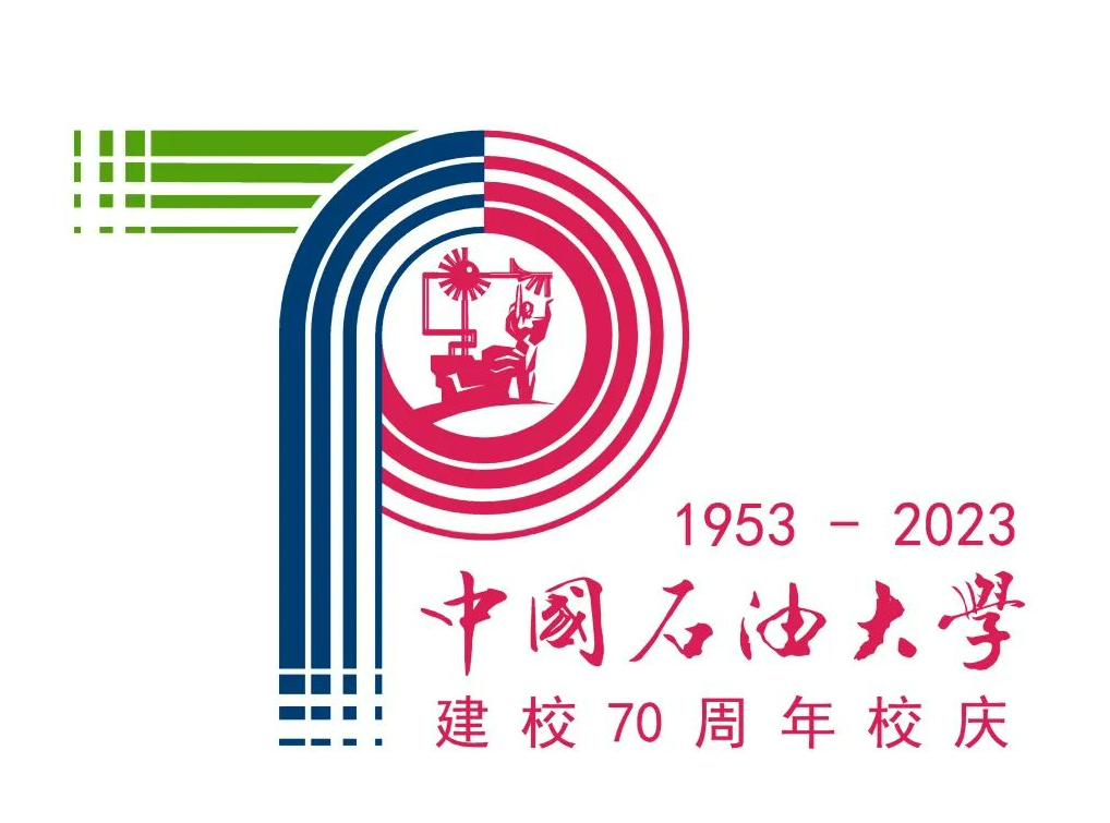
Identifier instructions
The logo is based on the number of the number "70" as the creative body. The first letter "P" and the iconic sculpture of the stone "Petroleum" are taken as a combination of the oil "Petroleum", which intuitively expresses the theme of the "Petroleum University" and "70" anniversary.
The visual experience of the centripetality: three colors of red, blue, and green, symbolize the school running pattern of "two campuses and one park" of the University of Petroleum (East China). With the spirit of the stone spirit of "the country's concentric, hard work, the truth, the truth, and the pursuit of excellence", it has made outstanding dedication on the historical runway.
Corresponding visual experience: The stone marks "created the sun" as the center, surrounded by circles, implying the spirit of Shi Da, and promoted and spread through generations of Shi Lady. It also symbolizes the new mission of the University of Petroleum University. From the research on traditional energy development represented by red, it is continuously advancing towards new energy development research represented by green and unknown energy development represented by blue.
No. 3 work
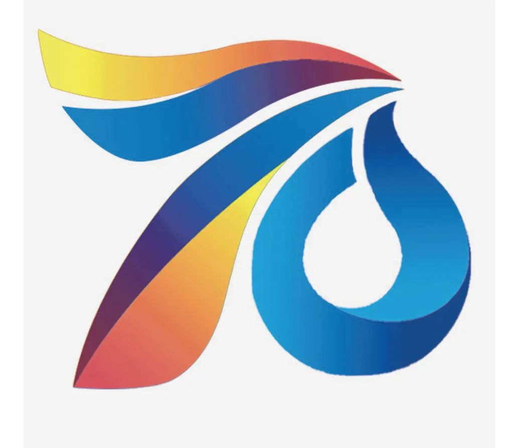
Identifier instructions
The design element consists of three parts: "70"+"wings"+"" fruit ". The logo is composed of the connection bridge of the number "7" and "0".
The number "7" looks like a pair of wings, which represents the beautiful expectations of the stone students as an ideal soaring. Among them, the vertical road of "7" can be regarded as a sail, echoing the theme of the school's celebration, which means that Shi Zhizi will sail and sail sail. , Together with a better future. The number "0" evolved from a drop of oil, representing the spirit of oil and oil. The overall logo is the word "stone", and once again, the three curves gather in the same direction, which means that the majority of Shi University is the same morality, interpret the feelings of Master Shi's home country, and firmly believe that Shi Da's future will be bright.
The image of the sailing and waves in many places in the logo, assisting the blue main color, represents the school walking around the waves. The logo overall is high, implying the pursuit of excellence.
No. 4

Identifier instructions
The design element consists of three parts: "70"+"waves"+"Youlong". The logo is composed of the connection bridge of the number "7" and "0". The right half is the extended dragon, and the tail of the dragon is also waves.
The spirit of the dragon can be summarized with the spirit of solidarity, the spirit of benefiting human beings, the spirit of hard work, and the spirit of harmony with the heavens. The elements of the dragon are used in the school celebration logo, showing the vigorous development of the stone. The use of wave elements represents the school in Qingdao. The elements that use sailing waves in multiple places mean that Shi Da continued to sail on the 70th anniversary. The text of "7" uses the texture effect of the golden stone, which means that the 70th anniversary casting is brilliant.
No. 5
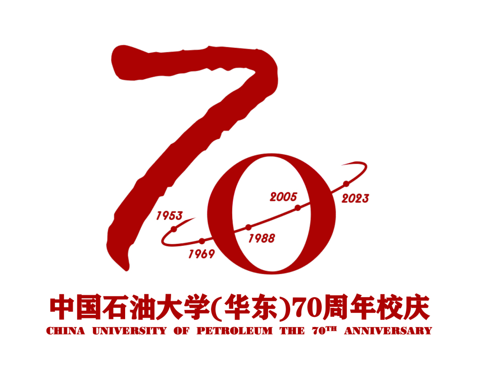
Identifier instructions
The logo is based on the digital "70" as the main design element, and the 70th anniversary of the school celebration theme to form a Chinese character shape to form a "stone" character, which reflects the spirit of stone.
The "0" on the right can symbolize the earth, which is in line with the characteristics of the school's leading universities in the energy industry and the sense of mission of the energy industry. "0" can also symbolize the objective world truth that is "firm as a rock", and the "7" on the left is more like a key, a persistent belief and humanistic spirit that pursue truth, a scientific attitude to explore the laws of things, expressing " The school motto with truth and truth. The trajectory line of five years has the meaning of time and space nodes at the same time. It intuitively shows the extraordinary history of school running schools in the three places in the past seventy years. Different from the anniversary of the school's anniversary, it also represents the unknown of Shi Da Ying. Looking forward to the new mission and development in the future. The identifier image is simple and smooth, bright and generous, can be used alone, and can also be used in a variety of scenarios in the 70th anniversary of the school badge.
No. 6

Identifier instructions
The logo is obviously displayed in the two numbers of "70". On the basis of this, some processing and design are performed. The horizontal stroke of "7" is changed to a fluttering flag. The overall looks like a flag. The "0" on the right has water droplets, which is oil.
No. 7
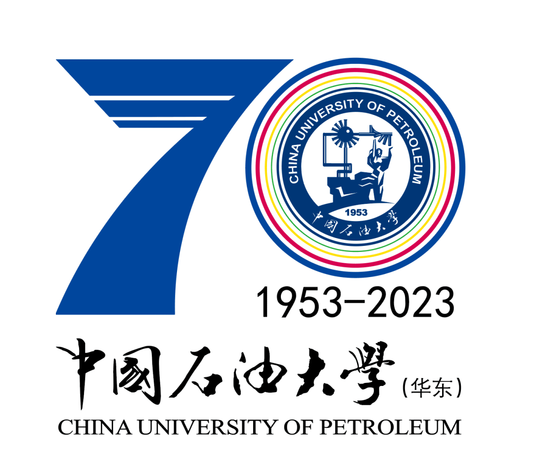
Identifier instructions
The main body of the logo is based on the number "70", supplemented by the words "1953-2023", representing the 70th anniversary of birth, and presents the most sincere blessings and praise.
The number "7" on the left uses three gradient lines, and the number "0" on the right uses four different colors of gradient concentric circles to present the hard work of the Shi Dajian school. Rename three times, built the school four times, and successively wrote the brilliant struggle of the legend of stone on the Beijing Wilderness, Dongying Salone and Alkali Beach, Tangdao Bay Cunnar, and Guzhenkou Wilder Beach. The three gradient lines on the number "7" are like ladder, carrying the marks of the school step by step; like a mountain, telling the school's ambition to meet the challenge again and again. The color of the four concentric circles of the number "0" uses four colors: red, yellow, blue, and green. Different colors carry the past, present, and future of Shida. The red gene; yellow: gold and heroic on the bank of the Yellow River; blue: blue imagination of Qingdao in Dream; green: Green hope to the future. No. 8
Identifier instructions
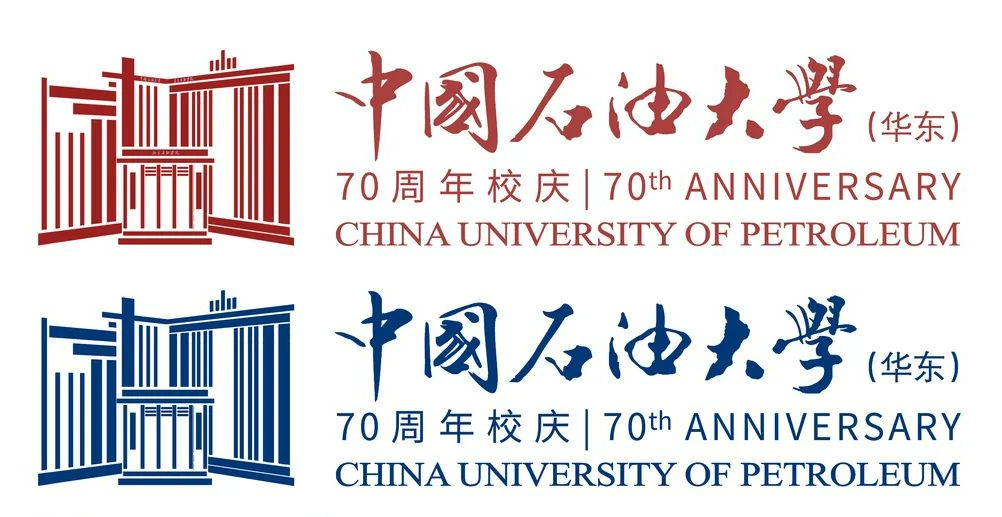
The identity as the theme image symbol of the 70th anniversary of the school, and strives to highlight the history and brilliant achievements of school running. The three hard-working schools were established to form a school history of Beijing-Dongying-Qingdao. Select three iconic buildings on campus for vectorization. The main building on the left is the main building of Qingdao. For the main building of Dongying, the thickened lines form the number "O" and form 70 words. The style of the main building of Beijing Petroleum Institute is located in the middle of the origin and original intention.
Based on the combination of digital 70 and three iconic buildings, it forms a stable, concise and prominent visual subject. It carries the beautiful memories of the 70 -year -old stone. The development of the year. Color uses Chinese red or stone blue, a warm and festive, a stable atmosphere, creating a grand and grand overall atmosphere.
No. 9
Identifier instructions
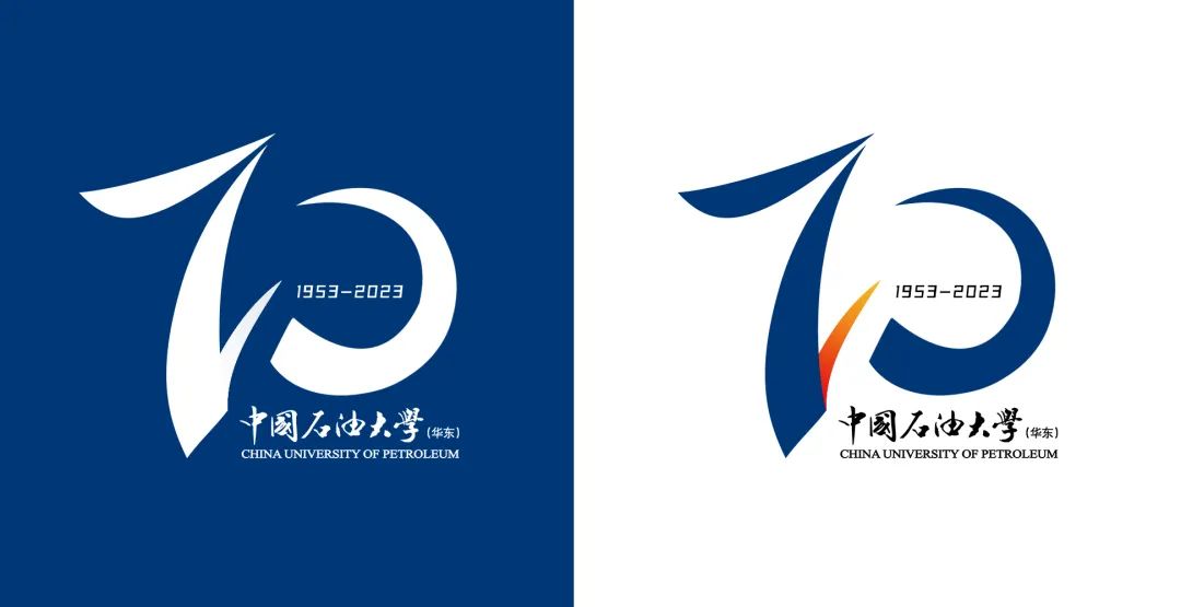
The logo consists of two parts: pattern and text. The pattern uses curve to outline the shape of 70, which means the 70th anniversary celebration. The shape of the number uses the smart expression of calligraphy and the spiritual appearance of teachers and students.
The color of the identifier is red, yellow, and blue, which corresponds to the three school stages of China Petroleum University (Beijing, Dongying, Qingdao). The text is composed of the Chinese, English and 70th anniversary of the University of Petroleum.
No. 10
Identifier instructions

The logo combines the "stone" of "70" and the University of Petroleum University, and the color uses the three primary colors. The three primary colors are the original color, which means the long history of petroleum universities; yellow represents the earth, blue represents the ocean, and red represents the sun. Stranging and ocean are the two major directions of oil collection today, and the sun is the source of energy. It means "the earth, the ocean, and the sun are integrated, and the use of knowledge energy development material energy."
In the structure of "7", the shape of the dragon and phoenix was outlined with positive and negative shapes, which means that our school has educated dragon Peiche, and talents have also implied that our school has risen step by step in 70 years. The shape of the museum, and the tail is the oil pipe in the solar sculpture, both of which are representative buildings in our school; in the design of "0", the design of the ocean, drifting, and oil is used to highlight the special disciplines of our school. Geographical advantage with the coast.
No. 11
Identifier instructions

The logo is 70 as the main body, and 7 and 0 constitute the "stone" of "University of Petroleum", highlighting the characteristics of the school.
"7" has more layering when watching different thick and thin lines with gradients. The second half uses sailing boat as the main body, which means that the University of Petroleum of Petroleum in Qingdao takes the wind and waves in Qingdao. The design of "0" represented the seventy years of the glory of PetroChina University with the seven rounds of gradient thickness.
No. 12
Identifier instructions
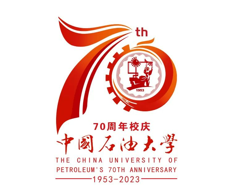
The logo consists of a elegant ribbon, runway, dragon, phoenix, gear, and school emblem. The main body of the modeling is composed of Arabic numerals "70". The image and accurate 70th anniversary school theme.
The left half of the number "7", consisting of 2 ribbons like a runway, symbolizes the school running together and moved forward. The head of "7" is like a dragon, and the Phoenix of the right "0" forms a dragon and phoenix. The numeric "0" on the right half is evolved from Phoenix and the school emblem. The school emblem is based on the abstraction of the school's iconic sculpture "creating the sun" and light radiation as the design theme. It means that the school is booming and talented. The matching of gears marks that Shida is a university that is mainly based on work, clear petroleum petrochemical characteristics, and coordinated development of multidisciplinary development. "0" Like the sunlight, it means that the school is based on Shandong, facing the country, and going to the world.
The color of the identifier is red and yellow gradient, and the color is pure. The 70th anniversary of the celebration, warm, festive, and joyful atmosphere, which means the school is auspicious and harmonious, permanently prosperous.
No. 13
Identifier instructions
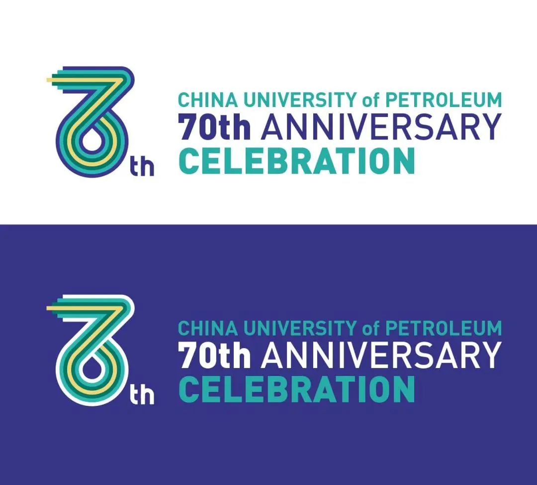
The logo consists of numbers 7, 0, and oil droplets, which reflect the 70 -year theme and special attributes of the University of Petroleum.
The logo basic strokes have seven lines to form a ribbon or road shape, symbolizing the 70 -year journey of Petroleum University. The middle one is golden yellow, representing the importance of oil as the development of the development of social industry. The colors are dark blue, green, green, and golden. Represents the ocean, knowledge, sustainable, and oil, respectively.
No. 14
Identifier instructions
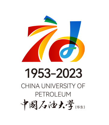
The logo is deformed based on the word "oil". The number "70" is integrated in the word "stone" and the word "oil", which means the original dream of the University of Petroleum (East China) born due to oil. The overall elegant silk ribbon runs through the entire identifier image, and the shape echoes each other. It represents that during the 70 -year wind and rain, the school continues to explore and adhere to the spirit of true and good pursuit of excellence. Color uses the four colors of "red, yellow, blue, and green", which represents the four periods of the 70 -year historical development and change of Shi Da. In the design method, the creative expression of stacked color is integrated into the identification display effect, focusing on highlighting the stone Greater pioneering and professional leadership, the outstanding contributions of Shi Da professionalism and development are in it.
No. 15
Identifier instructions
The logo is formed by the four representatives of the spirit of aggressiveness, responsibility, governance, and fearlessness representing Shi Da's spirit. In the course of the 70th anniversary, Master Shi integrates the spirit of Shi Da into the blood and inherit the veins.
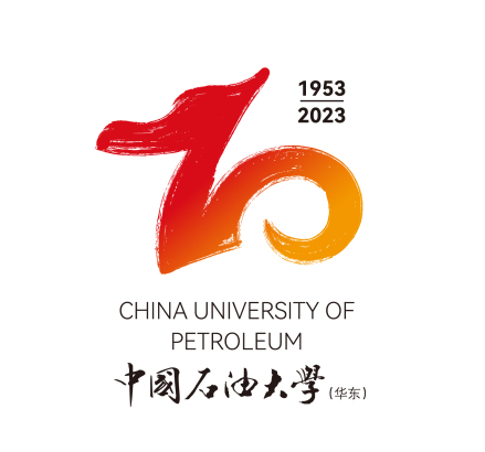
The number of "70" "7" is expressed in the form of a faucet. The first represents the traditional Chinese dragon totem culture, and the other represents the spirit of the first pride of Shi Shi. The overall color of the digital is the national flag color. With the Chinese totem culture and the national color, the strokes are full of storms and vicissitudes, which represents the 70th anniversary of the stone University that is about to enter the new era. At this moment, the leader also became a banner.
No. 16
Identifier instructions
The identification scheme complement the concept of "creating the sun" of the Shi Da school emblem.
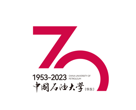
In the past 70 years, the writing chapter is brilliant and excellent. In the new 70 years, the University of Petroleum University is like a rising round of new sun in the times. Forget the original intention.
No. 17
Identifier instructions
The main body of the logo is the geometric treatment of the Chinese character "seventy", indicating the theme of the seventy -year school celebration. The three lines in the horizontal direction represent the three historical stages of China Petroleum University in Beijing, Dongying, and Qingdao. The spiritual style of Master Shi; the three lines also represent the harmonious development of the three people of heaven and earth.
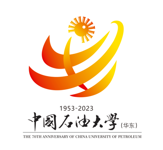
The logo is hugging the gesture as a whole, and the geometric lines ring the solar element in the upper right of the right. This element is the form extracted from the school badge, indicating the relationship between this sign and the University of Petroleum (East China). In terms of color selection, it is mainly based on the warm and vibrant red orange, which means light, hope and harmony, and it is in line with the meaning of school celebration themes and school iconic sculptures.
No. 18
Identifier instructions
The logo design highlights the history of school running, reflects the spirit of stone, and shows internationalization and the characteristics of the times. The logo consists of four colors. The main colors of red, yellow, and blue represent the school's three -school stage through Beijing, Dongying and Qingdao. Green represents the sustainable development of the green economy represented by new energy, as well as the goal of promoting internationalization, and the establishment of a world -class research university. The logo is composed of "70" as a whole. The main body is the number "7", which reflects the glorious history of the school due to oil. Just like the oil mining process, from the rock formation to the sky, spray it out, and fly out of the sky, symbolize the school's hard entrepreneurial entrepreneurship. There is nothing, flourish up. At the same time, the bottom of the number "7" is like a road, and the upper end looks like two upward arrows, symbolizing the accumulation of the school and pursuing excellent cultural heritage. The shape of the number "0" is spiral, and the color is yellow -green. It symbolizes new energy, new technologies, and internationalization, indicating the infinite future of the school. The shape is also taken from the shape of the oil droplet. The end of the stroke is upward, and the number 7 is in the same direction as the number 7. It aims to express the school's realistic innovation and the pursuit of excellence.
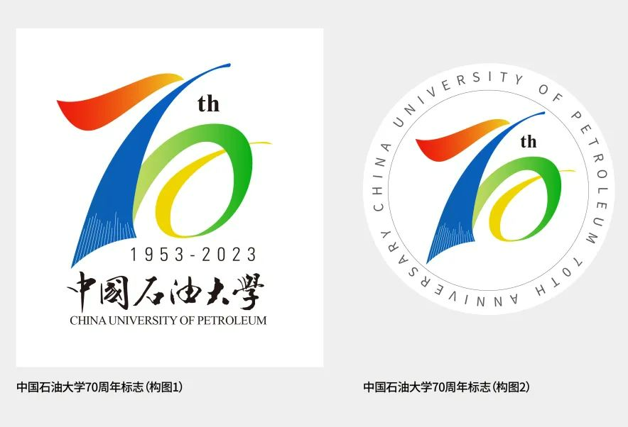
No. 19
Identifier instructions
The logo design highlights the history of school running, reflects the spirit of stone, and shows the characteristics of internationalization and the times.
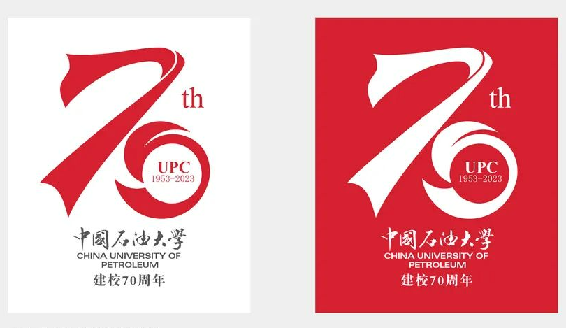
The main shape is the number "70". At the same time, the "stone" of the calligraphy of petroleum universities is referenced, so that the logo looks both 70 and the "stone" of Chinese characters, which has the dedicated attribute of stone. The shape of the strokes of the number "7" refers to the shape of the banner, which represents that the University of Petroleum University has always been breathing and co -destiny with the motherland, conveying the spirit of "home country concentric". The shape of the number "0" comes from the shape of the sun and the phoenix. It mainly expresses that the school has renamed it three times and established the school four times. From the capital Beijing to Qilu land. After 70 years of hard work, forging ahead, it has achieved today's brilliant achievements. She is a famous school and has experienced Phoenix Nirvana, and now Hua Zhang has resurrected to create the sun for tomorrow for the motherland.
No. 20
Identifier instructions
The main shape of the logo is the number "70". At the same time, the "stone" of the art body is used to refer to the art body, which looks both 70 and the "stone" of Chinese characters. The three colors of red, yellow, and blue, which represent the three school stages of Shi Da, gradually expanded from the inside to outside, symbolizing the continuous development of Shi Da.
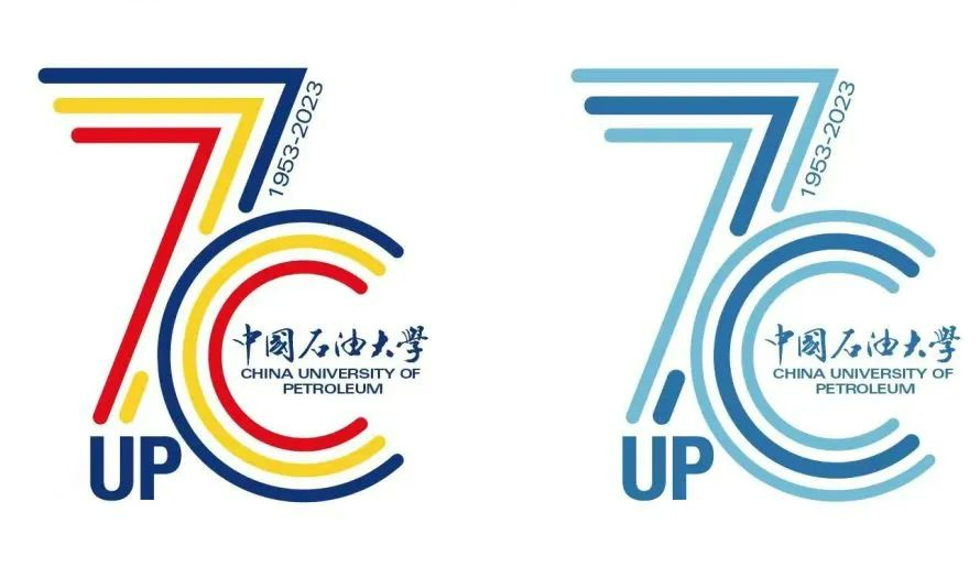
The strokes of the number "7" in 70 are folding corners and the shape of the arrow, indicating that the future is bright, and the road is tortuous. The University of Petroleum has gone through twists and turns. The reason why they can defeat all kinds of difficulties and continue to achieve brilliant achievements rely on the spirit of indomitable and self -improvement. The arrow represents this spirit. Today, it represents the spirit of Shi Da's hard work and the pursuit of excellence. The shape of the number "0" is a circle that is not completely closed. It not only reflects the scientific spirit of pursuing truth, but also reflects the concept of "educating people with moral educating people" at the University of Petroleum, integrating the scientific spirit and humanistic spirit. Spirit. No. 21
Identifier instructions
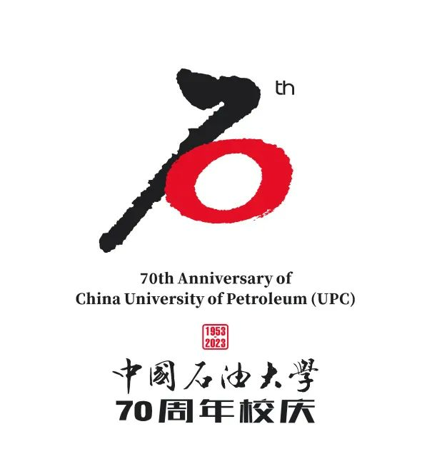
The logo adopts the design of Chinese calligraphy, which reflects the long history of Shi School's creation of seventy years and the rich and profound cultural spirit of the school.
The logo design cleverly combines the "70" theme with the first Chinese character "stone" of the University of Petroleum. The theme of Chinese and English reveals the theme. The red circle means the sun and the earth, which also shows that the achievements of stone education are rich. The end point returned to the starting point and started a new journey again. Black straight line represents oil pipes, which means oil mining technology. Black is the visual color of oil, and red is the representative color of oil professional. The red is enthusiastic, meaningful, and reflecting the theme of the anniversary. The red and black color contrast is clear and easy to identify and propagate. Calligraphy's pen marks have a texture, and the oil that has been shown in the University of Petroleum has changed after hundreds of millions of years of precipitation.
No. 22
Identifier instructions
The word "70" in the identification of colorful shapes means the joy of the 70th anniversary. The rising arrow on the left imply that the continuous development of the stone for seventy years has continuously developed, and at the same time, it represents the spirit of continuous innovation and the pursuit of excellent stone spirit.
The shape of the "0" on the right extracts the components in the iconic sculpture of the school. After design, it becomes the sun, energy, radiating light and heat, which reflects the spirit of true and realistic. The shape of the dandelion symbolizes the stubborn vitality, and can take root everywhere, which reflects the spirit of the Stone and the hard work of the country. At the same time, it means that the stone is 70 years old, and the seeds of petroleum human cultivation cultivated in the motherland flew to all parts of the motherland like dandelion, and contributed to all fields of the petroleum industry and society.
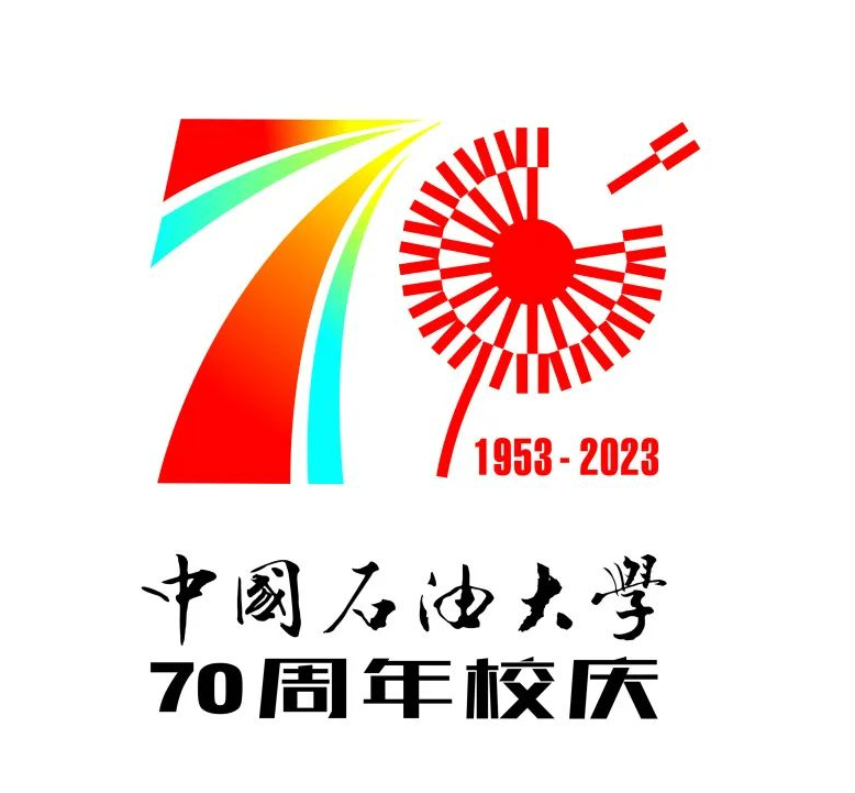
The logo design is ingenious, like the eyes focus on seeing the inside of the earth, and study the mining and utilization of oil. Red is the representative color of oil professional. The red is enthusiastic, meaningful, and reflecting the theme of the anniversary. The blue meaning of the school where the school is located. The geometric design language reflects the rigorous academic studies.
No. 23
Identifier instructions
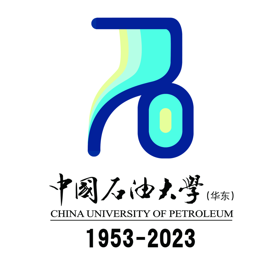
The overall shape is a drawing of the "stone" of the "stone" to the "70" anniversary of the book. The shape is novel and connotative. It fit the attributes of the University of Petroleum, which is convenient for identifying and memorizing, conducive to communication, and impressive.
The "70" main shape integrates professional growth and progress in various fields such as exploration, mining, transportation, storage, oil refining, and application of oil. It has strong professionalism and brilliant achievements. The overall main color is blue, transitioning from cold color to warm colors, color represents scientific research, representing academics, implying the school's influence in the field of oil majors, and cultivating countless high -tech talents for the society. Constantly transport professional talents. The overall style is the academic composition shape, which can better fit the spirit of "the country's concentric, hard work, the truth, the truth, and the pursuit of excellence". The home country is concentric, live up to the expectations of the country, and achieve great achievements.
No. 24 works
Identifier instructions
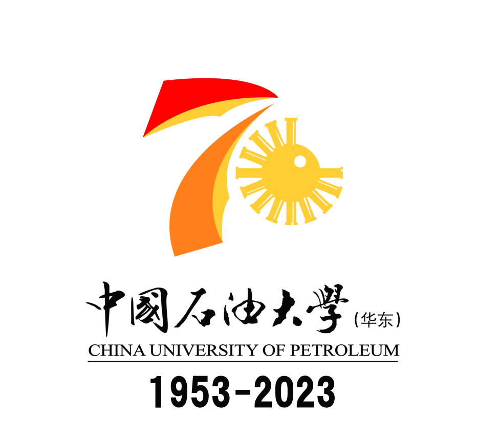
The overall shape is a creative design on the number "7" and "0". Digital "7" adopts a relatively tough and thick structural shape, which means the school's professional attributes. The shape is composed of two pointed hammer. Steel continuously cultivate high -precision talents. The number "0" is the solar shape of the pipelines in the emblem of the Shi Da school, which means that the school's family is concentric, send talents for the country and the society, live up to the expectations of the country, and help the development of the country.
The overall main color uses warm colors, which means the school's influence in the field of petroleum majors. 70 years of achievements, 70 years of precipitation, 70 years of stone, more sunny, 70 years of stone, 70 years of Shi Dawei in Shi Dawei in 70 years. True, pursuing excellence, struggling hard, and creating good results.
No. 25
Identifier instructions
The main body of the logo is composed of "stone," 70 ", runway, arrows, roads, rings, and eye elements. Taking the word" stone "as the main source of inspiration, naturally and cleverly incorporate the number" 70 "into it, condensing the essence of the stone large Essence
Digital "7" deformation is a runway shape, like the guidance of the arrow. Among them, the graphic in the lower left corner is disabled, which is intended to show that in the road of exploring the truth, no matter how difficult the conditions are, Master Shi will step by step. It is brave to move forward; at the same time, it also depicts the beautiful prospects of Shi Da's wings and flying, showing the spirit of Shi University vigorously and pursuing excellence. Digital "0" deformation is the three -ring ring, which looks like the shape of the eyes. It is intended to express the three schools that have gone through the school: Beijing, Dongying and Qingdao. These three ring colors are from shallow to deep, with shape from small to large, and progressive layers. They can not only pull people's eyes to the distance of the long -term era, but also bring people to a bright and brilliant future. 70 years of wind and rain carrying the sedimentation step by step, it has achieved the prosperity of Shi Da today. No. 26
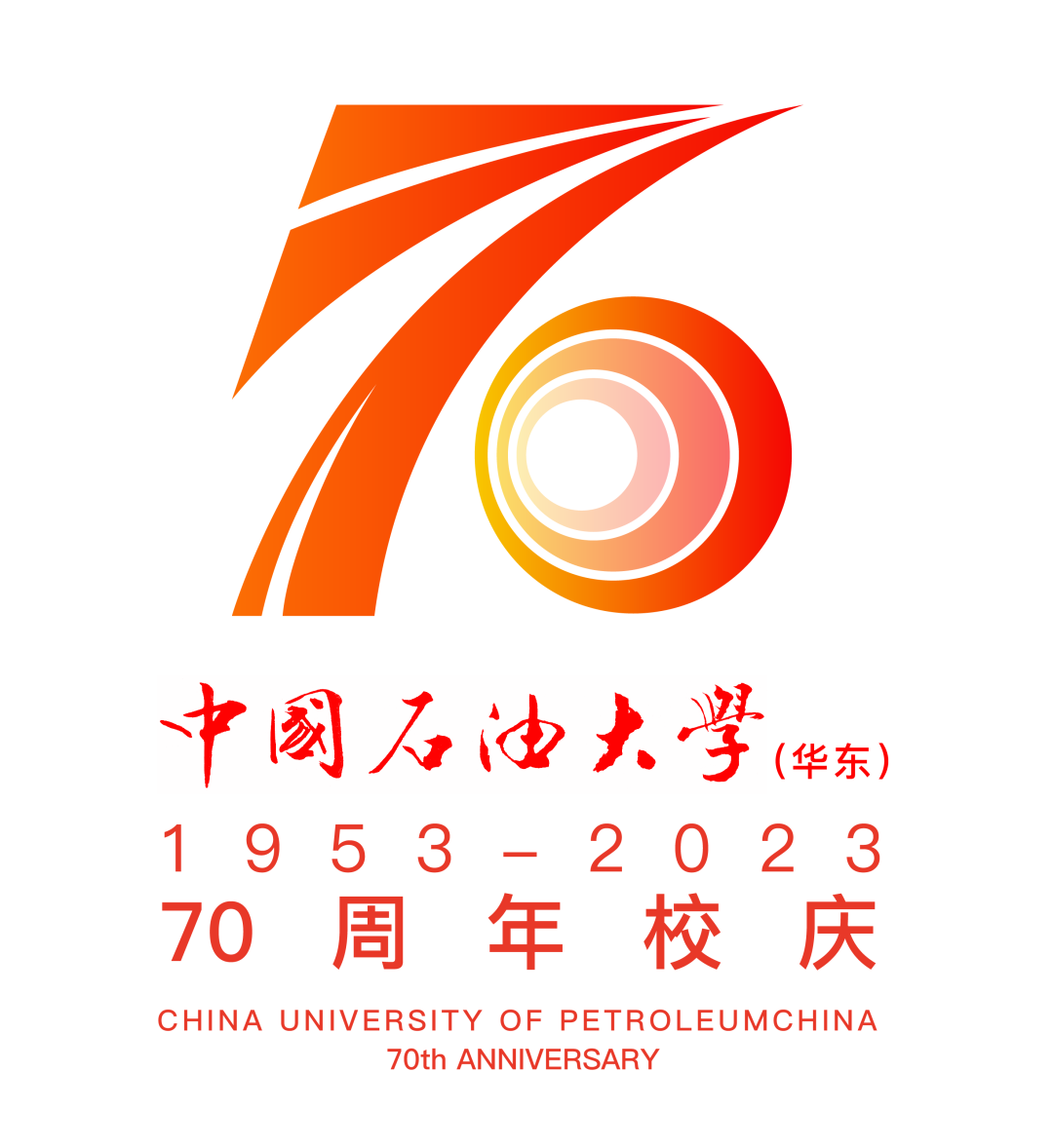
Identifier instructions
The main body of the logo is composed of "Chaoyang", "70", runway, arrows, roads, rings, and eye elements. The main source of inspiration with the rising rising sun is intended to show that Shi Da's pioneering and hard -working gesture is intended. At the same time, I wish Shi Da's dazzling and glory on the future development path; naturally, the number "70" is naturally cleverly "70". Incorporate the theme of the 70th anniversary of Dianming School.
Digital "7" deformation is a runway shape, like the guidance of the arrow. Among them, the graphic in the lower left corner is disabled, which is intended to show that in the road of exploring the truth, no matter how difficult the conditions are, Master Shi will step by step. , To move forward bravely; at the same time, it also depicts the beautiful prospects of Shi Da's wings. "Number" 0 "deformation is three ring -shaped rings, and it looks like the shape of the eyes. It is intended to express the three schools that have gone through the school: Beijing, Dongying, and Qingdao. The shape is from small to large, and the layers of progress can not only pull people's eyes to the distance of the long -term period, but also bring people to the bright and brilliant. The prosperity and glory.
No. 27
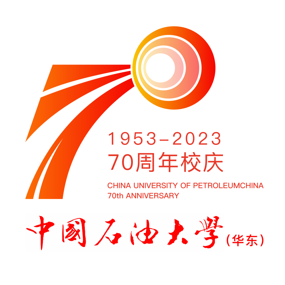
Identifier instructions
The main body of the logo consists of "stone", "70", stairs, scholarship, and elements of studying. Taking the word "stone" as the main source of inspiration, it naturally integrates the number "70" into it. It not only fits the application of the 70th anniversary of the school, but also condenses the essence of the stone.
Digital "7" deformation into a tilt ladder is intended to show that there will always be many difficult, hardships and twists and turns on the road to move forward, but Master Shi always has a positive attitude, perseverance, and indomitable fighting spirit. With this kind of quality and stubborn quality and style of hard work, we rely on the peak. Digital "0" is deformed into a place where the scent of scholarship. The place of studying shows the strong atmosphere of the book, the rigorous teaching concept and the long history of running the school. The scientific hall is courageous to climb.
Which design touches your heart most?
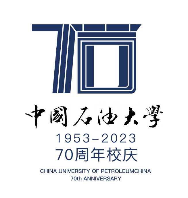
Come and pick your best identification in your heart, right?
Please choose up to 10 works
Deadline for voting:
24:00, July 21, 2022
Source: 70th Anniversary School Celebration Work Office
Edit: Sun Ruiqing
Editor in charge: Bu Ling Du Du Wenqian
- END -
The face and the people!Berlin Park "micro -transformation" realizes "micro -improvement"

Parks are not only a good place for urban residents to recover, but also an import...
What are the compensation of 5 million compensation for the hive energy and launching a sky -high price lawsuit against China Innovation Airlines.
Hongxing Capital Bureau learned on July 20 that under the auspices of the Ningde Intermediate People's Court in Fujian Province, the Ningde Times (300750.SZ) and Honeycomb Energy were in unfairly comp...