Regarding "water", the designer never lacks imagination
Author:WELENS Time:2022.09.05
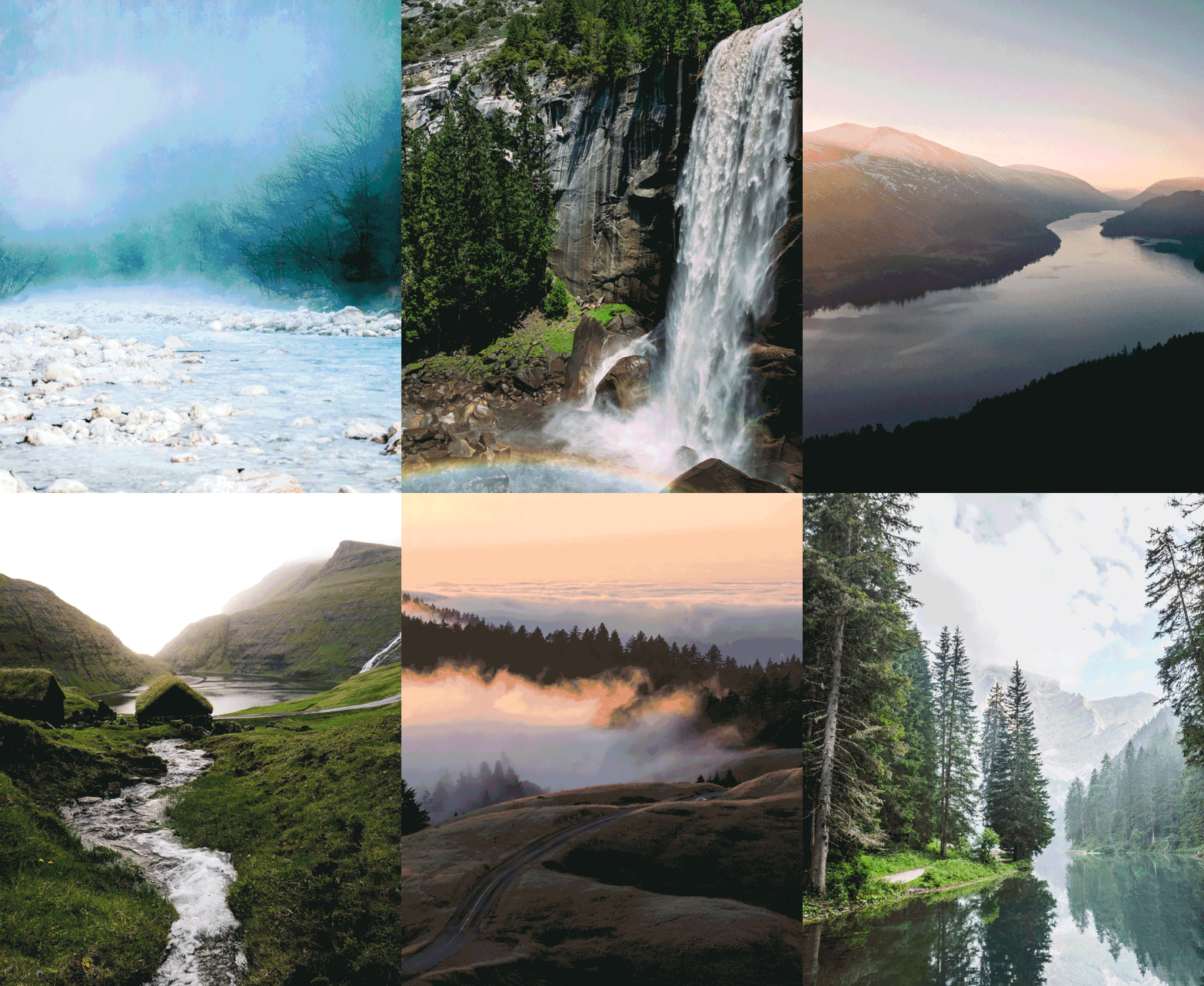
Most of the contemporary young people live in tight cities, and the symptoms of "urban diseases" are being enlarged infinitely: they are tired of work and life, worried about health, longing for nature, and gradually falling into numb and decadent.
A study published in the international academic journal "Public Science Library · Comprehensive" shows that the relationship between people and nature has become closer.
The emergence of this trend is not accidental. People who live in the city for a long time are no longer the most convenient and efficient way to adjust the body and mind when traveling is limited. All this solution is to find nature. Just like the author of "Silent Spring" (Rachel Carson), he also said: "People who feel the beauty of the earth can gain the power of life until the end of life."

Since the industrial era, people and nature seem to have become alienated, forming a near -opposite relationship, stereotyped and cold geometric design. But another designism that is very different from it is also continuing to speak, that is, the concept of nature reflected in design. People will never be separated from the lives given to us. Designers will always be keen on the beauty of all things. Extract inspiration.
Among them, the use of water concepts and images is the most commonly used by designers to try to close the sense of alienation between people and nature.
Water, the shape is changeable, as if it can grow into different shapes, and has the most primitive vitality, giving the designer constant inspiration, whether it is a psychological or aesthetic level. Either metaphorical or fusion in the design in the form of decorative forms will give users a sense of light and vitality, and it can also bring a sense of relief for urban people under the busy background. This also makes designers more likely to use the element of "water" to make articles.

Architect Ando Zhongxiong Works: Church of Water

Liquid clock RHEI
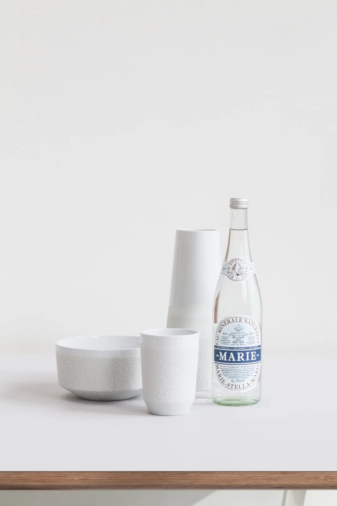
Archiving water cup, "water droplet" increases the friction of the outer wall better
You know, the most basic characteristic of water in psychological image analysis is "nourishing" and conveying vitality and vitality. Among the good designs that use water transportation to the maximum, they draw the characteristics of water to the greatest extent, bringing people to moisturize and experience silently.

Discussing classic designs related to water is always inevitable, the most creative work of the American architect Frank Lloyd Wright, Frank Lloyd Wright, the American architect.
He once said: "I like to use steel concrete to imitate the structure of plants to design buildings. In the middle of the structure, there is a trunk, which is buried in the ground. Each floor is like growing on the trunk. Enter the room from top to bottom to create a feeling of natural lighting. "
This paragraph is described exactly the intuitive feelings of the flowing villa to people. The flowing villa that once called the "greatest building in American history" is the living textbook of organic buildings advocated by Wright.
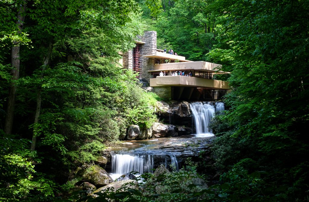
The most creative part is the integration of the waterfall. The white suspension balcony extended from the villa extended to the balcony, and the water was over the water. The waterfall poured out from the balcony. If you want to have a zero distance with water, you can follow the stairs of the big balcony, and the water is flowing water. Whether it is stream or waterfall, it seems that they have become part of the building.

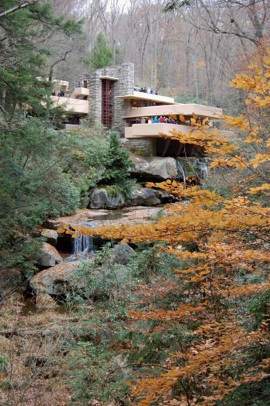
Here, you can hear the sound of streams dingling, or the sound of the small waterfalls falling down. This sound will float into the forest and the villa. This is a designed design that Wright uses the live water to the fullest. Although the entire villa is very thick in the past, this is actually the pursuit of the natural response to the natural rocks in the mountains, so that the landscape is self -contained.
Wright once said: "I hope that Kobaman can live with the waterfall and become part of their family life, not just admiring the waterfall."

No one will be more good at tangible than Japanese designer Sato. He is one of the designers who can use the most metaphor to be designed. He can easily jump out of the meaning of the morphological conventional meaning.
For example, without a drop of water, it can change the effect of "water flow".
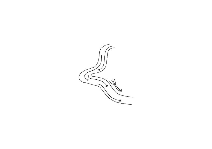
Waterfall combined desk design concept map
In 2020, Sato Oki and his team designed the combined table named "Waterfall".
The table legs are often hidden under the desktop. In addition to supporting the role, it is also to allow the desktop to free up space to place practical functional appliances or decorations. When the position of the desktop and the table legs is swapped, the desktop legs supported by the desktop unexpectedly produced a unique floating feeling. The table legs passed through the table, and it looked like water was slowly flowing from the rock.

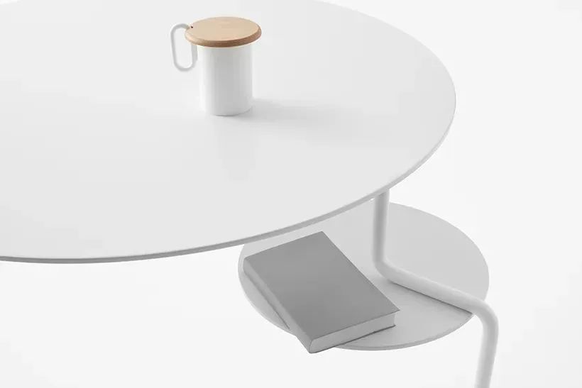
This may be a work that needs to be imaginative. It may be a bit abstract with the table legs to refer to the water flow. But if you know its name Waterfall, you can quickly understand the meaning.
In Sato's design, there is often such a step -by -step thinking. For example, the stairs when no one climbed, the lamps during the day or when sleeping, and no one watched the TV when it was watching? This may be a blind spot for most people's thinking. Sato wants to seize the "rest time" of these daily things. Even at this moment, no one is drinking tea and chatting here at this moment, and it is also a freehand landscape.
In terms of Liu Shui villa, water is borrowed from nature. The house is embedded in streams and valleys. This water is like flowing from the villa, so that nature and architecture are integrated. As far as the WTERFALL combination table is concerned, water is born from a highly abstract imagination. There is no drop of water, but you are reminiscent of the image of fine water.
We say that the designer is in love with the borrowing of water elements. Later, he tightly held its "God" and "rhyme", and created the experience of the design as the experience of the water itself.
For example, the new system ColorOS 13 released by OPPO, the design and concepts are all about the concept of "Aquamorphic". It is very similar to the experience of diving in the clear and clear water. He is clearly in the water, but he can't see the water.
The "water conservancy" in "Tao Te Ching" has been disassembled and clearly dismantled. It helps all things, silently, and there is a rigid, net, capable, and great mind in the softness. "Aquatic Design" also hopes that the experience of like water can quietly incorporate the subtle experience of mobile phones, giving you the vitality of inspiring spirit, and giving you a light and non -disturbing care.

OPPO scattered the three forms of water (liquid, solid, and gaseous) in the use of the entire system. The most basic experience is naturally as smooth as liquid water; Stable and clear. And the most likely to be perceived by the top -level notification or interest screen reminder, just like gaseous water, light and not disturbing, allowing users to interact at each level naturally occur naturally.
ColorOS 13 uses the three forms of water to build a system level

This may be a design thinking that requires patience to observe it. However, there are also some inspirations to capture between nature and daily, which have been quietly plugged into different functions.
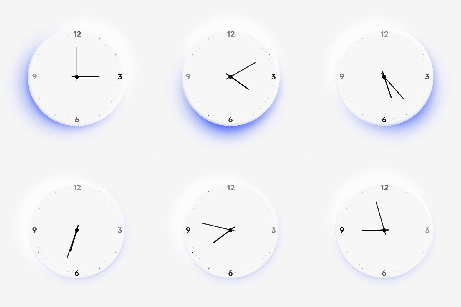
For example, the most common system clock in the mobile phone has transformed into a chasing clock in COLOROS 13. It combines the real -time sun orientation to simulate the light and shadow effect produced by objects at different times. It is perceived in the continuous changes of the halo. Time transformation. In the words of the designer, the nature of the color of water is the relationship with light, and the change of light itself is also a change in time.
Chase clock
In the updated blooming wallpaper, "Plants" will perceive the common app and change the theme color. When the length of the machine exceeds the set value, the plant will show the state of mineralization, giving you a gentle sign, reminding you to put down your mobile phone in time and rest for a while.
Blooming wallpaper
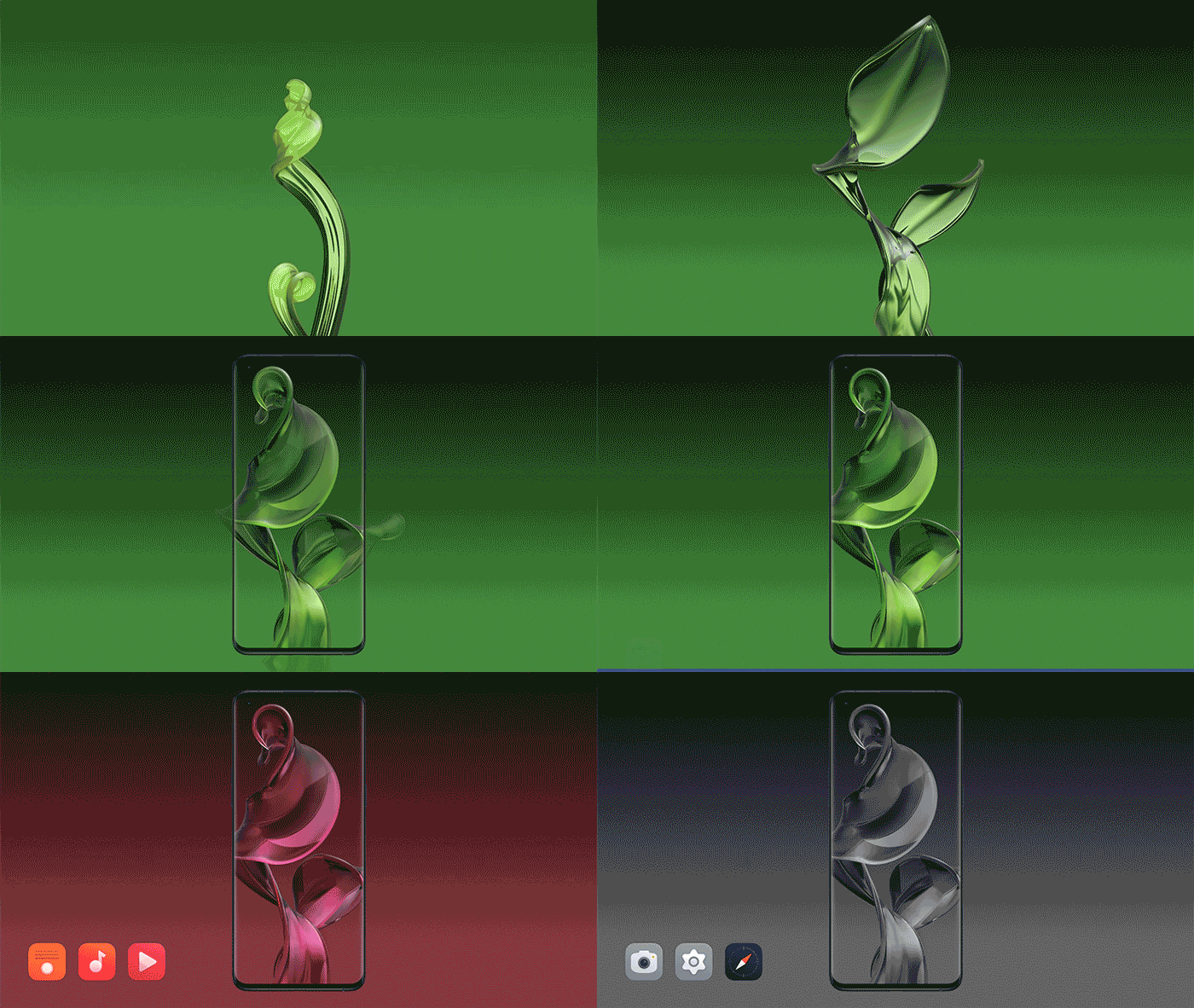
ColorOS 13 gives you the first impression of you, perhaps from the vitality of color.
ColorOS 13 (left) vScoloros 12 (right)

How long have you not gone to nature to see those primary colors that have never been tuned? This time the new color system is obvious to want to pull you out of the dull daily life. The color selection is to draw inspiration from nature. The orange that appears from time to time, and there are more Kleinan, who is more biased towards the sea, can always bring people imagination about the sea.
Bleak
However, Hainan is hundreds of rivers, water. The water in your eyes may be streams and waves, or raindrops and snow.
But the designer told us that we must install the experience like water in the precise and complicated mobile phone system. How to hide this kind of moisturizing and silent experience into everyone's minor needs.
Author: viuviu
Bleak
- END -
Visual Qingyang | Longyuan earth's wheat waves, it is another year of harvest

At night, the south wind rose, and the wheat covered the Longhuang.Recently, the 1...
Top 100 experts and doctors appeared.
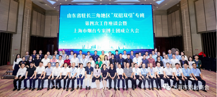
On August 30, the fourth work symposium on the Double Strokes and Double Quotes sp...