Visit the most beautiful hospital in China in the depths of Dashan
Author:Medical community Time:2022.08.28
For medical professionals for reading reference

A modern hospital built in the depths of Dashan is hailed as "the most beautiful hospital in China".
When I first went to the center of Lishui City, Zhejiang Province, it was difficult to not be attracted by the color of the facade of each building. Yellow, gold, red ... bold and modern beauty with color, and white on the eaves of some buildings were decorated with white. The canvas, in the hot south, can not only block the hot summer heat, but also add a romantic and relaxed atmosphere.
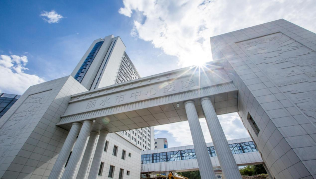
Hospital gate

Administrative building
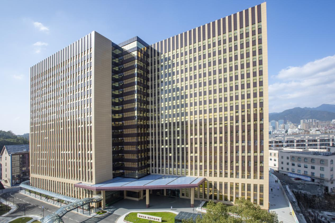
Department of Internal Medicine

Cafeteria
There is a corridor between the building and the building to form a ring. In the center of the hospital, a huge rockery stones stand up, which not only consolidates the sediment required by the garden, but also isolate the space, and it is incorrect. Although the construction department is still busy, this green space for patients and their families in the future will have a little elegance of Jiangnan gardens step by step.
And these exquisite hospital buildings, except for the oldest outpatient clinics, almost all have the participation of Dean Wei Tiemin's personally participating in the design. The dean who is quite accomplished in architecture has devoted his talents to the design of the hospital. The training of our responsibilities "echoed.

Lishui Middle Hospital Hospital Training
Next, we came to approach Lishui City Hospital to experience the style of "the most beautiful hospital in China" from the details.
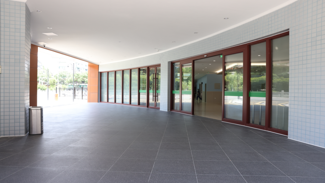
Enter from the outpatient clinic, the first thing you see is the curved gate. Because it is located at the crossroads, the gate of the courtyard is a dual -current lane. In order to save the rescue time of emergency patients as much as possible, the ambulance can stop at the door of the emergency center as quickly as possible no matter which direction.
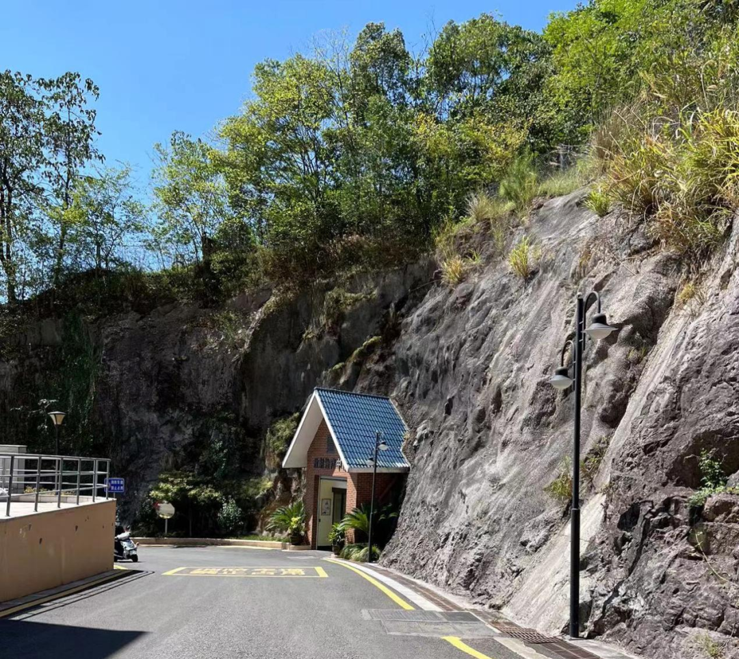
A radiotherapy department in the hospital is designed in the first half of the mountain -bearing air -raid hole. Because the mountain itself has the function of isolation radiation, the hospital saved a cost when designing. After entering the treatment area, the walkway is slightly tilted down, and even if it is not installed, it can achieve warm winter and cool in summer.
The toilet in Lishui City Hospital all gave up the design of the door and switched to the fans, which also played a effect of protecting privacy. The clear color contrast and simple pattern design make the toilet clear at a glance. At the same time, the hospital switched to a fan to pull up the air, which greatly improved environmental hygiene and could not smell the odor.

In terms of soft outfit, the hospital design is unique. After entering the emergency building, walk inside, and there is a packeting corner at the right corner of the corner of the corner. Lu Lihua, deputy director of the Party and Government Comprehensive Office, explained to prevent critical situations. The ambulance staff pushed the bed into the corner. The damage is reduced to the minimum.
On the wall of the corridor, there is a colored acrylic decorative wall, adding a bit of color and playfulness to the hospital.
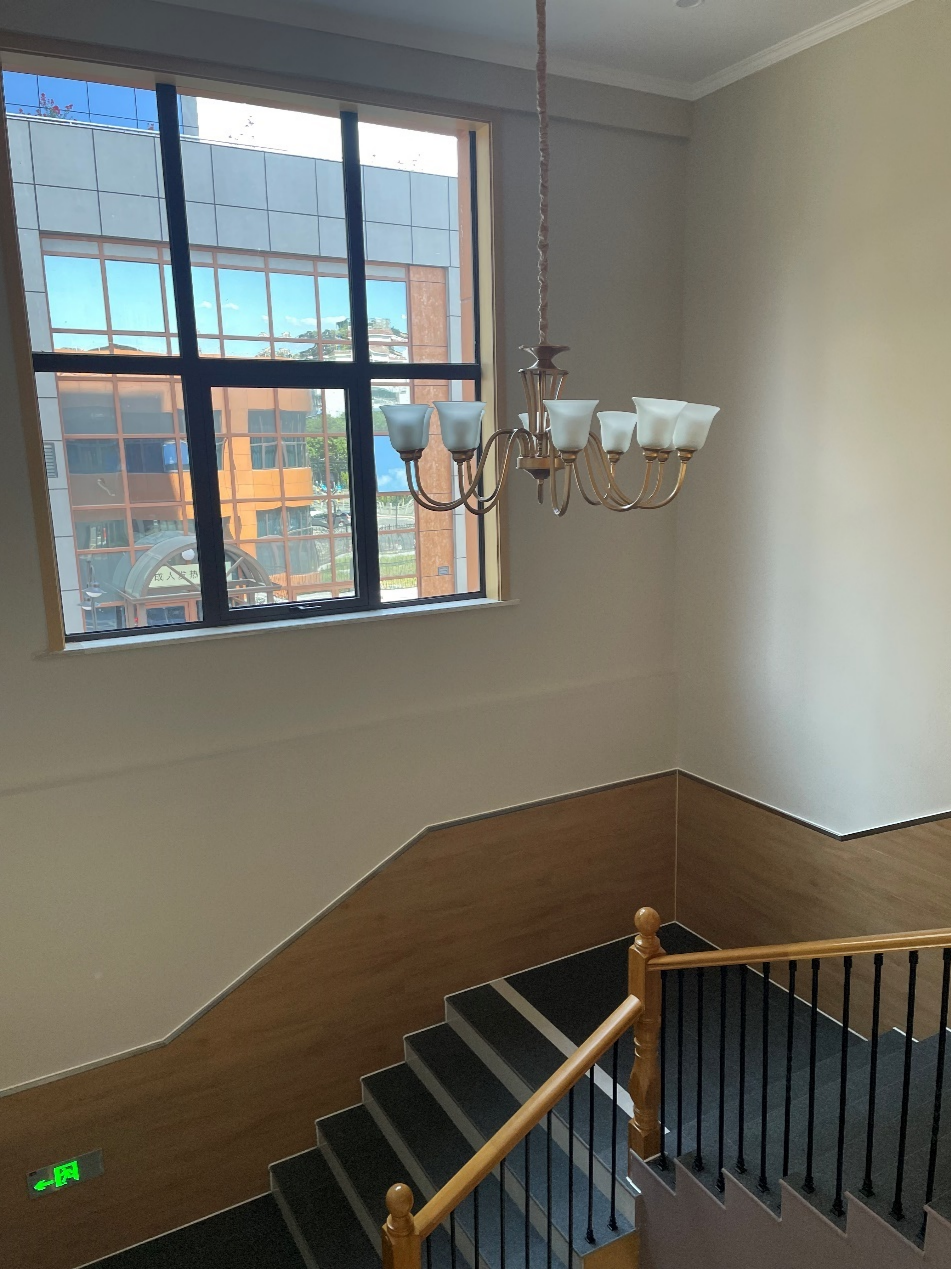
At the staircase next to the emergency consultation platform, a white chandelier hangs from the yellow ceiling, and the wooden handrail railings present the shape of the font, surrounding it in the middle, as if they are in a living room of a giants in the Republic of China. In particular, the comparison of dark and light -colored step colors make patients on the upper and lower stairs see more clearly.
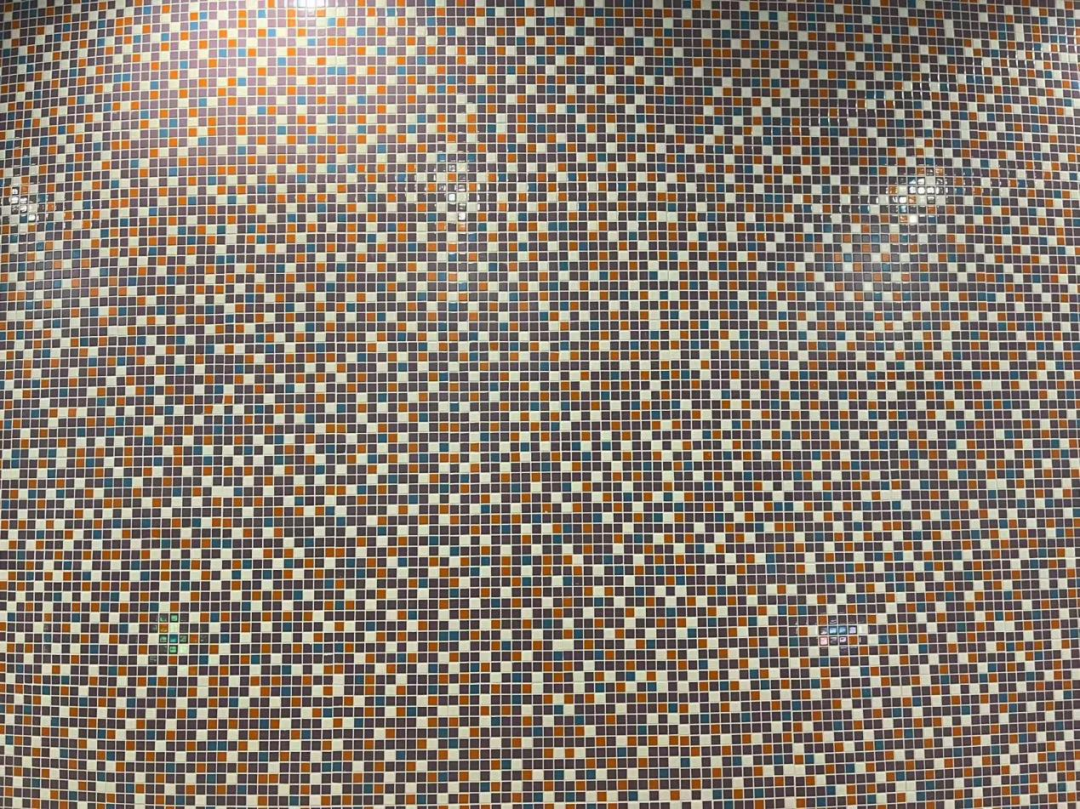
In the waiting area of the patient, the customized dark blue base tiles clearly circulate the boundary, which is both aesthetic and practical.

In the children's infusion area, the sofa design is more spacious than the adult infusion area, so that parents do not feel crowded when they hold their children's infusion; "Renewal."


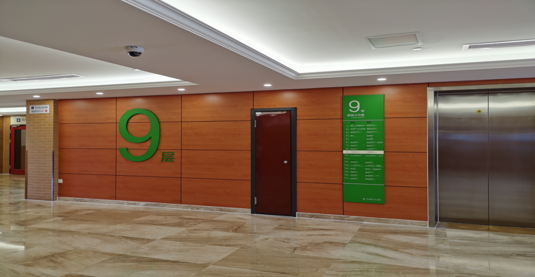
In the newly completed internal medicine building, the "medical tank of the medical world" saw the elevator hall, which was even more eye -catching. The warm color wall with a cold tone sign makes the floor and other information more prominent.
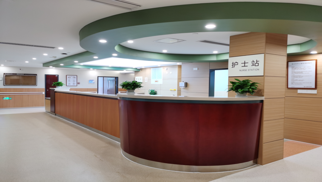
There is a slope tilt in the nursing station's jet. It also increases the height of the countertop accordingly at the place where the patient's family is asked, so that the station is close to the inquiry.
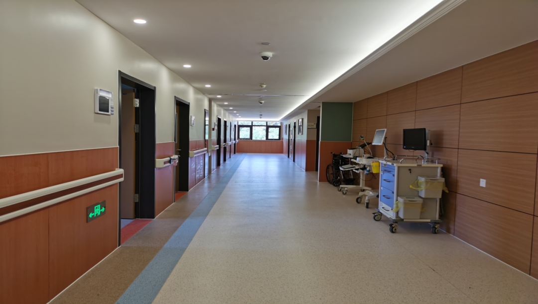
In the corridor of the inpatient department, there are several additional spaces that are randomly random, which is convenient for medical care to temporarily put various treatment vehicles, transshipment beds or other diagnosis and treatment instruments, and do not occupy the aisle space. There are sockets on the side of the wall for convenience at any time.
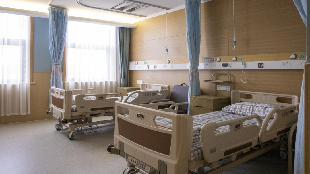
There are 2 beds in the ward, and strong light, weak light, etc. are set up from top to bottom for lighting and medical night inspections. Dean Wei Tiemin also tried to discuss publicity and specially adopted a cartoon curtain, hoping to bring some childlike fun for the patient's nervous and restless mood when he was hospitalized.
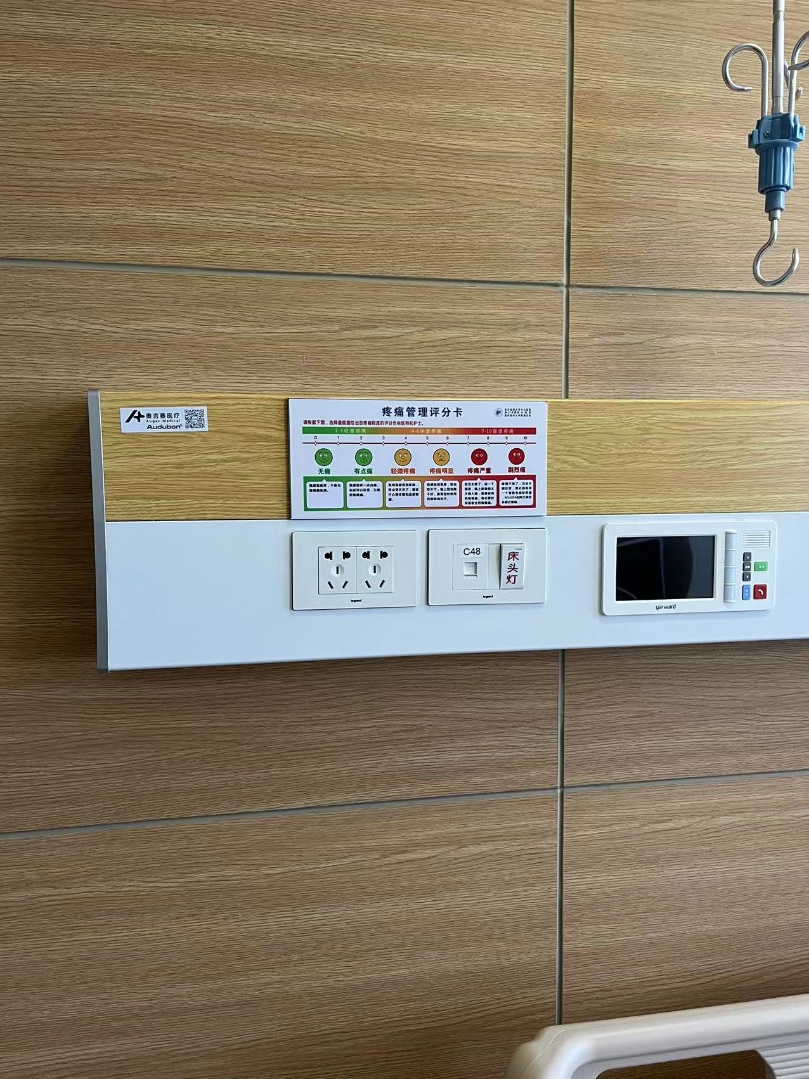
At the bedside of the bed, the hospital specially posted a sticker described by the pain level as a reference, so that the patient told the doctor to tell the doctor.
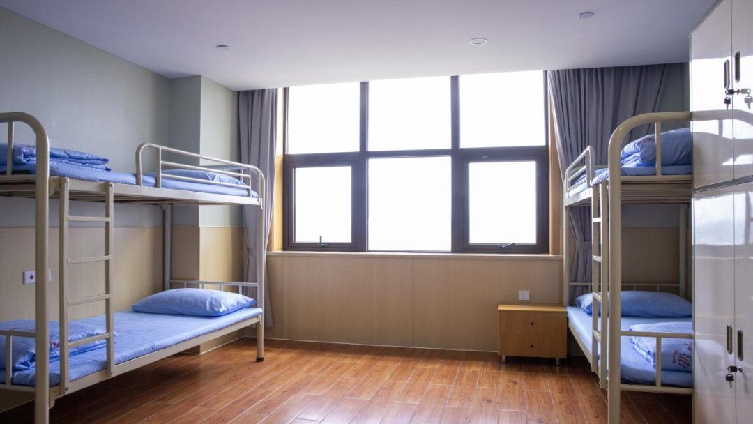
The hospital has also fully considered and specially designed the hospital's rest and office area.
The four high -low beds are made of customized high -end rubber mattresses, so that the doctor on duty should be as good as possible. There is a switching light on the wall of each bed, so that even if someone in the same room is resting, it can minimize the impact on it. At the same time, it can make the latter not need to get up to turn off the lights after sleeping.
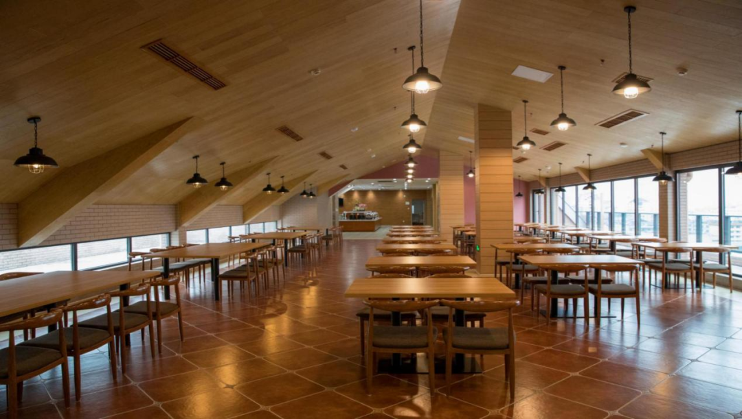
The self -service restaurant and the library of the hospital's dining are also very distinctive.

Come to a beautiful photo of the Hospital's administrative office. Such a spacious and bright sunroof is very rare in domestic hospitals. The white curtains are well obstructed to the hot sunlight, and at the same time, it also maintains adequate lighting in the room. The distance can also make each other not disturbed.
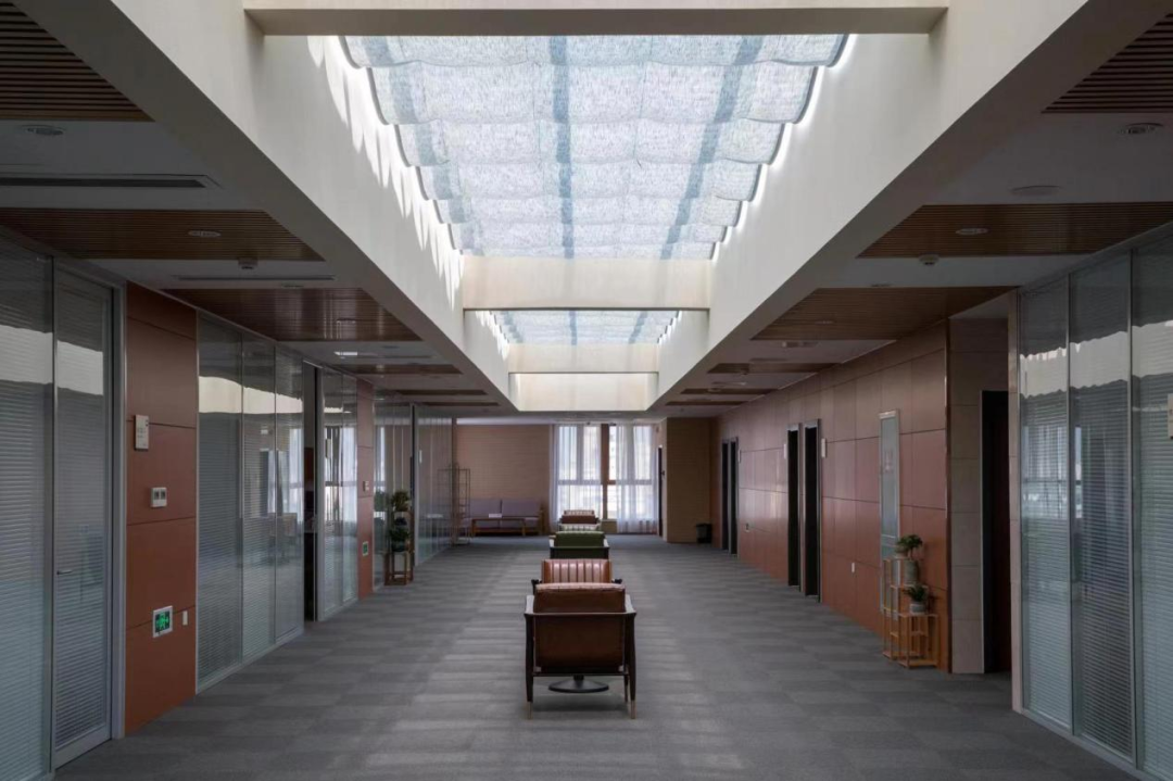
Both the hospital and the interior, all reflect the high aesthetic and life interest, and also take into account the actual needs of the use scenario, and the practicality is very strong.
Lu Lihua, deputy director of the Party and Government Comprehensive Office, told the "medical tank of the medical world" that many hospitals and soft furniture outfits are compared with three in the hospital. They are repeatedly selected. A lot of decisions. What to make Dean Wei Tiemin is proud of that the design of the hospital is very beautiful, but the overall cost of the new building is well controlled. For example, the teaching building is only 2200 yuan/square meter, and the administrative building is as low as 1700 yuan/square meter. The cost of the hospital's preparation building is also basically self -sufficient, which is very rare.
Text: Medical Tank
Picture: Lishui City Hospital
Source: medical tank in the medical world
Editor: Ling Jun
Hot text recommendation
- END -
Live Trailer 丨 The Eighth Press Conference of the New Crown Extraction of Tibet Autonomous Region

Source: Tibet Satellite TV+New crown epidemic prevention and control work in Tibet...
The community opens the "smart classroom" to help the elderly cross the "digital gap"
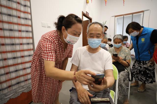
On June 28, the Tangdu Garden community in Lianhu District carried out the smart e...