How to make the design facade design more artistic!
Author:Design artist Time:2022.08.28
The facade of the building is dressed like a person, whether the dress is decent, and the design is critical!
The first sensory impression of the building comes from the outer facade of the building.
How to design a good facade of the building, you should first understand the plane composition! It is said that architecture is a combination of technology and art. Today we will talk about the artistic ingredients in the design.
The following is a detailed graphic content. The text reading time takes about 6 minutes.
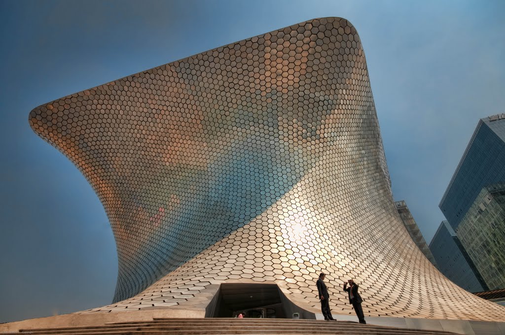
As we all know, "plane composition" is one of the three major compositions of visual art and the most basic art rules.
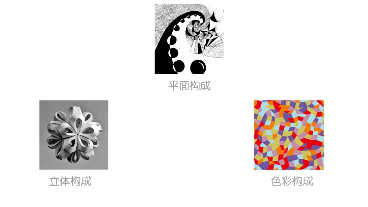
So what is the relationship between the plane composition and the design of the building facade? How should we use it? Let's understand together.


The three major elements of the plane are "points, lines, and faces". How to create the relationship between image and research and image with rational and logical reasoning is an important prerequisite for creating artistic aesthetic buildings.


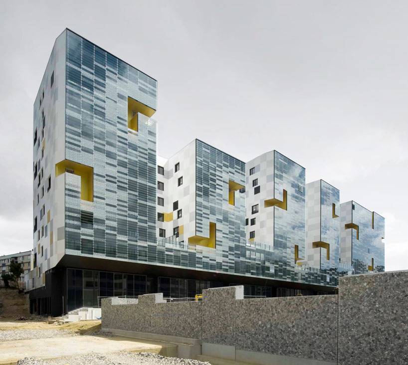
Today we only talk about the artistic effects of the point elements in the plane composition in the facade of the building. If you like these contents, if you have time later, I will continue to explain other content for everyone.

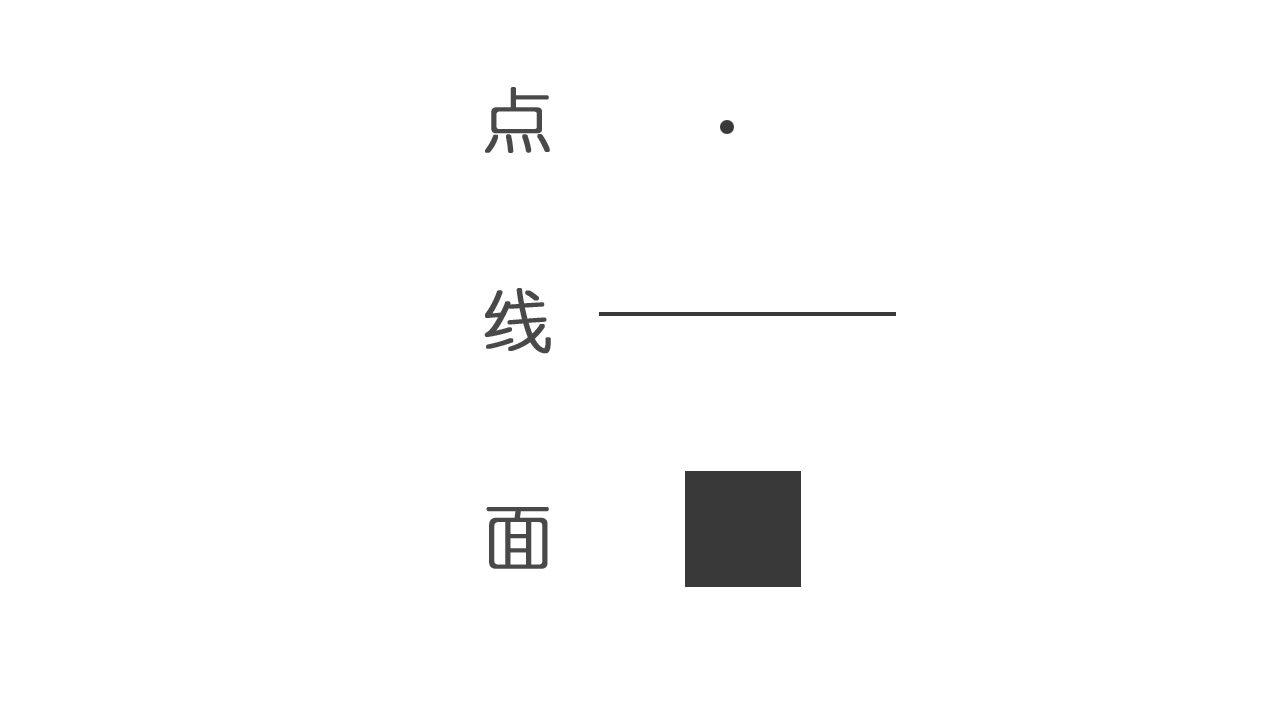
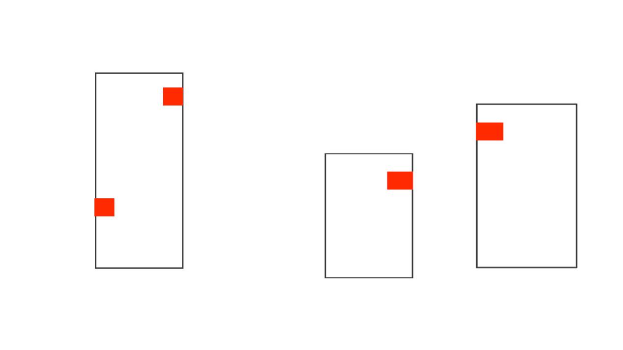
First of all, let's take a look at the concept of "point": In geometry, the point is an element that only has a position without direction and size. It is the smallest unit in the shape. The psychological feelings of a single point in different positions in the screen are also different.
For example: When the point is located in the center of the screen, the feeling gives people stable and calm; when the point deviates from the center point, it changes the stability and calmness of the picture to form an unstable motivation; When moving to the lower left or lower right corner of the screen, it will give people an unstable feelings;
If you move to the upper right corner, you will immediately give people a hint of leap and rise.

In summary, we can use the various psychological characteristics of different attributes to the different attributes of the point into different building facade design and creation.
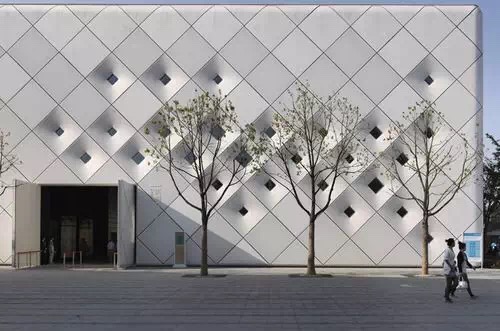
Through the study of the above single points, "points" can produce a "visual center" in the building. It is a visual unit with spatial position in the expression of the building facade.

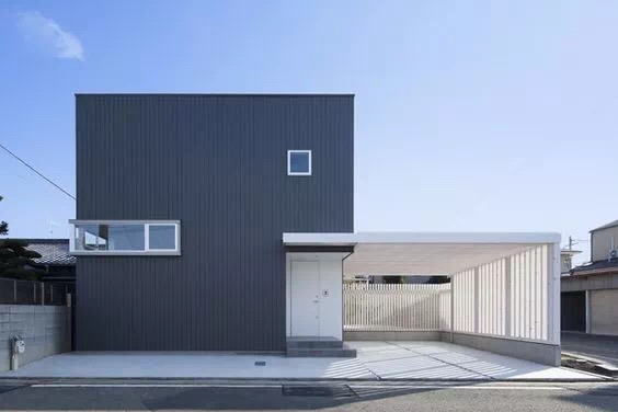
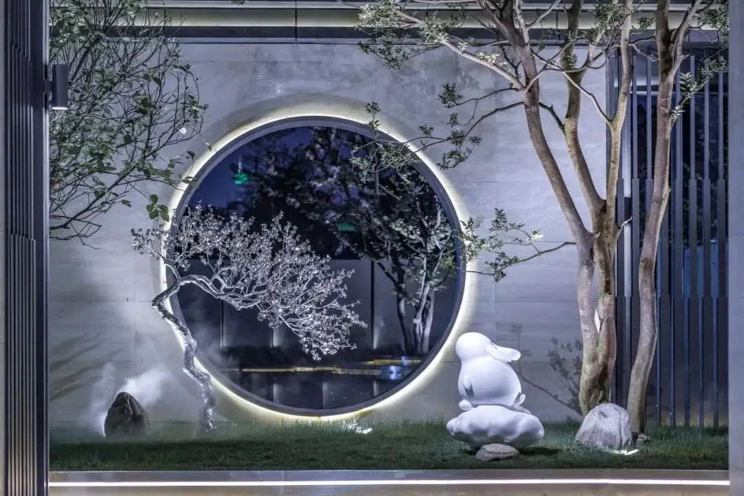
In architecture, points can be presented in a variety of forms, such as circular, square, triangular, trapezoidal, and even irregular shapes.
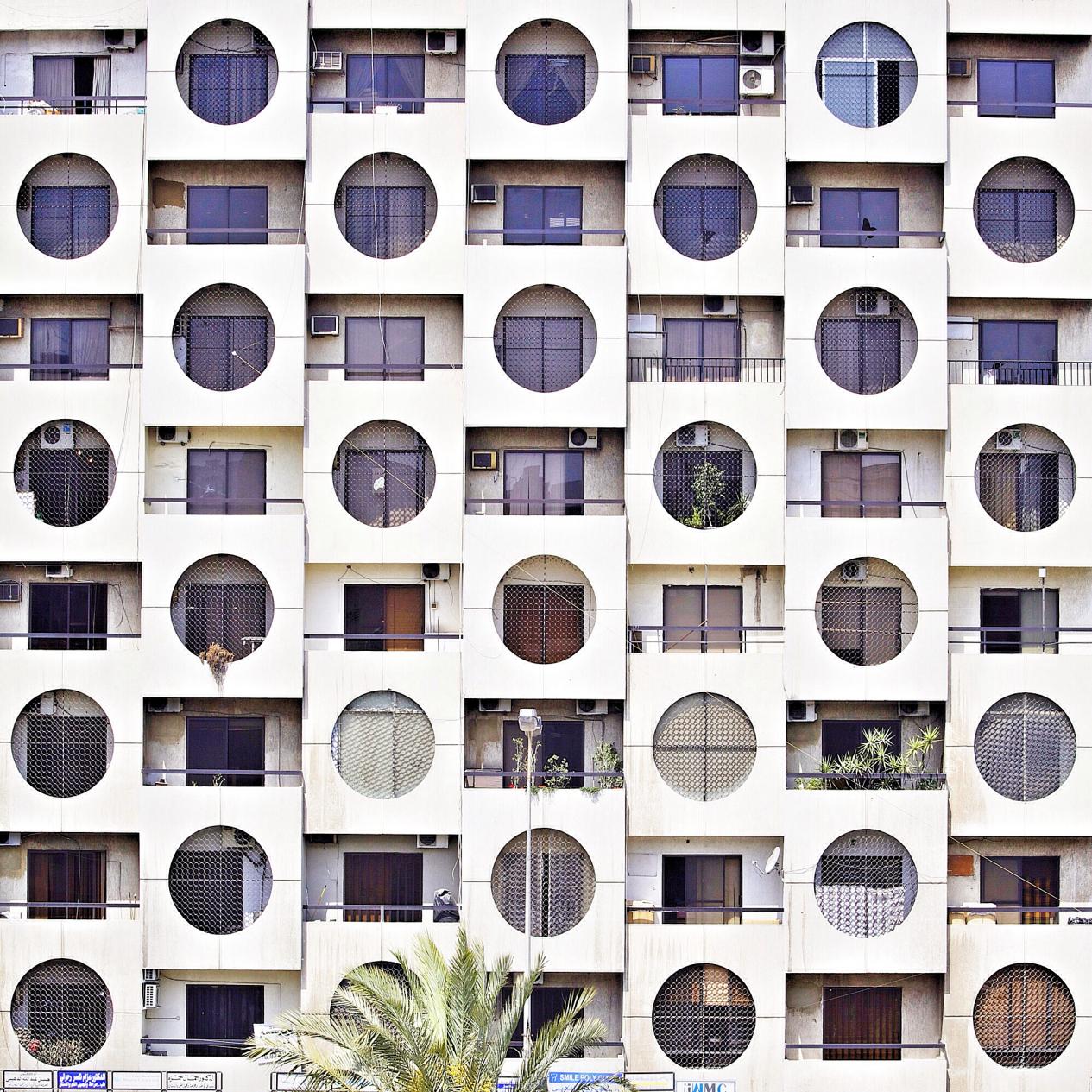
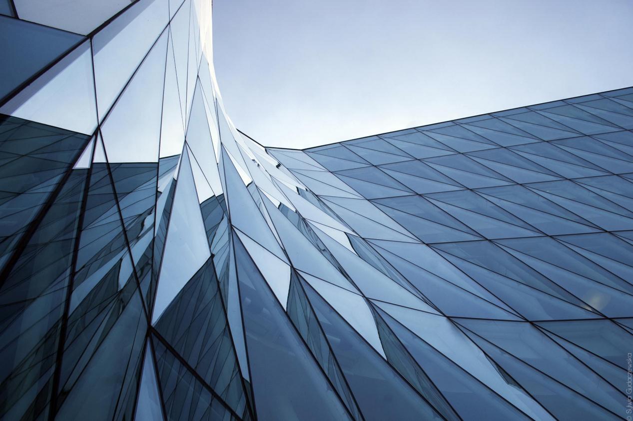
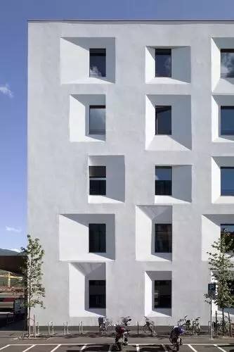
Next, let's take a look at the relationship between points and points.
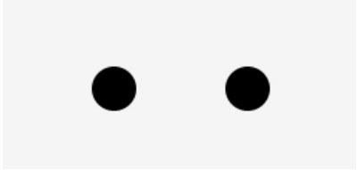
For example, when two "point elements" are the same but placed in different positions, it can make people think of the connection between two points and generate a visual tension. As a result, people's eyes move back and forth between these two points, which can produce a line feeling.
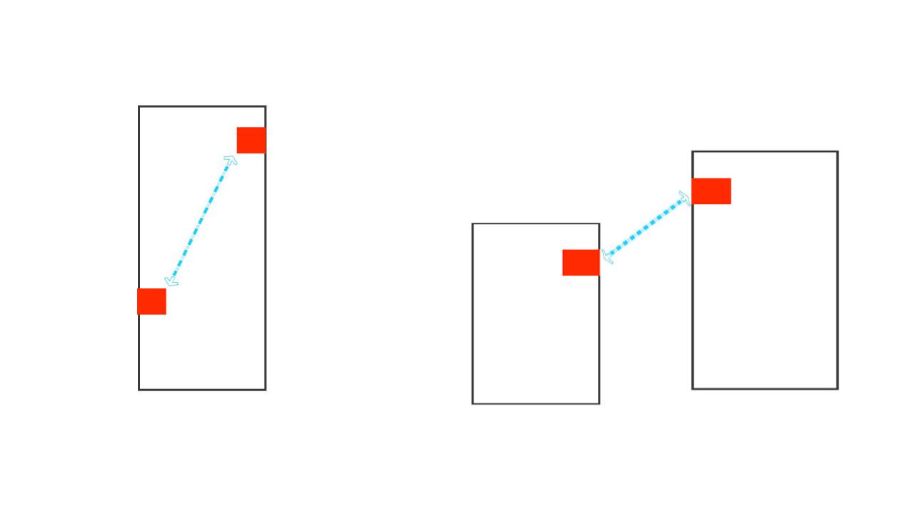
When the two points are different, the large points will attract small points, and the sight will move from the large point to the small point, which contains a dynamic trend;


When there are multiple points in the picture, the sight will move between these points, and the psychology will produce a geometric feeling, or a rhythm -like rhythm.
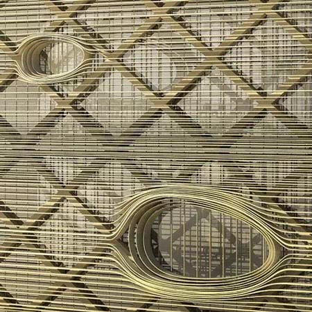

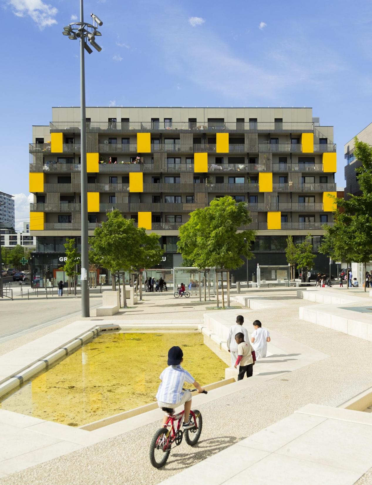
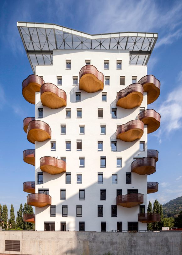
Finally, let's take a look at the flat visual effects formed by the various arrangements of several "points", which is what we call the "flat composition" of the point element. Repeat composition: Refers to the form of two or more arrangements in the same plane in the same plane. Basic elements are the basic units that constitute graphics, and we see it here as point elements.

Repeated arrangement can strengthen the visual impression of the graphics, form a strong sense of rhythm and order, and make the image highly rigorous and overall sense.
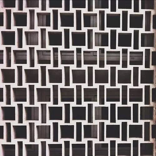
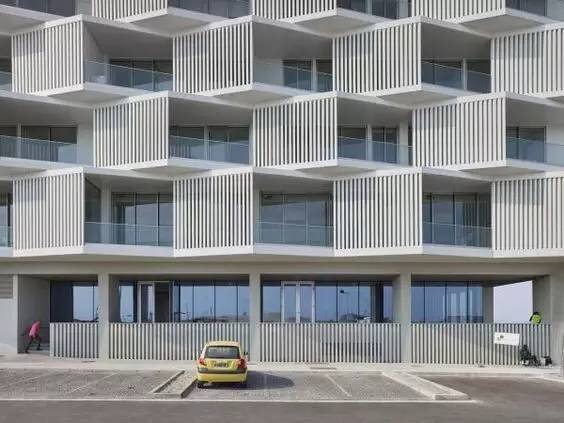


Approximate composition: refers to a combination of basic elements that will have similarities. The basic elements in the approximate arrangement have common characteristics in terms of size and shape, showing a variety of unity.

The approximate composition is the mild change that repeats, which can make up for the monotonous rigidity in the duplicate composition, which can increase the lively sense of the image.
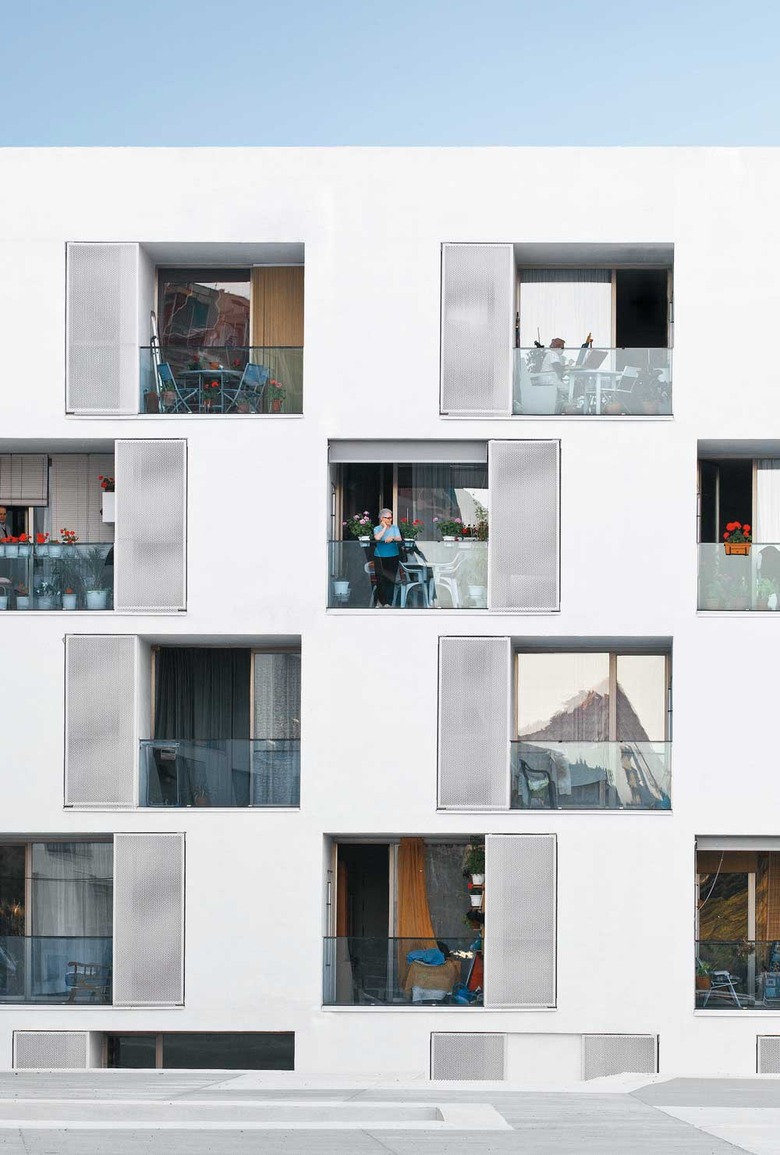
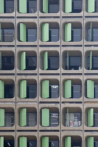
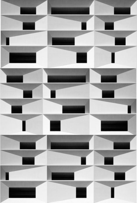
Gradient composition: refers to the gradual change in the basics in accordance with a certain law, thereby evolving into a new image and overall form. Gradient composition is a form of composition with strong regularity and rhythm and rhythm.

Usually, gradually changing in size, direction, position, shape, etc. Gradient composition gives people a strong beauty of rhythm. At present, there is an popularity under our computer parameterization auxiliary design.
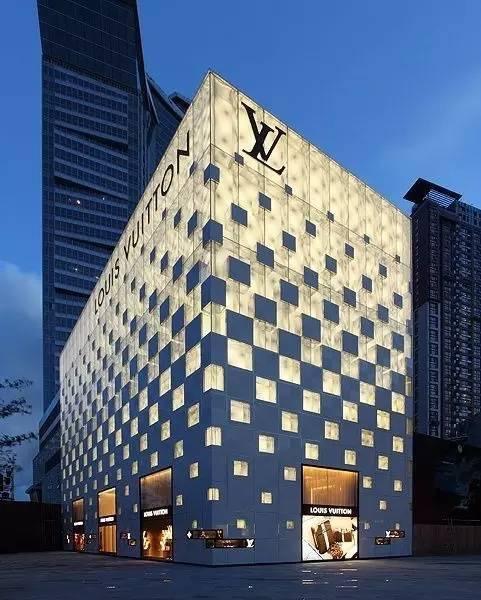
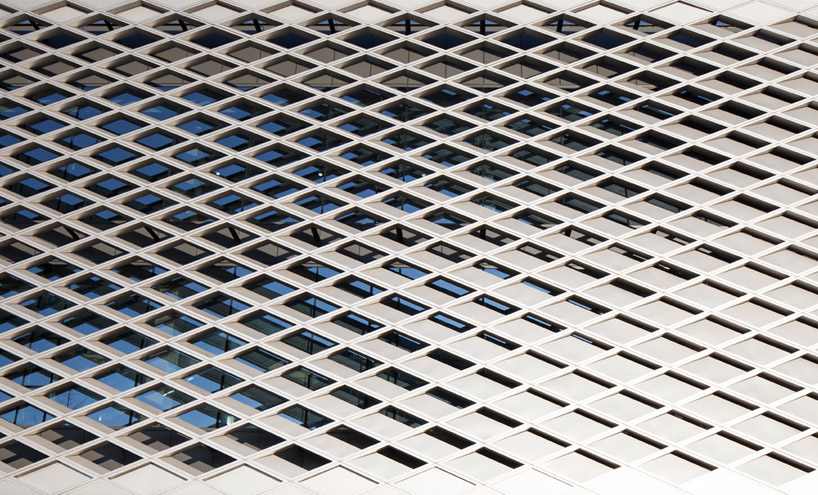

Mutant composition: refers to the visual effects formed by local mutations in a more regular form.
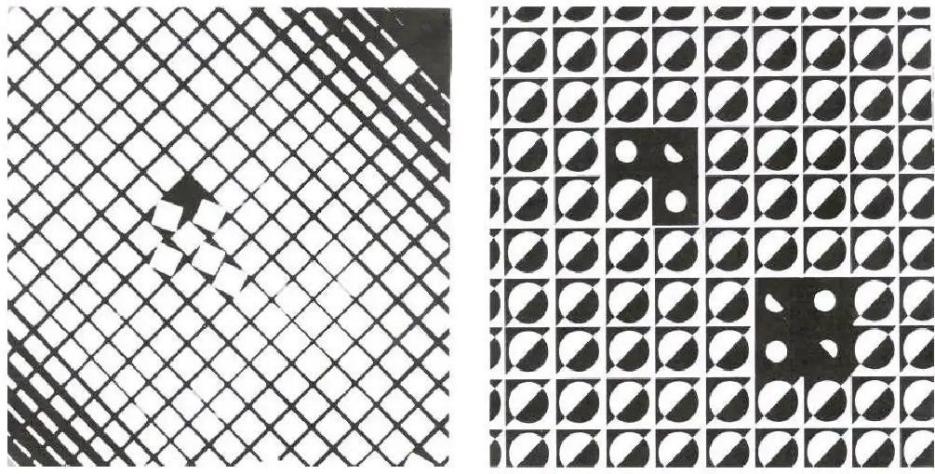
The composition of mutation breaks through the normative and monotonous regularity constituent, which can effectively strengthen the visual center and brush a strong sense of existence.

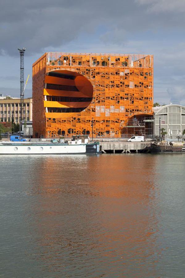

In reality, especially when computers are highly developed today, there are many ways to create architectural design through the composition of point elements, so I will not repeat them one by one.In actual creation, you also need to start thinking and creation according to different projects.
Well, let's talk about this today, and see you next time.
- END -
Du Wenxi, member of the Standing Committee of the District Party Committee and Minister of the Propaganda Department, and Tang Kexin, deputy head of the district government, went deep into the streets and towns of Daoli District to inspect and guide streets and old communities.

Strive to create a national civilized cityOn August 14th, Du Wenxi, member of the ...
Meteorological expert: "Summer+flood season" must pay close attention to weather changes when traveling

Summer is the peak period of travel travel, and it is also the main flood season i...