The Zhejiang couple insist on making full cabinets in the whole house.
Author:Designer Lao Gan Ma Time:2022.08.26
The Zhejiang couple insist on making full cabinets in the whole house.
In this era when the network information is very developed, friends who are preparing to decorate will watch a lot of decoration cases on the Internet. This is good -looking, that is also good -looking, looking at one to love one, and finally I do n’t know which style.
Today's selected cases come from@今 今 's new home. When the hostess was preparing to decorate, she also watched a lot of decoration cases on the Internet. When it comes to the style, I do n’t know what style of my home, and I am afraid that my family will make four. Finally, under the suggestion of the designer, the overall simplicity of modern and simple style was selected. On the basis of simple and hard installations, add a little gentle and soft outfit, so that it can be versatile and not wrong, and it is very resistant to it.
Let ’s take a look at this simple and practical new home with Xiaobian. I believe that you can bring you different decoration inspiration.
House information
The construction area is 138 square meters, and the practical area of the set is 117 square meters. It is a unit type of a three -bedroom, two halls, two guards, and one kitchen.
Porch
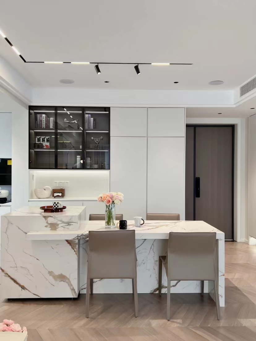
Entry is the restaurant's apartment. After opening the restaurant and the kitchen, each space is much larger. Now seeing the large area of the right side of the door is a meal cabinet, if the shoe cabinet is on the left side of the door.
Dining room

The restaurant uses rock plates for the combination of dining tables and island platforms. Unlike other places, the combination of the combination here is uniform materials, and the visual effects are more coordinated.
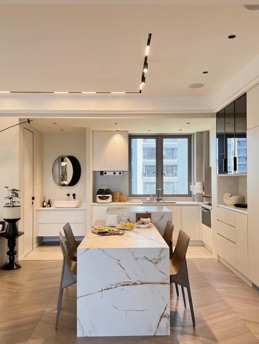
The dining table and the island platform were not designed on the same straight line. Instead, they were dealt with misaligned. The visual effects looked even more chic, like two tables of different heights.
kitchen
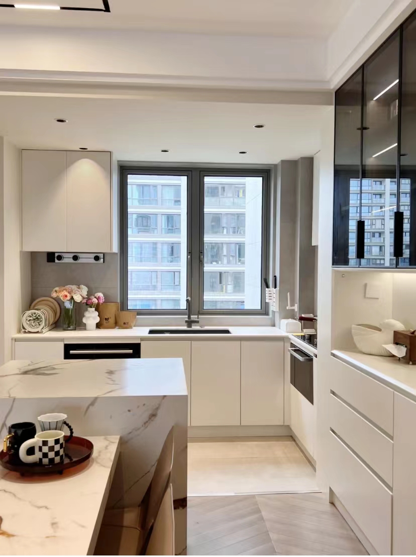
The whole kitchen is white, which looks clean and easy to take care of. The ground tiles in the kitchen part are closed with a copper bar with the ground floor, which is beautiful and practical.

Because the kitchen has a large window, the area of the wall is not sufficient. Excluding the position of the range hood, there is only a little wall space above the cabbage. Dry goods are suitable.
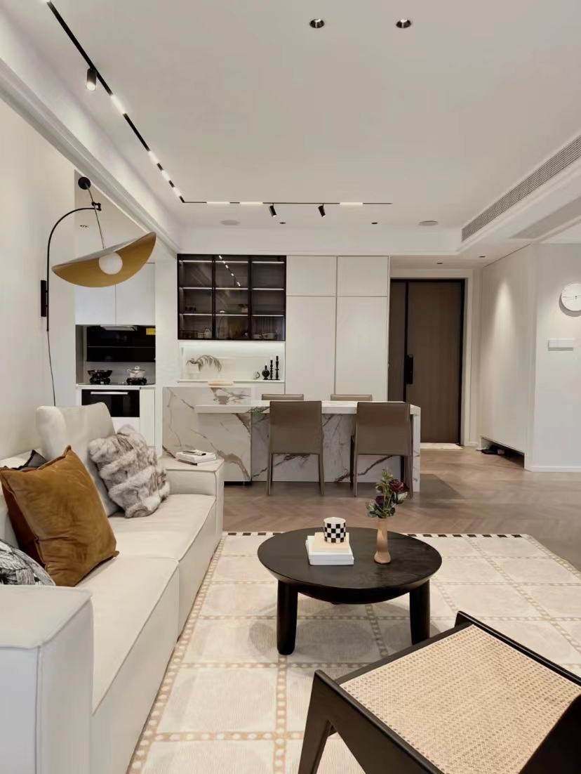
From the perspective of the living room to the porch, the restaurant is most seen, followed by the kitchen. But because the two spaces have an integrated design, at a glance, it is particularly spacious.
living room

Do not want the traditional cumbersome main light, choose the design of the main light without the main light, use a pooker with a magnetic rail lamp, and use a very simple way to create a bright space of uniform lighting.
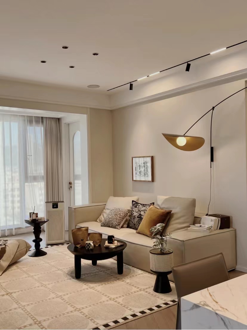
The background wall of the sofa brushes latex paint, because I don't like complicated decorative paintings, only one word is hung. The space next to it looks a bit empty. It is decorated with a shape of a wall lamp, which can be illuminated and looks good.
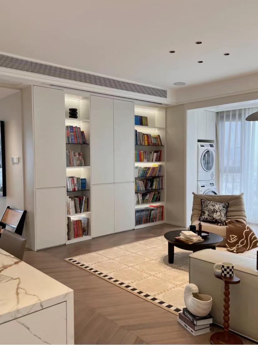
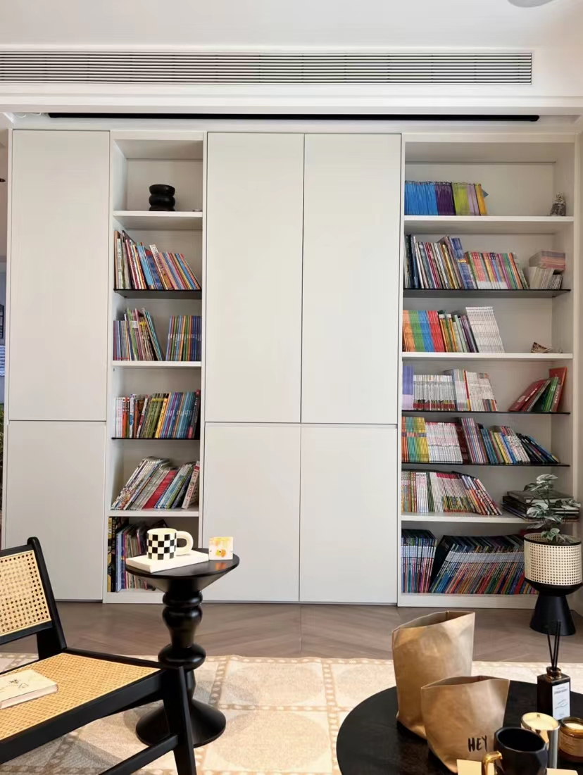
Now young people, there are fewer TVs. Here, when designing, the TV wall is designed as a cabinet to facilitate the storage of books and debris in the living room.

Although the TV is less, occasionally idle, and just when I have a favorite TV series and movies, I still want to see it. Design a set of ranging curtains on the top surface of the cabinet, which is super good.
balcony
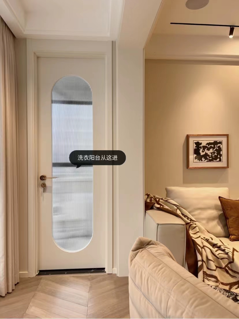
The balcony outside the living room was originally long. Outside the other room, in order to make the living room more beautiful, the balcony was divided into two. The independent laundry balcony was designed, and the Changhong glass door was separated.
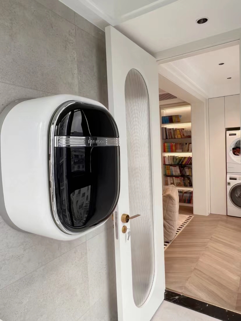
From the perspective of laundry balcony, you can vaguely see the washing baking combination on the other side of the balcony. A small amount of clothing, if you wash it with a large washing machine, is a waste of water. Add a wall -mounted washing machine on the wall of the washing balcony to solve the problem of a small amount of clothing cleaning.

The laundry ponds and clothes drying rods are arranged in this space, and they are washed and dried at will, which has no effect on the outside space. If the space is sufficient, it is necessary to design an independent laundry balcony.
Multi -functional area
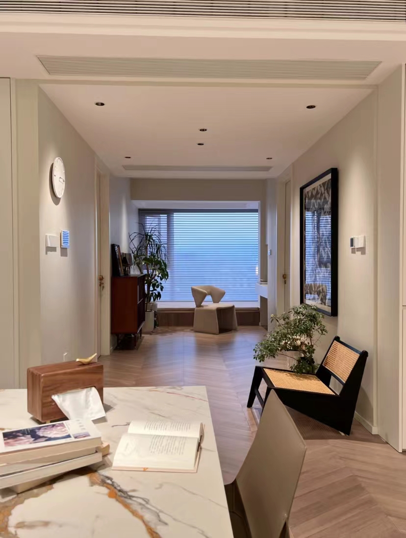
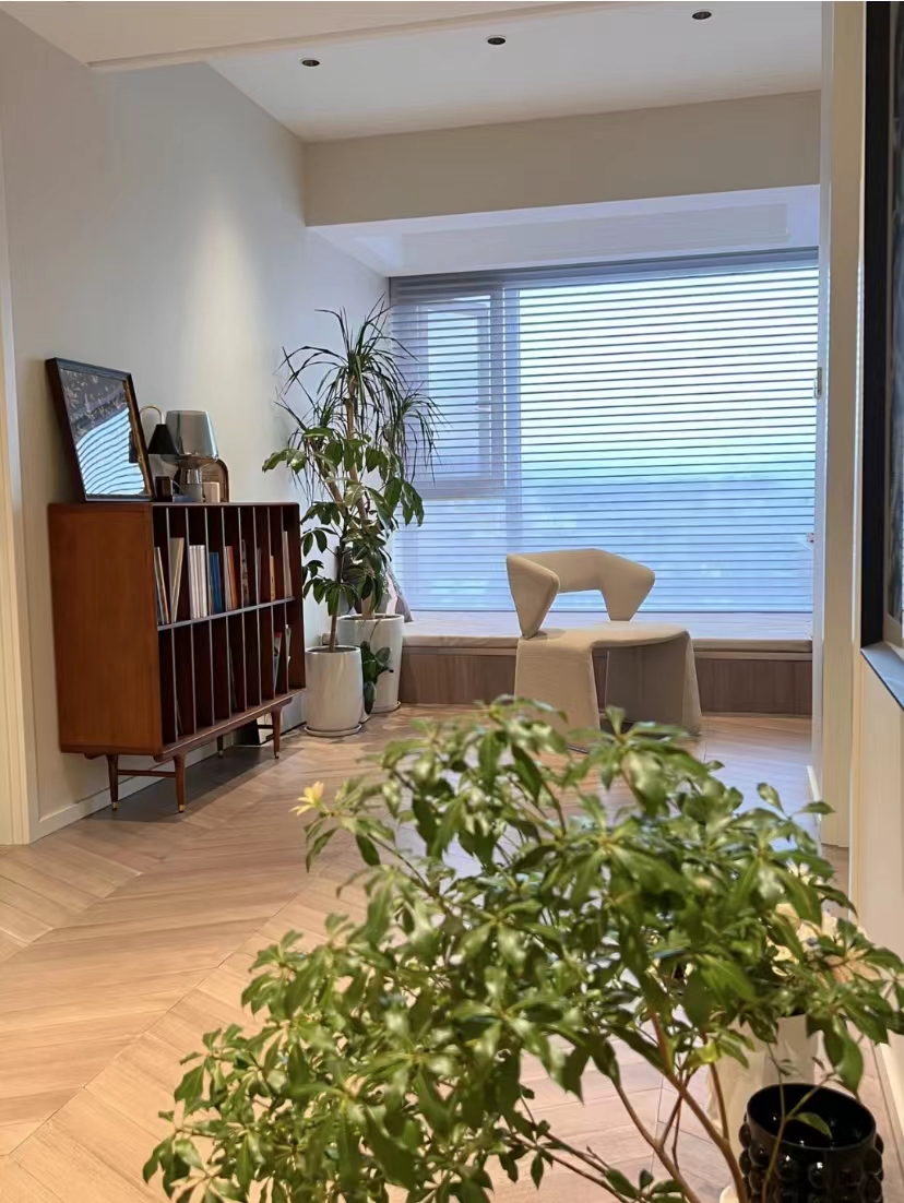
Remove the partition wall of the bedroom and connect with the restaurant to transform into a multi -functional area. The position of the bay window, remove the fake bay windows, occupy some indoor space, package a tatami, can be used for leisure tables and beds.
bathroom

From the perspective of multi -functional areas, you can see the dry area of the bathroom and the white washing pool. It is a suspended style with a wall row, beautiful and hygienic. The mirror with black edges on the wall is full of three -dimensional.
Master bedroom

The bedroom still follows the basic principles of simple design. The solid wood flooring and wall surface brush latex paint, simple double eyelid ceiling with a main lamp design.
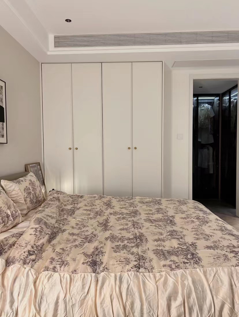
The wardrobe of the side wall made a design of the top, four long door panels, without any shape, simple, and resistant to see, and it is also convenient to take care of it. With a small buttons, it can be more durable.
Children's room
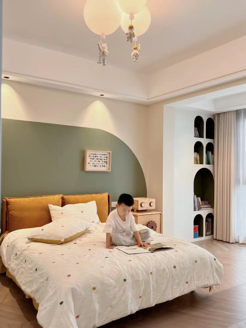
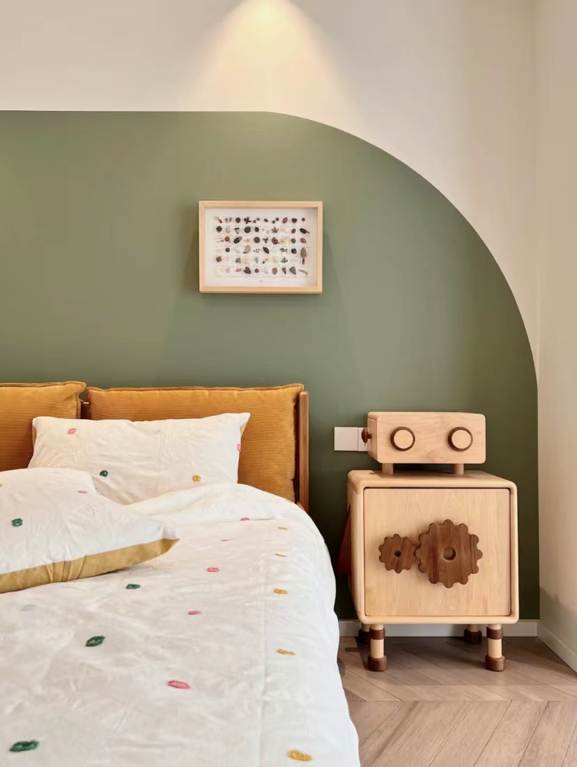
The background of the bed does not have wooden noodles, that is, a curved art paint is brushed to echo the curved cabinet. With this robot cabinet, it is cute.
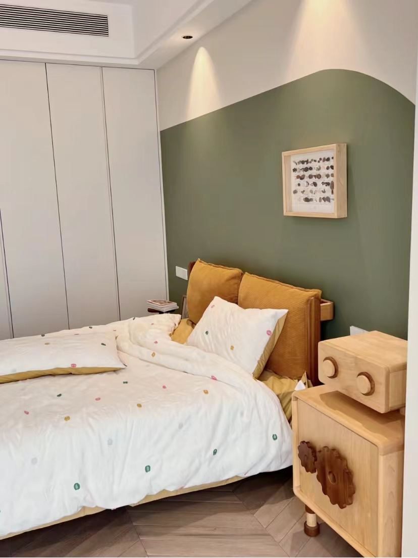
The bed is one meter five meters, and the pure wood has no taste. The two orange pillows can be disassembled. Later, it was found that the green of the background wall was quite good. The four -piece set was fresh, cute and refreshing.
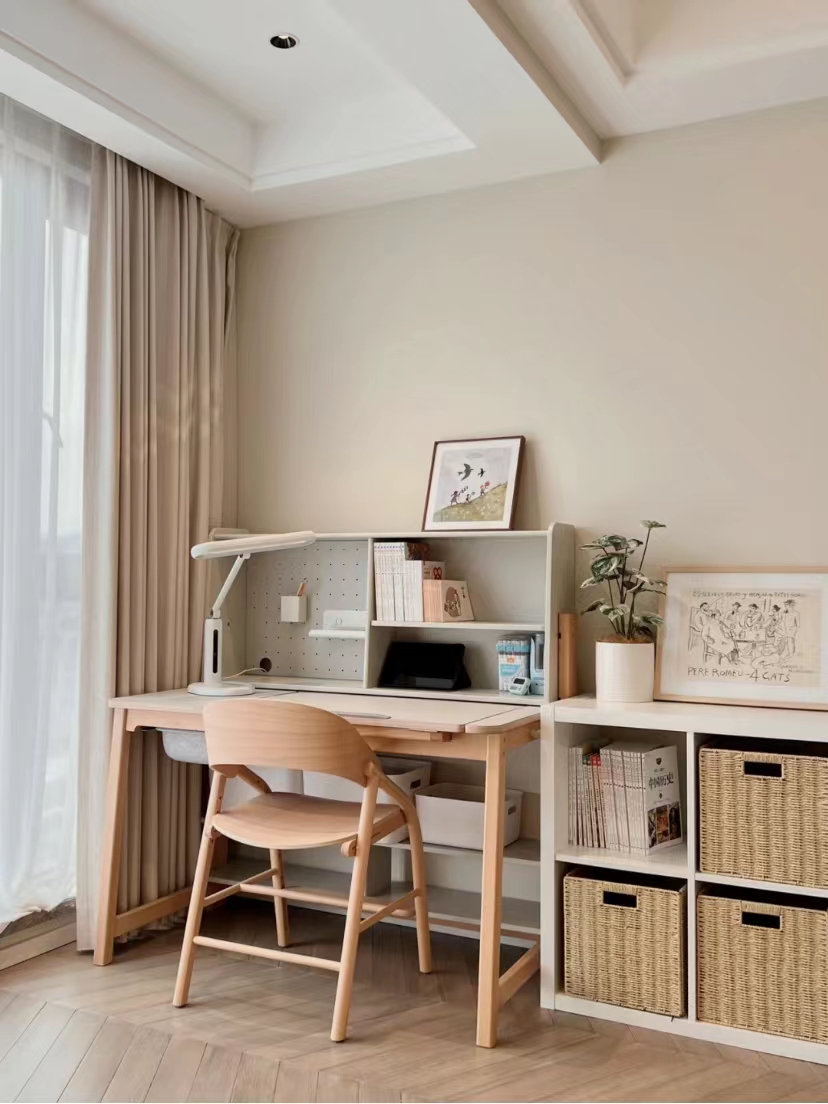
Opposite the bed is the white wall, the color number is the same as the large space outside. Here are the children's learning tables and chairs, leaning on the floor -to -ceiling window, the sight is relatively bright. The bottom of the table has a special storage seat, and there are partitions and cave panel storage on the table.
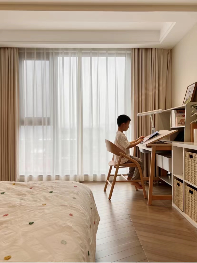
There is another IKEA's low cabinet next to it, with the storage basket, so that children can be put away.
(The picture comes from the Internet, if there is any infringement, delete)
- END -
Children walk into the History Museum of the Tieyi Hospital of Qinghai -Tibet Railway.

On August 16th, the children of the Yiyiyuan Community of the Yiyanta Street in Ya...
Jiangsu Taicang: Spring Scenery of the Garden Study Room
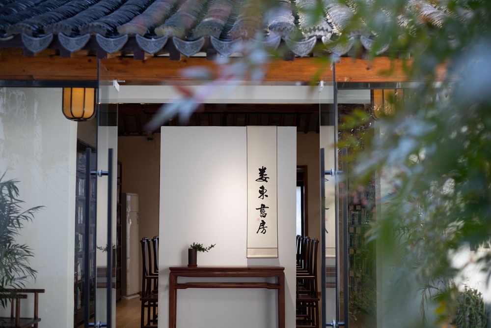
Source: Suzhou Learning PlatformLou Dong Studycore, located in the garden -style s...