International SaaS | Product design, pursue user satisfaction
Author:Everyone is a product manager Time:2022.07.25

Many times in order to pursue efficiency satisfaction, things will be complicated.
The efficiency here usually stems from two aspects. One is that the business appeal did not want to clear and the Deadline oppression, which caused the product to be easily deformation when the product was released. In order to solve the problem, you have to pat your head for product design.
On the other hand, it is derived from the shallow definition of the problem. The design without deep thinking often cannot withstand the scrutiny. After a period of time, I have experienced similar things that I have experienced, and the demand one Friday has produced five solutions and PRDs, causing continuous filling and adjustment in the post -stage.
In his ten principles in his design, I liked a few: Good Design is Less Design.
It means that good products are less designs, a little bit of taste.
Regarding some information about the German industrial designer, there are quotes at the end of the article.
1. SaaS homepage transformation
Recently, I am doing cross -border logistics SAAS product "Homepage Reconstruction" solution.
Initially, I wanted to combine the homepage to do some marketing promotion for various countries/regions, and allowing users to use the process to reduce resistance to smoother.
There are local festivals, news hotspots, and consumption habits in different countries/regions. Good entry point.
At first, referring to other products, there are many ways to "pop -up window prompts+advertising columns+labels", but they gave up at the beginning. Think about it, which means a little cowhide advertisement. May not be able to please.
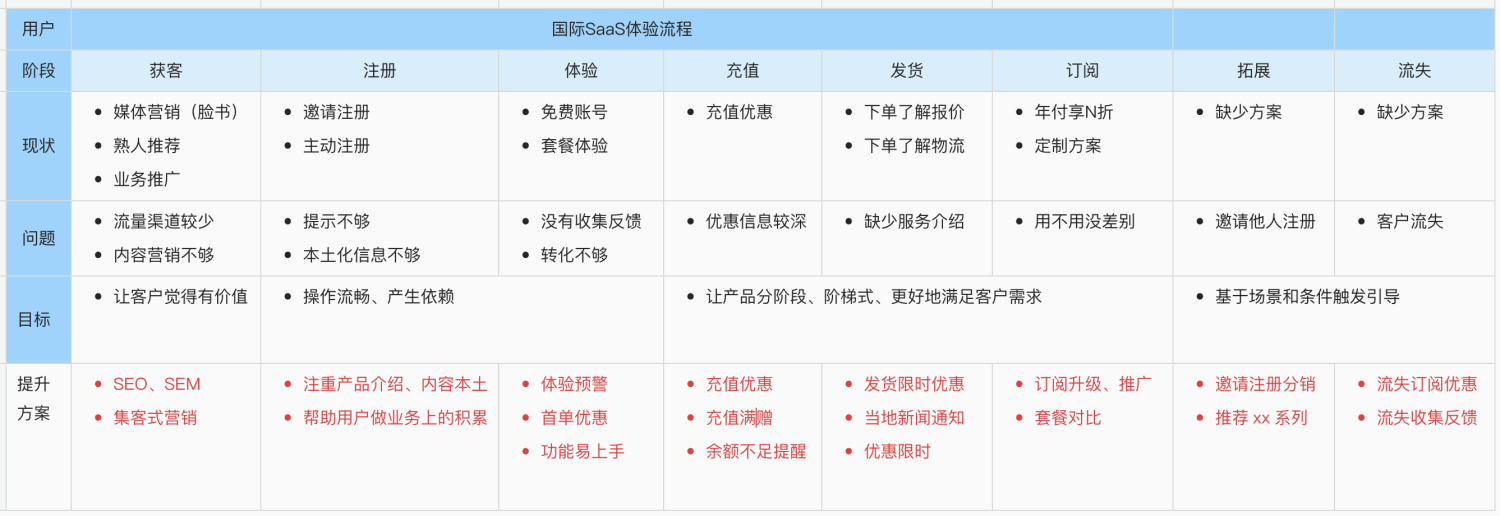
Later, I took the end and thought of two points: one was to know the overall path of the user's use of the product. The user experience journey thinking in the "service design" was very suitable for perception of global issues.

The other is to do a good job of classification and abstraction on the scene, so that it is convenient to know what problems are currently and what solutions can be used.
As a result, from the perspective of the overall customer acquisition, registration, and expansion of the loss of SaaS products, many problems can be sorted out.
For example, if you use the product for the first time, how to complete the international package delivery, how many problems lack the guidelines, how many users have reached, the product does not accumulate, reflects and even the product gift free experience package, the user has no perception. Marketing promotion and simplifying the operation process, in order to achieve business goals, after analysis and combing.
It is transformed into: how to better satisfy users through the homepage.
The difference between the two is that the former is pursuing efficiency, solving the problem alone, and the latter to improve service quality and experience.
Second, the plan to land and think
During different product stages, there must be a certain amount of priority. I think early products are to give priority to the business closed, and the second is marketing.
Because the highlight introduction is needed, some early users can join and assist us to iterate the products together. Therefore, the product plan, combined with the just -above experience map, was revised through two angles.
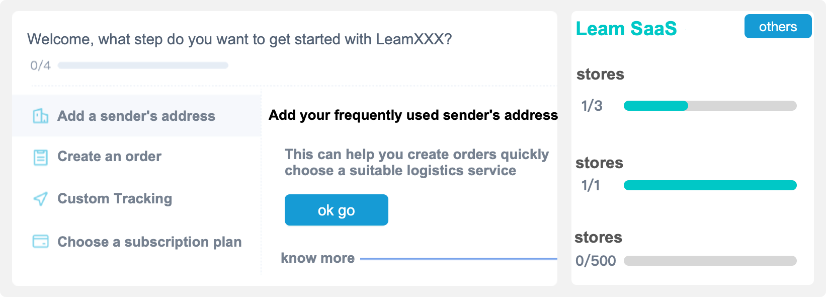
First of all, from the perspective of simplifying smoothness and dependence: the scenes of many original function pop -ups, operation descriptions, abnormal reminders and other scenarios are taken out to make the homepage "Beginner's Guide" Essence
In order to allow users to better perceive the operation process, two large pieces of data display have been added, namely "comparison of package rights and interests" and "cumulative user touch" to help users know what they are using, what are the highlights of us, and help you do it. What, how many achievements.

Finally, cut off the original industry notifications, business promotion, product discounts and other functions, and let the UI help, combined with title, small title, content copywriting, and background map, designed as two types of template styles on the homepage. The business only needs to adjust the text, time, and content for different scenarios, so that it is convenient to promote it in a timely manner.
Through such two changes, the overall product utility and visualization have been enhanced. The homepage will become an effective navigation window. In the future, the user experience process will be continuously adjusted/added to the corresponding content. The help of the user will also increase the user's help.
The quality of the homepage is up, and occasionally adding some business promotions and publicity will not interfere with users too much, reducing many unnecessary prompts and pop -up advertisements.
What to do in the future
Good products can represent users. I think of a few days before eating with the intern, and ask what document tools they use. Everyone recommends flying books: beautiful interaction, convenient collaboration, and smooth writing, which also represents young people's people of young people A lifestyle: efficient, simple, and personality. Interestingly, the company is in the company's spiral management documents. They choose to write good words with flying books and paste to the corporate knowledge base. This impressed me.
Back to the perspective of SaaS product design is the same. Many years ago, we were discussing how to attract users with some highlights, how to allow users to use it to accumulate data and generate migration costs. User/organization cannot help them solve the real problems of real existence, and they will eventually choose to leave.
Therefore, in the future, we must do the international SAAS product solution, and we still need to
Keep a certain rationality and sensibility as much as possible.
From a rational point of view, because radiation users are global, the business problems of users/organizations around the world are not a single function and operation difficulty. So you need to think about: Where is the current user/organization? Are they similar scenes? What links will happen?
If the perspective of rationality helps us observe the problem global, the sensual perspective is to keep us emotionally and maintain a certain sense of empathy.
Remember to design the "Vietnam" national design scheme at that time. Many solutions and copywriting users did not understand local users, because their PC penetration rate was not high. Everyone used to use mobile phones to operate. convenient.
Later, I learned that it was simple and rude, telling them how to do it, which is the way local people like.
So, from a sensual perspective, you need to think about: Why don't they like it? What's emotional? How to help them better?
The ultimate purpose of combining rationality and perceptual is to make the product solution better satisfy users, rather than solve a single problem.
Related information of Rams:
https://www.youtube.com/watch?v=-mladcqzzamhtps://www.youtube.com/watch?v=gqdbimwlbbwhtp://www.sznews.com/content/MB/2021-03/ConTent_240111111111111111111111111111111111111111111111111111111111111401114011 .htm
This article was originally published by @Leam Grow. Everyone is a product manager. Reprinting is prohibited without permission.
The question map is from UNSPLASH, based on the CC0 protocol.
- END -
Gathering to create a "investment Welai" investment promotion brand Weifang City stimulates the vitality of China Merchants 丨 Reform to go to the top 20 of the gift

Press: In order to welcome the 20th National Congress of the Communist Party of Ch...
The Fourteenth "Hundred County Basketball" Rizhao Division preliminaries in Shandong Province
Live Live Rizhao July 2nd News On July 2nd, the 14th Hundred County Basketball Rizhao Division preliminaries in Shandong Province and 2022 Rizhao City Qing July Basketball Tournament started at Ri