Designer's home, a modern and simple style of 250 square meters, simple and atmospheric, very personalized home
Author:Shangpin Meishe Time:2022.07.23
"Temperature of Life" Chengdu Renju Donghu Changdao 250㎡ modern minimalist style
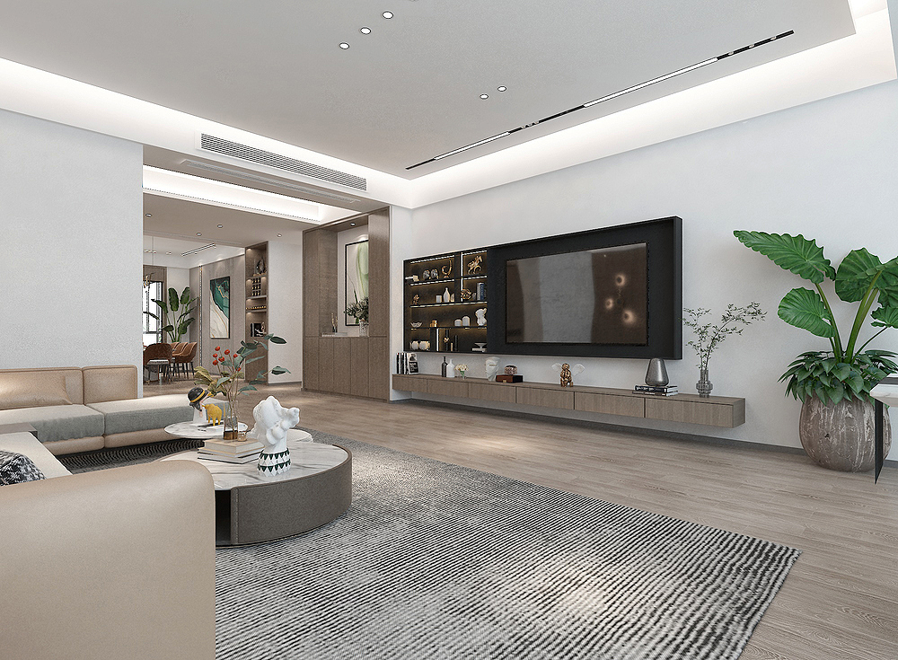
Decoration style: modern minimalist style
Actual area: 250 square meters
Space pattern: 4 rooms and 2 halls
Designer: Qianliying
Project location: Chengdu Renju Donghu Changdao
Decoration cost: all -inclusive estimation 70.58W
Original structure diagram
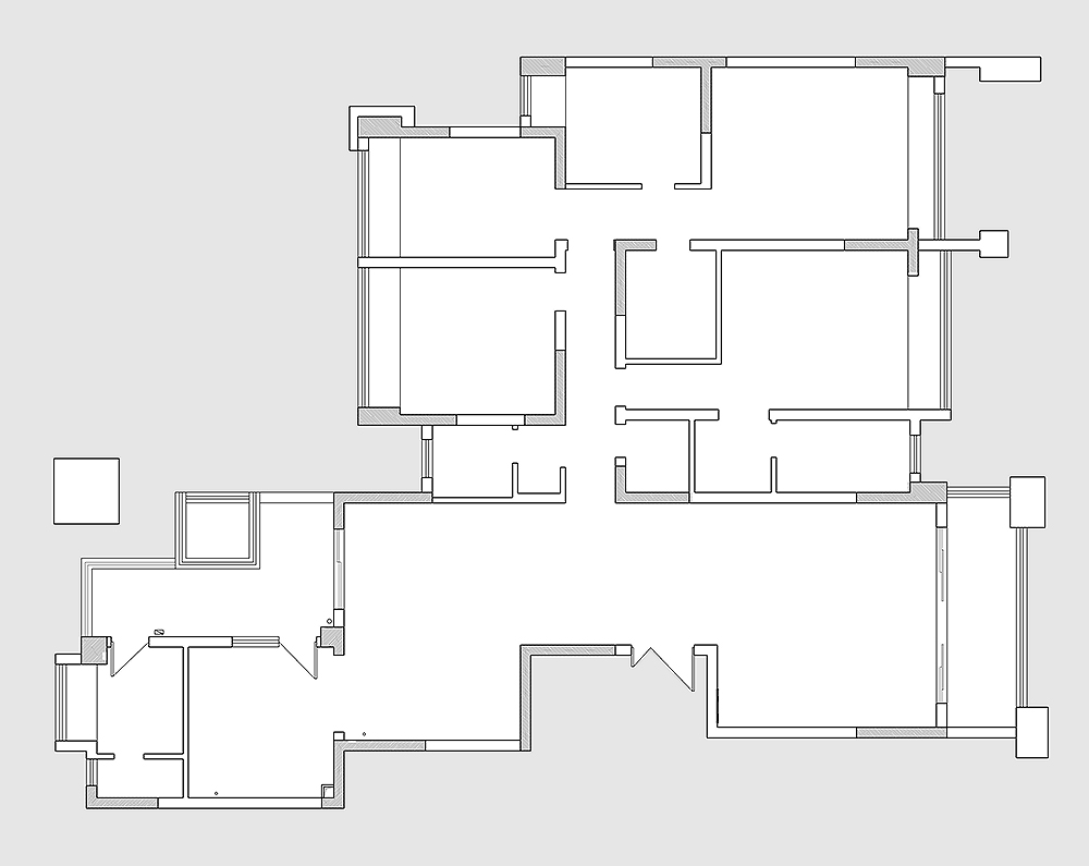
This is a large flat layer with a actual area of 250 square meters. The family of three homes is still very comfortable. The house looks at the atmosphere, and it is convenient to change it. It will not be designed and transformed by the area. Although the area of the house is large, there are only four bedrooms. There are more public areas, and the functional space of the public areas is more reserved.
Layout plan
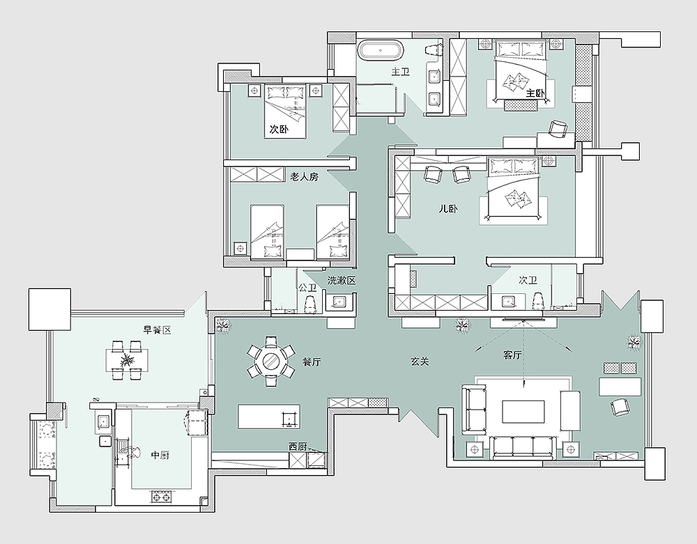
The house is good, and the functional space of the apartment is quite comfortable. First of all, the overall. Because it is a family of Sankou, there is no need to stay so many rooms. There are only four rooms in total, the master bedroom suite and children's room suite. In addition, there is an elderly room with a double bed. It is convenient to make guest rooms when visiting guests.
The kitchen space is relatively large, and there is a very comfortable, light and good breakfast area, so that there is a life atmosphere of "leisurely cloud wild crane". The breakfast area and the living room balcony are open to the door to the outside. There is a large garden space outside, which is very comfortable.
Porch
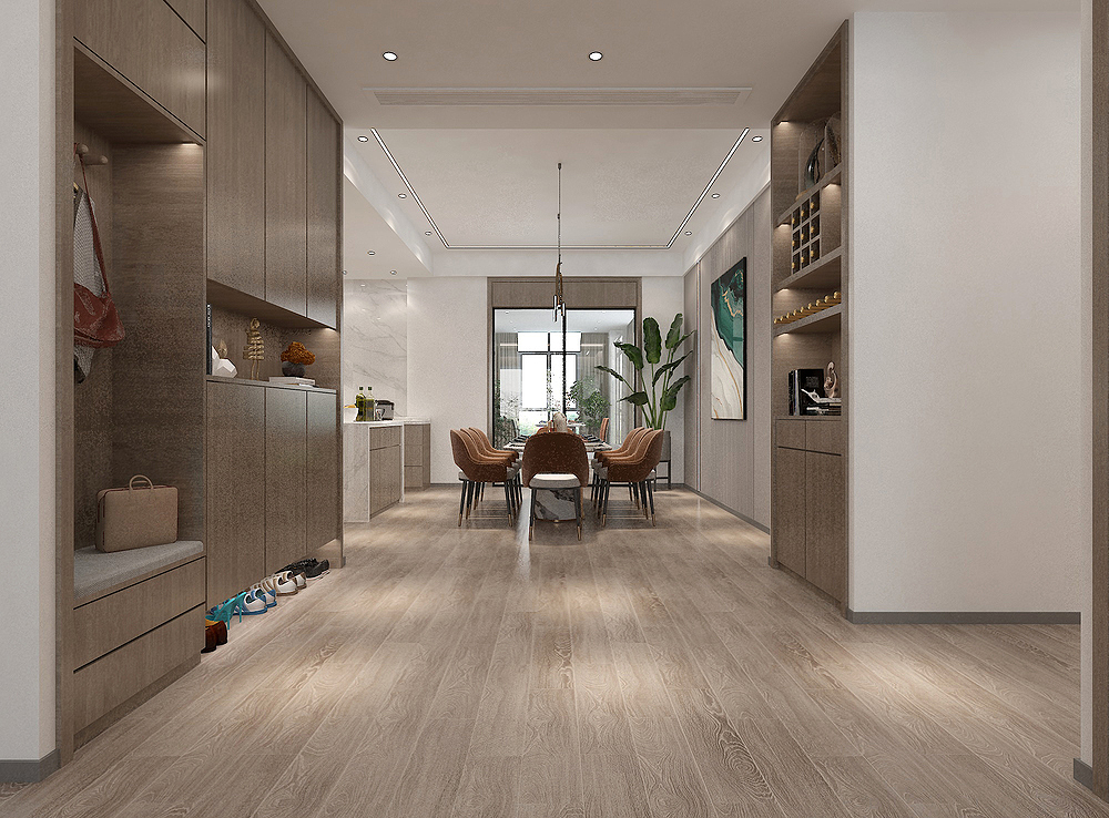
This is the porch space area of the household, which is very spacious and comfortable. The cabinets have been made on both sides of this perspective. The shoe cabinets have made multi -functional design and planning, which is much more convenient to use. The color of the cabinet door chooses wood color, which looks very elegant. The design of the cabinet door has no handle, which looks simple, plane and comfortable.
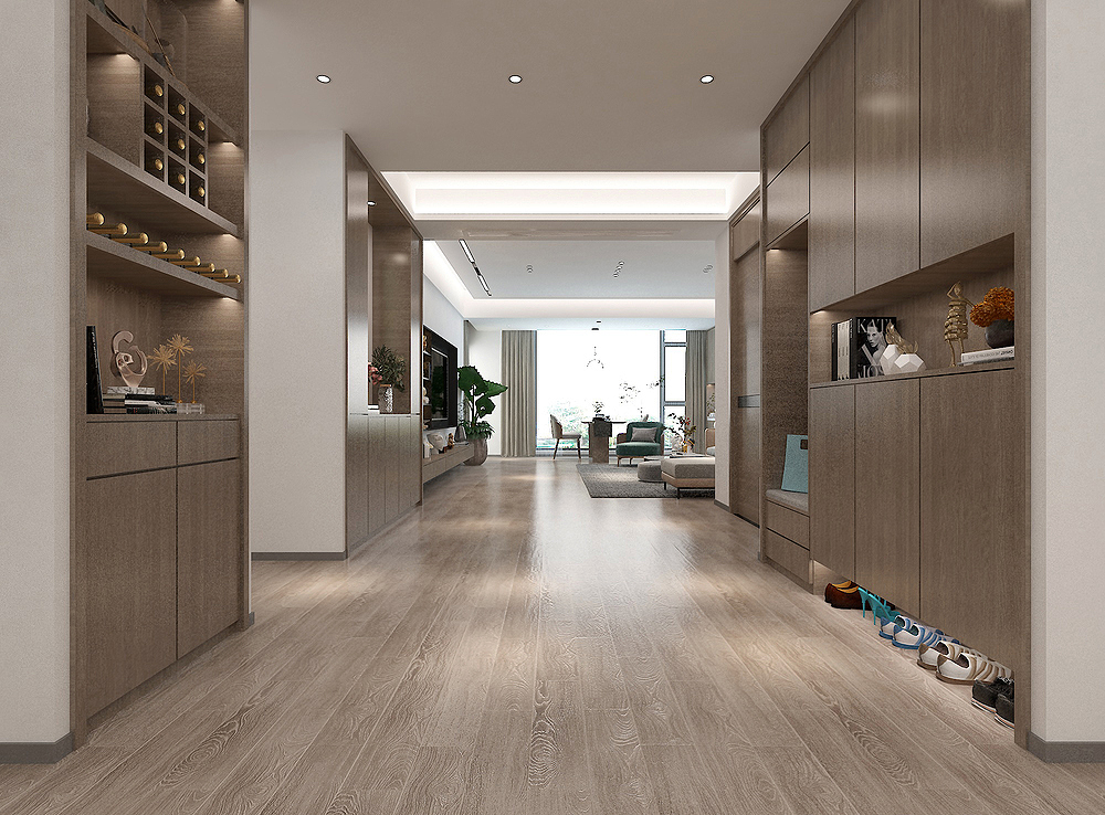
Porch visits the perspective of the living room. The ground is not wooden floor but wood grain bricks. It looks better.
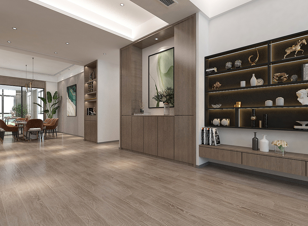
Another perspective in the porch space area, here is mainly a set of shoe cabinet display. A part of the middle is left to hang a painting, which is much more exquisite than the entire cabinet.
living room
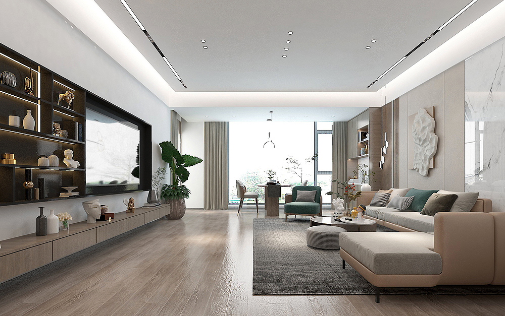
The living room is looking at the perspective of the balcony, the design of the main lights made of the top surface, and the lamps embedded in the top surface and made of strip lights. It is much better than the design with the main light, which is also more popular at the moment. The source of this lamp looks softer, and it will not be as dazzling as the main light.
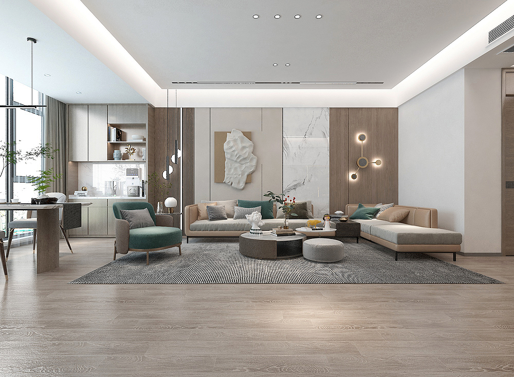
The perspective of the living room sofa wall, the material used on the wall is relatively rich, the colors and shapes are well matched, and the walls will not be very abrupt. Together, it looks very good, and it looks simple.
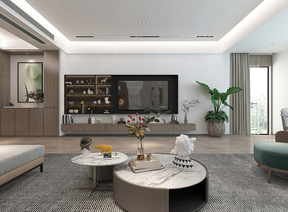
The perspective lens of the TV wall of the living room is relatively simple in shape, but it is very distinctive. The TV wall is connected to the display cabinet together, exquisite and beautiful, the following rows of TV cabinets, and several sets of drawers.
Tea area
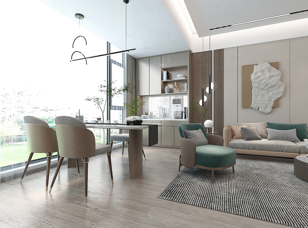
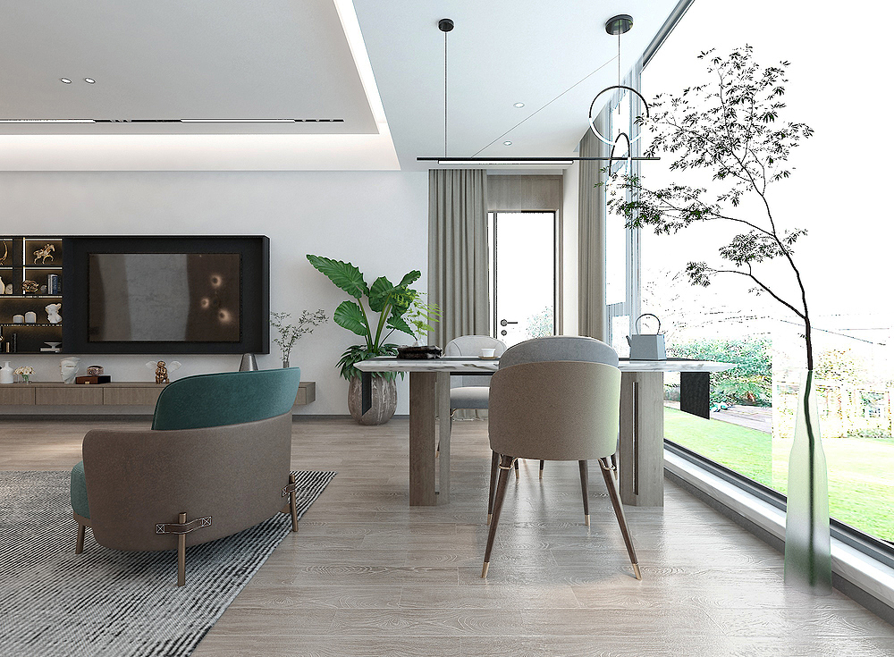
The balcony space next to the living room is also a tea -tasting area in the home. It can also be an open studio of the owner, a "one empty and two -purpose" space area. The design and processing of the balcony and living room looks like a lot of spacious atmosphere.
Dining room
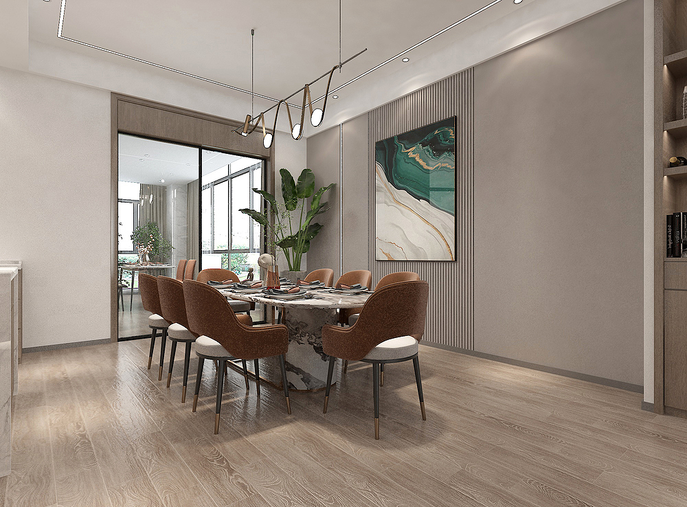
When you come to the restaurant space, the wallboard design of all the walls of this perspective looks simpler and grade, it will not look very complicated, and it does not look monotonous. This is the simple and exquisite effect.
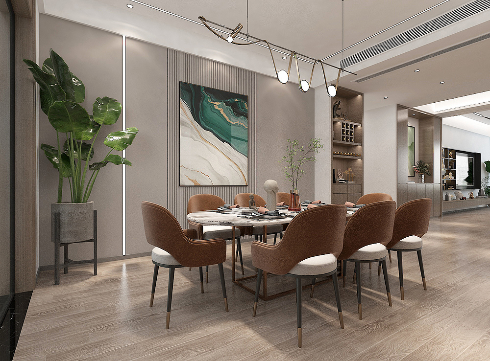
A pot of green plants are also placed on the edge of this wall to play a decorative effect of the entire space, because life needs "a little green" to be more delicious. The art chandelier on the top is also I like more and very personal.
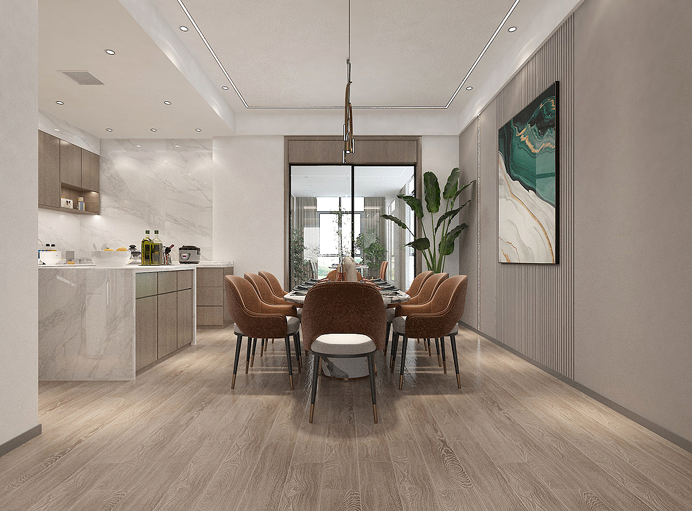
It can be seen that the restaurant and the western kitchen are together. The two spaces have the effect of increasing the visual space of the space. The two parties are particularly convenient in actual use.
Western chef
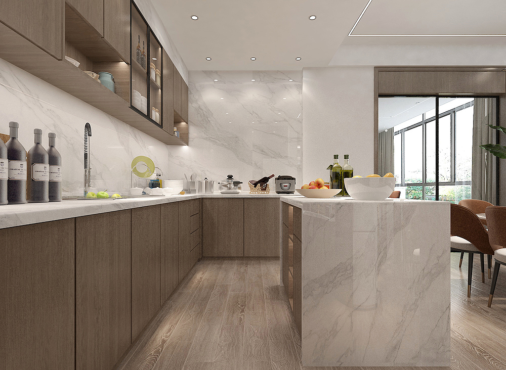
There is too much benefits to the western kitchen space in the home. The most important thing can make up for the lack of Chinese kitchen countertops (although it is not needed here, because the area of Chinese kitchen is also large and the table is sufficient), like eating some meals, you can go directly here. Operation, no need to go to the Chinese kitchen.
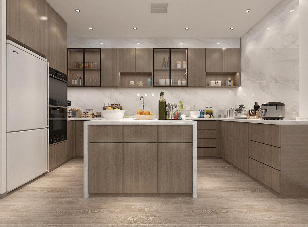

The operation space and countertop of the western kitchen space are still sufficient. The storage space is storage. There are also electrical products such as embedded refrigerators and ovens. They are not naked outside but embedded in, which looks very overall.
Breakfast area
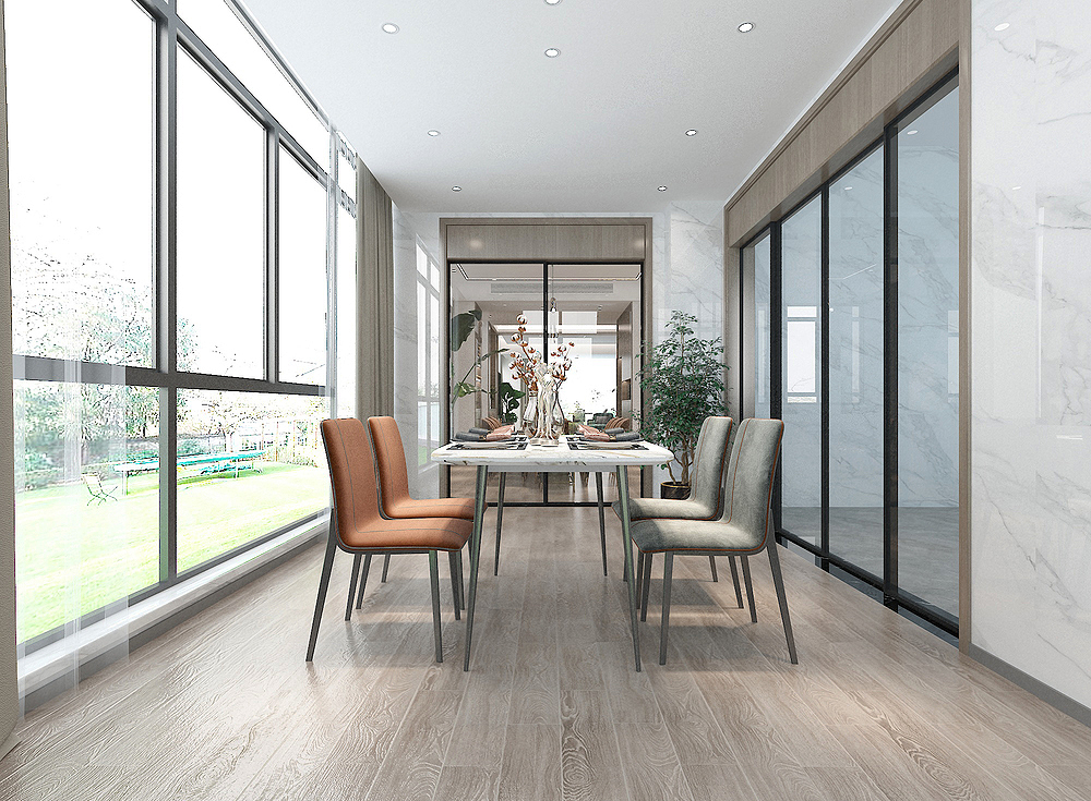
This is the breakfast area, another restaurant space in the home. The one -year plan lies in the spring and one day of the morning. This sentence fully illustrates the importance of breakfast. Then the atmosphere of breakfast also determines the spiritual appearance and thinking flexibility of people.
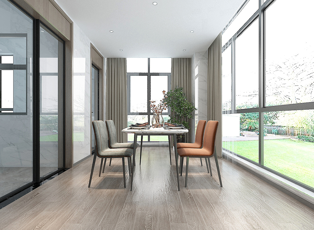
The lighting effect here is very good. Both sides are large windows. Here you can also enjoy the scenery of the garden outside the house. There is a sense of vision with a garden fragrance.
master bedroom
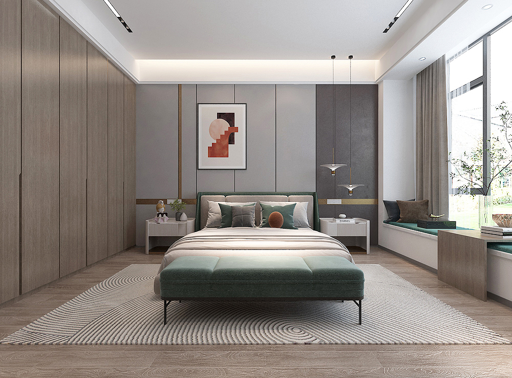
The master bedroom is simple and durable. The design of the main lamp as the same as the living room is made of embedded line lights on the top surface, as well as a hidden light belt. can be seen.
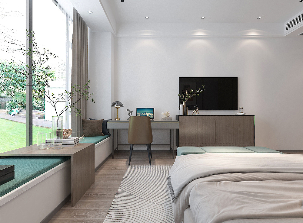
This is another perspective of the master bedroom. You can see a few shooting lights embedded in the top surface. The TV walls are all finished furniture bought. There is no shape. The simpler the bedroom, the better.
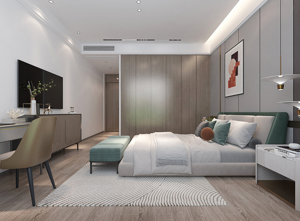
The design made by the master bedroom wardrobe, the inside of the Gala straight, did not make a sloping hand and a bright hand, the straightener was installed inside, and the cabinet door was gently pressed inside. very convenient.
Lying
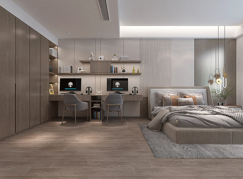
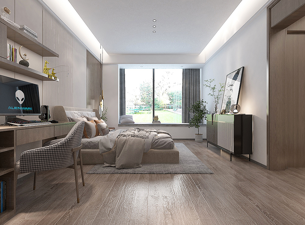
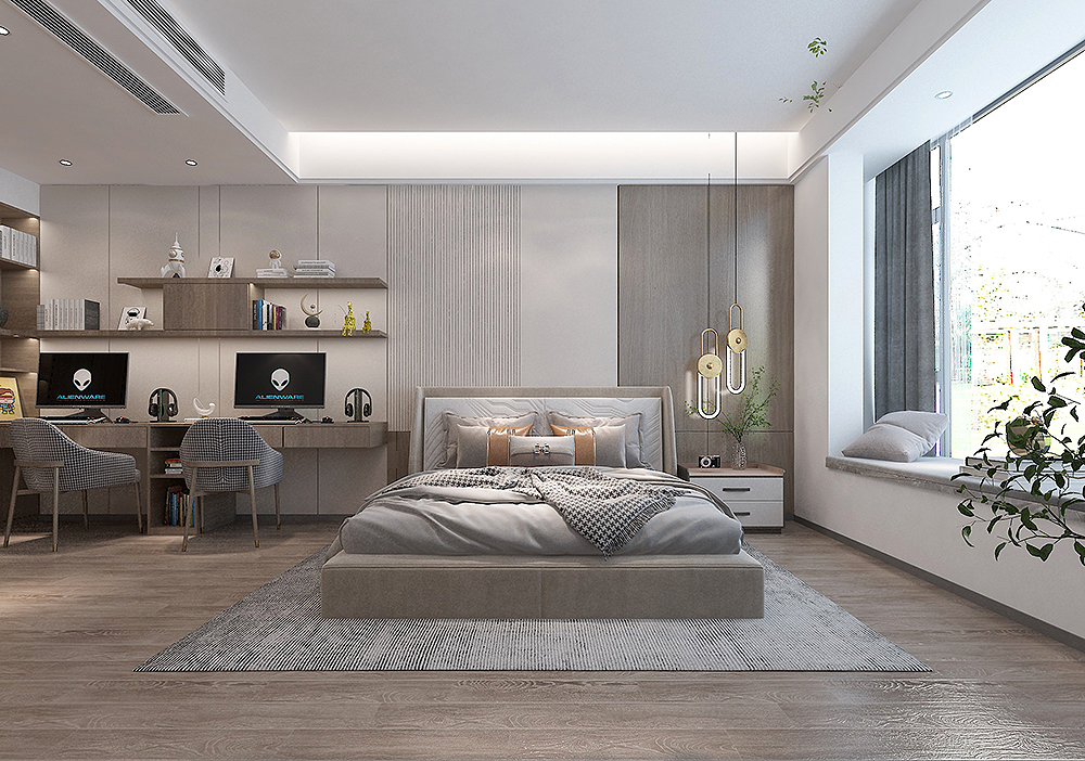
Children's bedrooms are very large, and the area of the master bedroom is larger. The owner's children have been in junior high school, so the style of the child's room is similar to the master bedroom. It has the same wonderful work in the shape and color matching.
- END -
thrilling!Suddenly the driver of the pickup high -speed tires rotated in the direction of 720 degrees and hit the big truck
Qilu.com · Lightning News, June 29. Recently, a black pickup truck suddenly hit the central guardrail when it was driving normally at the Heze section of the Jiguang High Speed. Later, stop in the e
The man wandered the highway with a knife, and the high -speed traffic police patiently persuaded hi
At 7:40 pm on June 9th, the nine brigades of the traffic police team of the Traffi...