After watching the renovation of the villas of the Nantong post -90s couple, I have a soft spot for the new Chinese style, elegant and elegant
Author:Shangpin Meishe Time:2022.06.22
As a home improvement blogger for many years, I have seen countless sets of decoration cases. I have also seen that it was very popular before, but now I have hardly mentioned the Mediterranean style and European style. What has always existed in the market is still Chinese style. The new Chinese style has also evolved in the Chinese style.
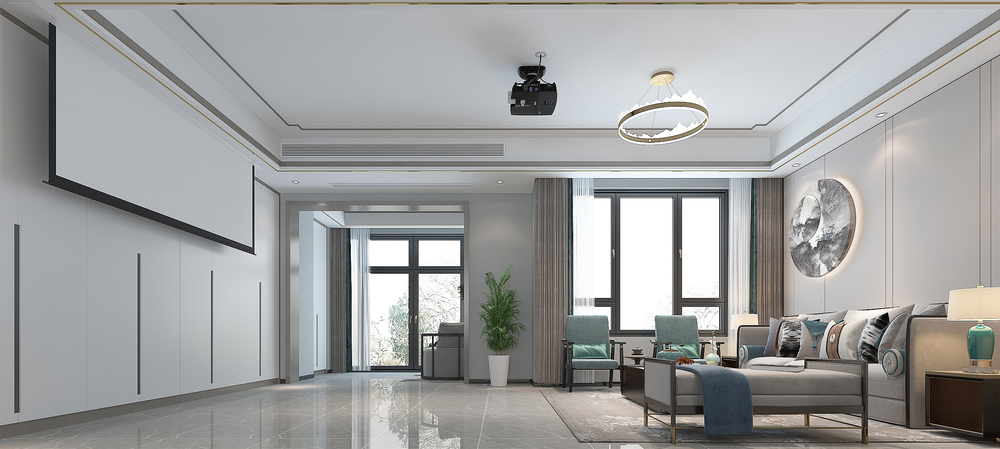
This case introduces a new Chinese style of more than two hundred square meters. There is no traditional Chinese style complex and dull. It is more modern and simple and fashionable. Through this design method Chinese style comes out.
Design introduction:
Decoration style: new Chinese style style
Actual area: 240 square meters
Space pattern: three -story villa
Designer: Fengyunfan designer
Project location: Nantong City, Jiangsu Province
Decoration cost: Estimated price 63.68W
Original structure diagram
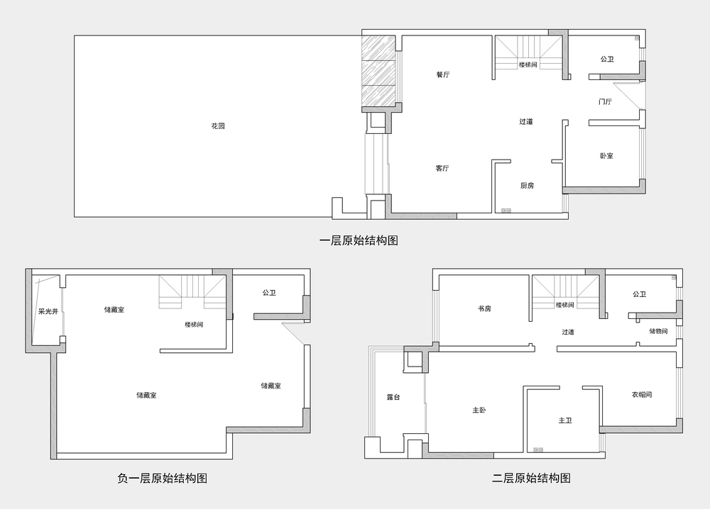
This is a "three -story small villa". Although the area of the room is not large, it adds up to 240 square meters, but the garden area it presented is particularly large.
In addition to the stairwell, there is another bathroom in the first floor. The rest is a spacious large space.
The most comfortable on the first floor is a garden space that is given away, where you can be unique here.
The developer on the second floor planned a large bedroom suite, but the owner has one child and two children. If you make a large suite, the room will be less.
Layout plan
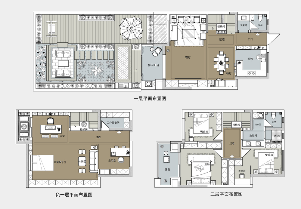
The structural owners' ideas and some characteristics of the units have been adjusted.
The first floor knocked off the staircase non -loading wall, making the space more spacious. Planning: work equipment room, wine tasting room, children's entertainment area, tea room.
The garden on the first floor is very pleasant. The hardening part, casual part, flower breeding and grass areas are planned very reasonably, just right; indoor space: The guest restaurant merges into the living room, the living room becomes very large; Go to the bedroom next to the side.
There are no bedrooms on the second floor. The master bedroom brought a terrace, a girl's room with a small cloakroom, and the boy's room had only the bedroom area. Analysis from the plane is a "heavy woman".
hall
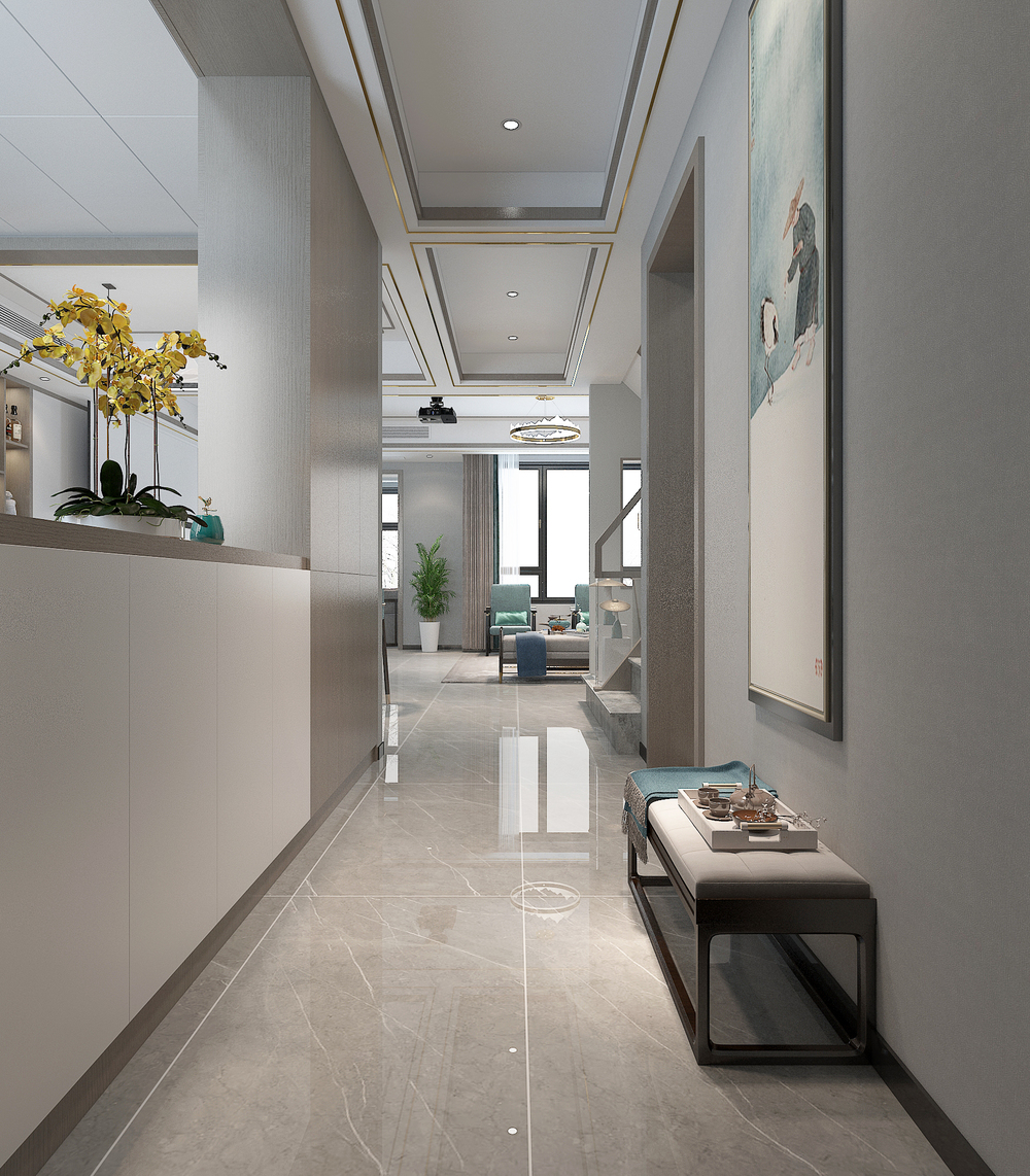
In order to maintain the natural lighting effect of entering the door, and the wall of the kitchen, the real wall that did not top and did not top the cabinet, but the low cabinet, the upper part can be left to the porch space.
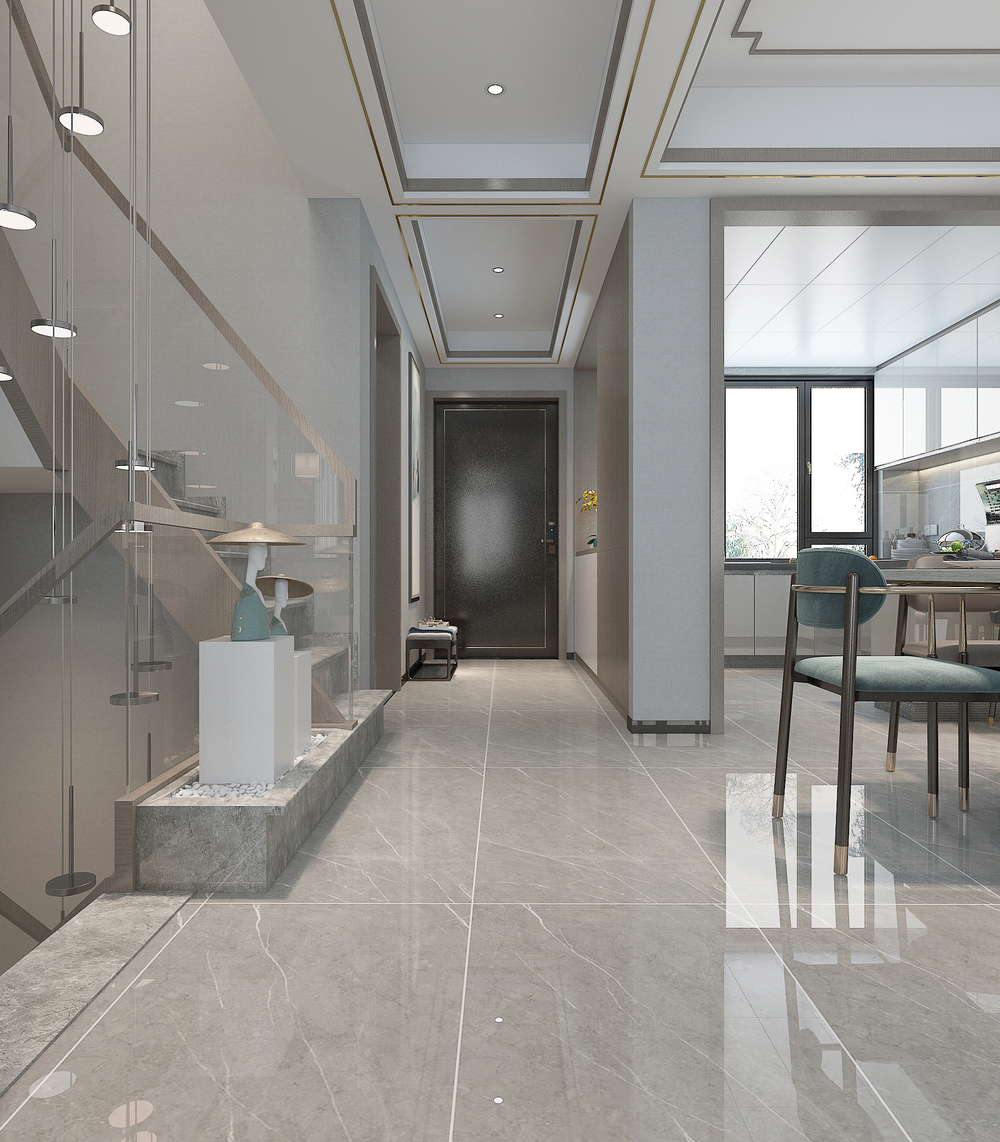
The distant camera of the porch, looking at the stairwell together, is still more echoed with each other.
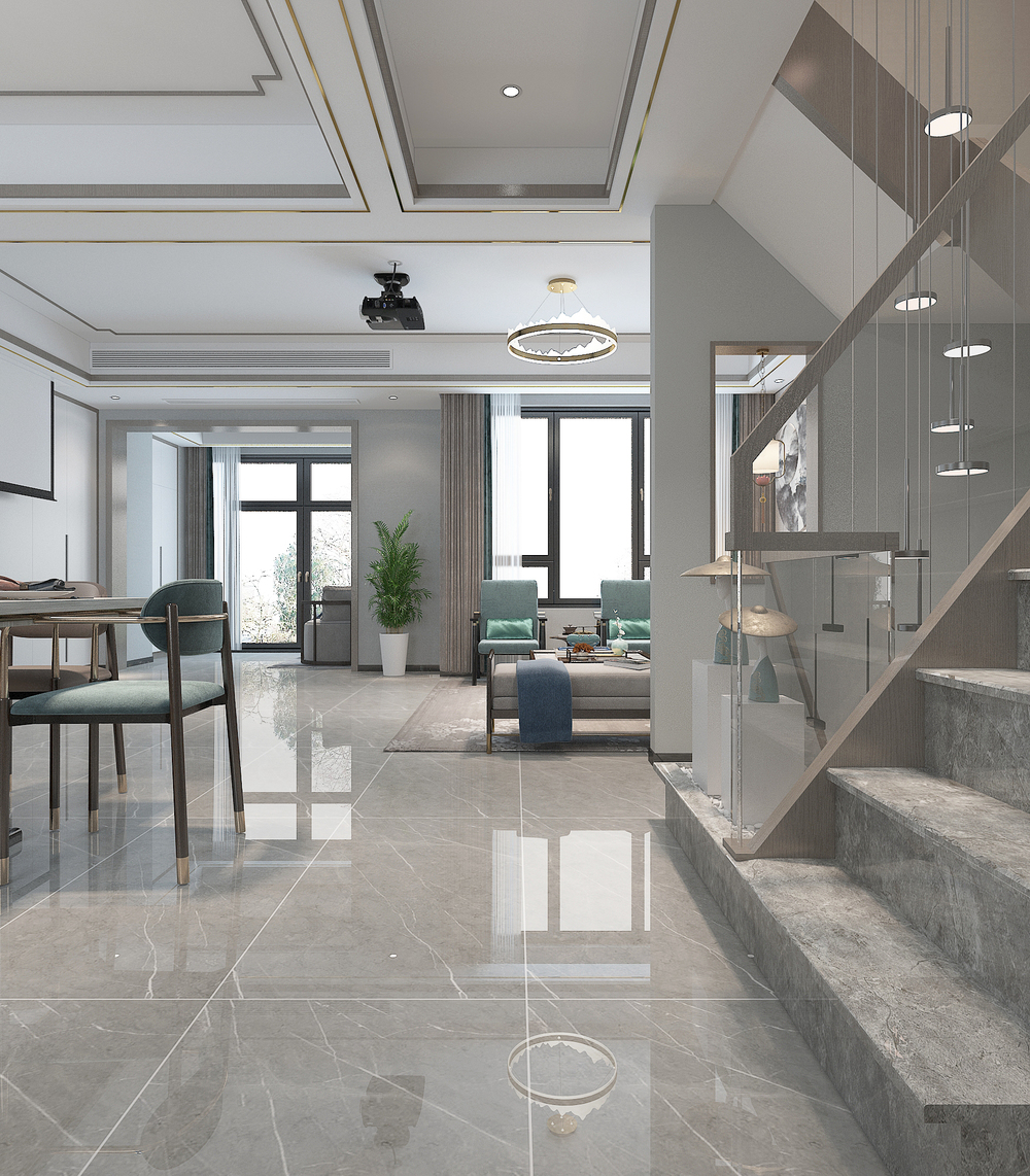
The indoor lighting effect is very good, and the gray tiles on the ground are full of sense.
Dining room
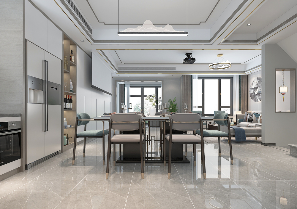
The restaurant is the original kitchen space. It is designed to this place. The space movement is better. There are conditions and living rooms to make integrated cabinets next to the living room, so that the double -door refrigerator can be embedded in.
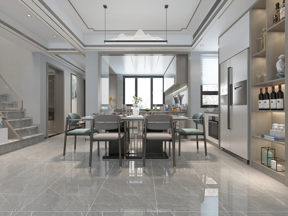
The open kitchen and dining rooms are visually connected. Not only are the kitchen lighting, but also the restaurant.
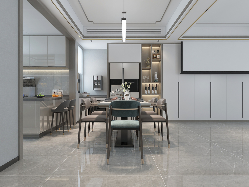
The restaurant uses a relatively clever layout here. The side of the window is not suitable for making the direct drinking machine as the refrigerator cabinet height.
living room
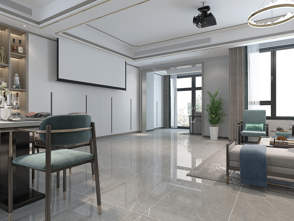
The living room has a "wireless TV" design, and it is switched to the more popular projection screen now. The whole row of cabinets in the back and the design of the handle is particularly overall and coordinated.
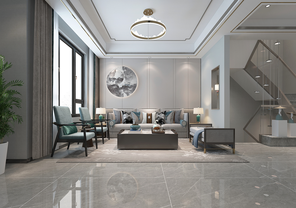
The wallboard shape made of the sofa background wall also added a round art hanging painting, which has the effect of star embellishment, and also shows Chinese taste.
kitchen
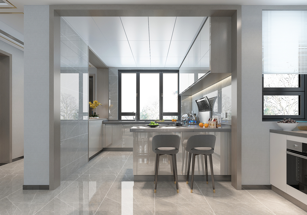
There is also an island platform between the kitchen and the restaurant. Usually, the two sons do not have to run on the table to eat at home. After the kitchen is done directly, it is enough to bring it to this platform.
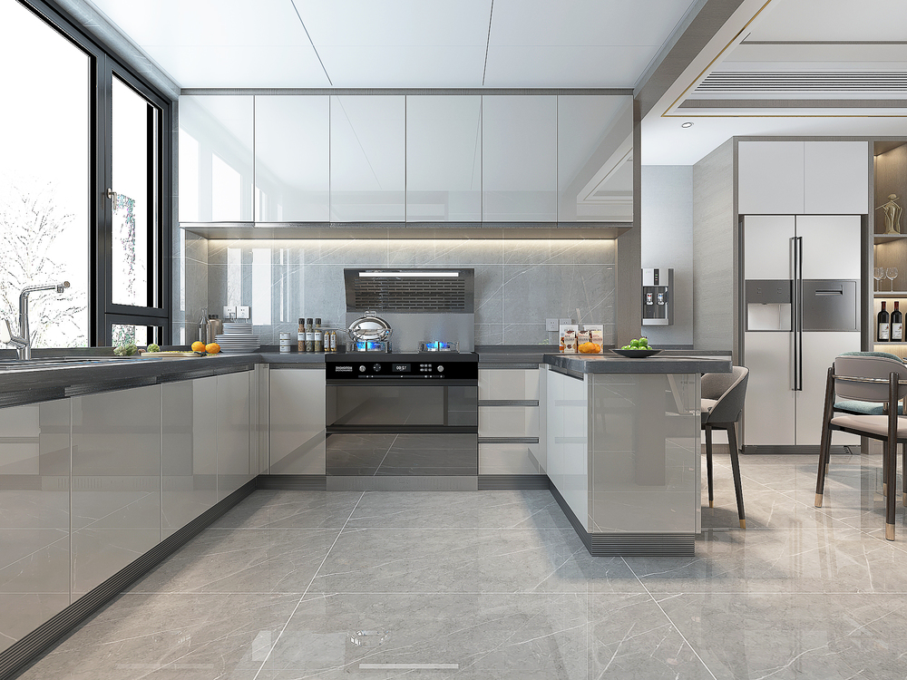
The bright noodle style of the cabinet door of the kitchen is better to be hygienic and not easy to stick oil. That is, there is oil stains on it, and gently wipe it with a rag to clean.
Leisure Balcony
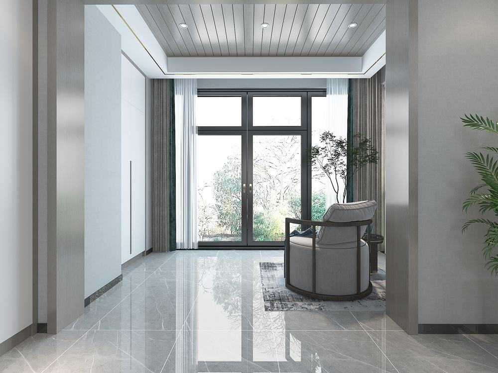
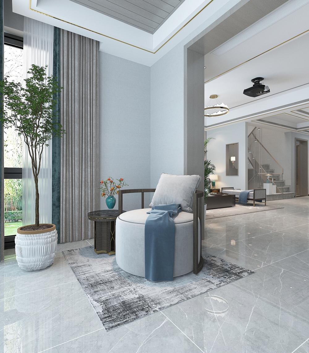
This is the aisle to the balcony space, and it is also a "leisure balcony" in the home. A casual chair, here, sit here in spare time, enjoy the garden scenery, and enjoy the sun bath.
Master bedroom
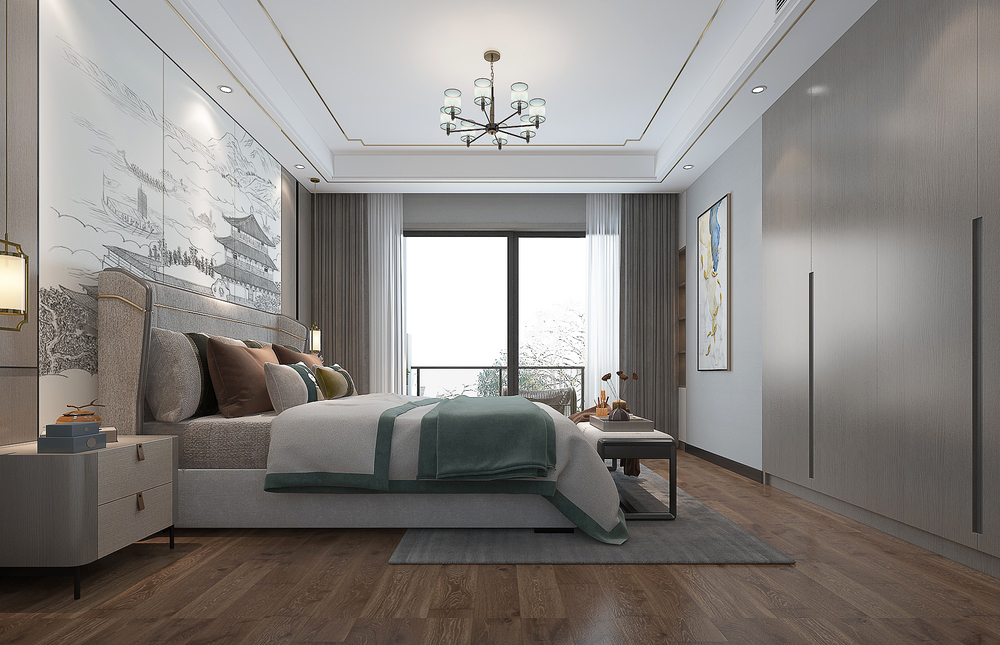
Modern Chinese master bedroom has a very elegant style. The space of the master bedroom is large, and the lighting effect is also very good. Look from this perspective. At the end of the bed, there is a group of wardrobes designed by a sloppy hand.
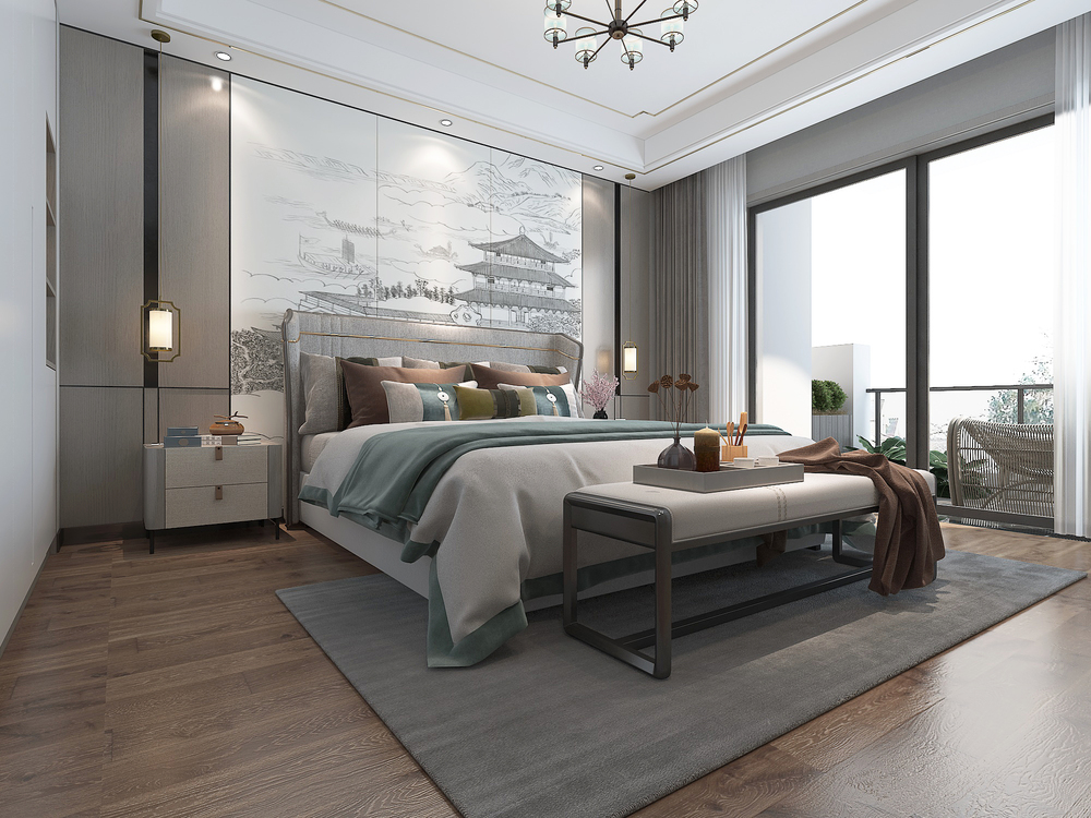
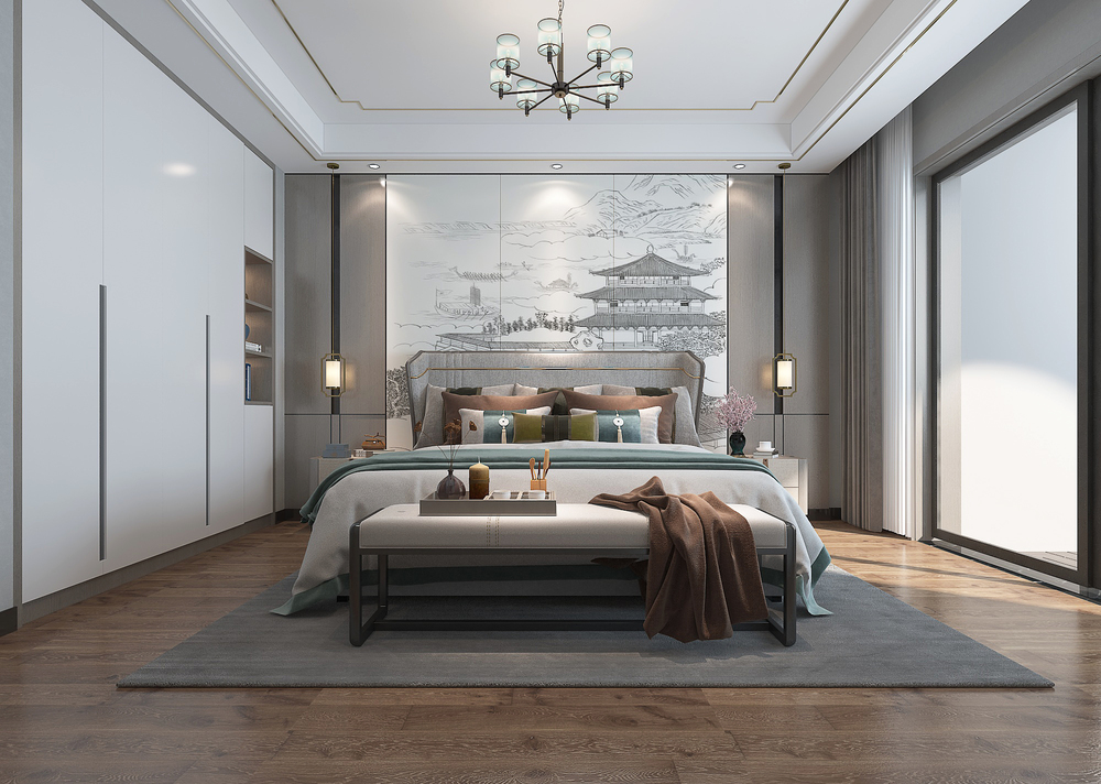
A painting on the bedside wall, the symmetrical wall plate shape on both sides. There is also a group of white cabinet doors on the side, which is also a sloppy design.
- END -
The fleshy meat for outdoor is very skinny.
The fleshy meat for outdoor is very skinny.Multi -meat is divided into two environ...
The "Three Hua" paths explore the decoration and decoration garbage classification of the East District of Linyi River
Divide gets to become waste into treasureHedong District Exploring Decoration Decoration Garbage Category and Disposal Three Hou pathsThe classification of garbage is an important measure to imp