Do you have better optimization ideas?
Author:Miya Designer Time:2022.09.23
Today we will share a strange apartment. There are more corners. I can't see what I think, it is very irregular anyway.
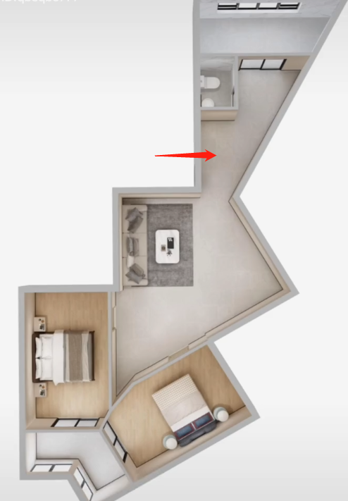
There are many problems in this apartment. There are not many lighting surfaces, but the windows in the lower left and the upper right corner can have lighting. This pattern makes the living room darker.

Because the overall opposite sex is more, it is relatively narrow, and the overall waste of the space is more. The bathroom is still relatively small, and the TV wall opposite the sofa is still oblique. There are so many disadvantages, let's see how to transform it.
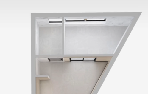
First of all, we start to change the position of the household door to change the pattern of the bathroom. Because the bathroom space is relatively small, let's re -layout here. In this way, the design can be designed to lay out toilet, rain and washing area.
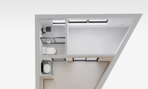
The position of the kitchen changes the position of the wall.
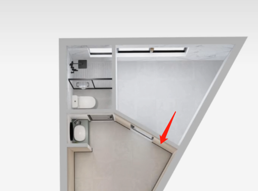
After changing the wall in this way, the overall kitchen space becomes larger, and the U -shaped cabinet space made is more open and more convenient to use.
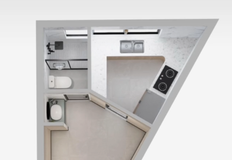
Outside the kitchen, we are a wall card, here are restaurants. Because it is the position of the opposite sex, we make a triangle table based on the wall.
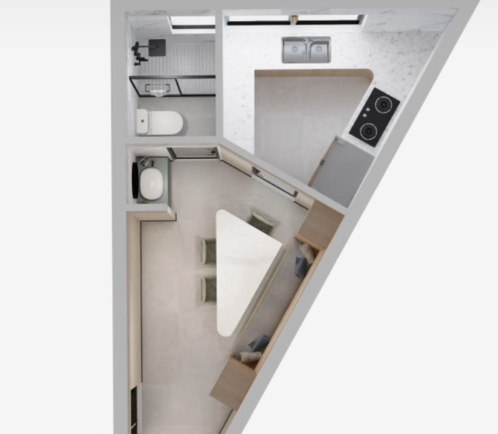
Because there is a sharp corner in this position, it makes people feel uncomfortable. We are sitting on the cabinets on both sides, making your vision is parallel.
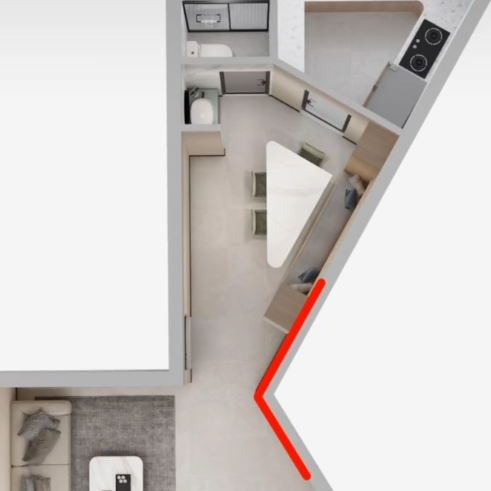
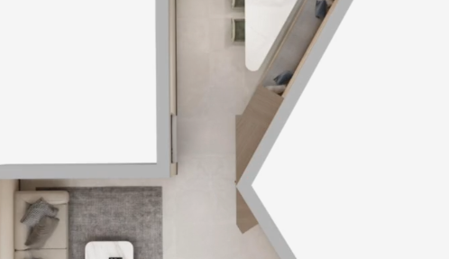
Make a flat cabinet to make the household feel comfortable, so that you can also forget that this unit is a sharp -angle apartment.
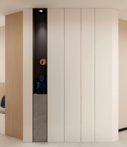
Is it very beautiful whether the porch made by sharp corners? Since the opposite side of the sofa is an oblique wall, can we turn the sofa in a direction. In this way, we must give the small horns, let us make a parallel line as a TV wall.
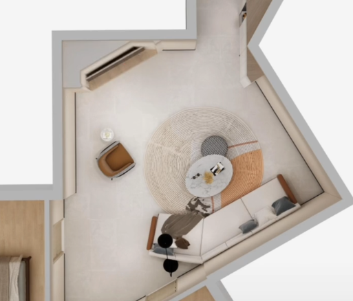
Because the original apartment is relatively square in the apartment, the sharp corners that see the living room make us look very uncomfortable and waste a lot of space.
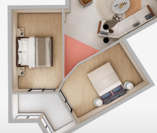
Now that we are wasteful, we are not as divided into two bedrooms, so that the two bedrooms can be better used in the two bedrooms.
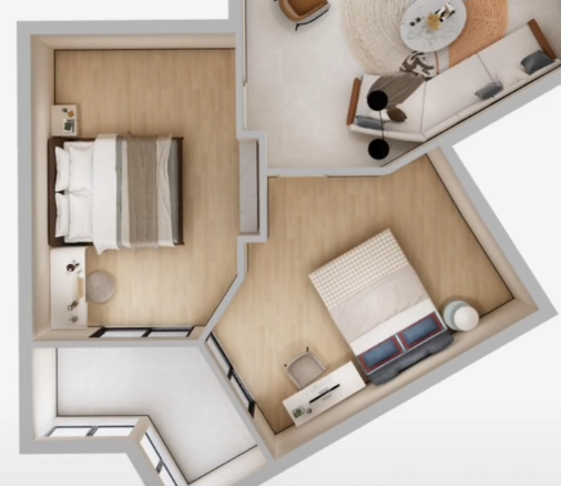
Looking at the space in the two bedrooms like this, it looks more comfortable. Change the wall of the bedroom to a glass door.
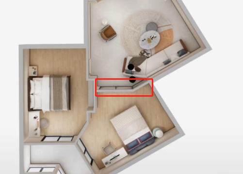
This can give the living room more lighting space. We finally deployed cabinets at the free position and sharp corner position. This adds us a lot of storage space.
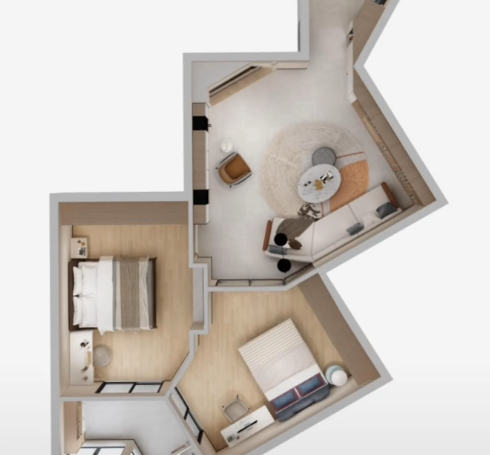
This wave of design is basically complete, let's take a look at the layout together.
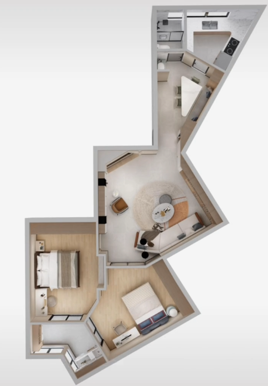
This case may not be suitable for your home, but there must be a place where you can learn from. If you have other ideas, please leave a message in the comment area, or if you need us to help me, you can send me a private message.
Did you learn abolition? If the content is helpful to you, don't you have a turn, comment, and praise? Follow [Miya to Simple Space Design], life decoration is not lost!
- END -
Home appliances to go to the countryside to benefit the people and the people of the people, and the shortcomings of the rural market continue to release consumption potential

Liu Ping, the owner of Jingdong Home Appliances Store, Qiaoto County, Zhaotong Cit...
@Chengdu citizens, please check this electricity -conscious electricity proposal!

Citizen friends:Recently, Chengdu has encountered the most severe high -temperatur...