After watching her American style decoration, I knew that the years were quiet. It turned out to be so, simple and beautiful
Author:Shangpin Meishe Time:2022.08.27
The best decoration style is to put a little bit in the upcoming house.
After the rest of my life, I am not pleasing to others, just to please self.
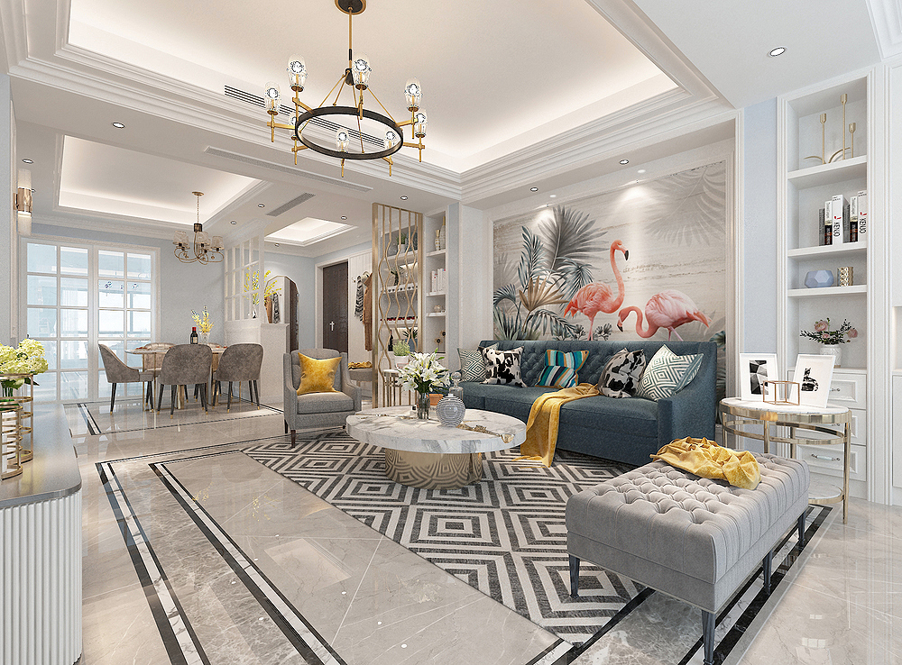
Design introduction:
Decoration style: American -style light luxury style
Actual area: 120 square meters (including wall area)
Space pattern: three rooms and two halls
Designer: Qianli Ying Design
Project location: Hengyang City, Hunan Province
Decoration cost: half -pack cost 10.45W
Apartment diagram
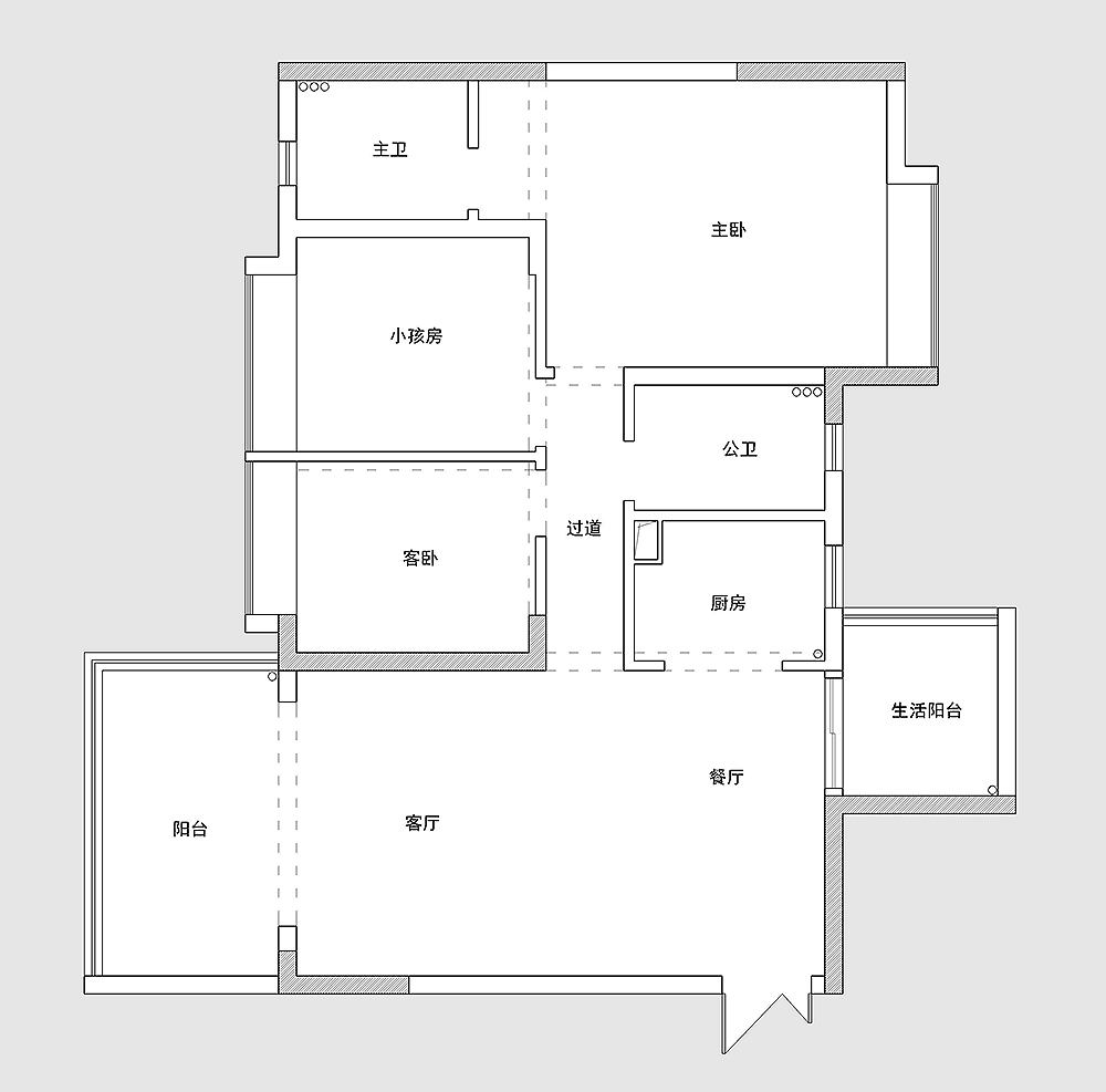
The house type is relatively Zhouzheng, a very standard three -bedroom structure.
There is no entrance to the household, which is equivalent to opening the door of the room. It is a restaurant. The restaurant is a relatively long structure and a shorter structure.
The living room is very comfortable and the space is so large. Coupled with the large balcony next to it, it not only gives the space comfortable lighting environment, but also gives the space open visual effects.
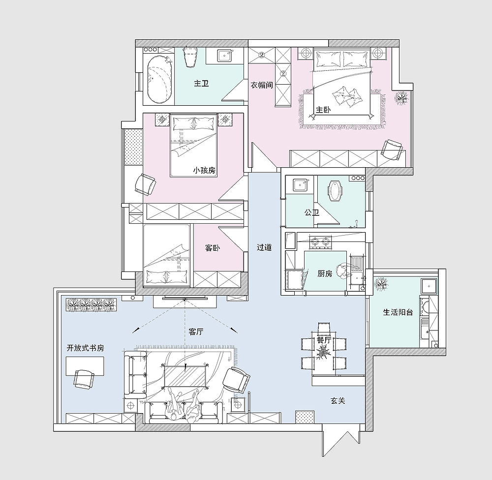
Layout plan

Because there is no porch space. In order to increase the sense of rituals of entry into the door, the shoe cabinet opposite the door is used to form a porch space.
The restaurant is behind the shoe cabinet, placing the dining table with the shoe cabinet, making the compact restaurant space more comfortable.
The living room and balcony are opened to do open design processing. Both spaces are spacious and large.
The public health is more convenient to use the design of dry and wet separation.
The design of the main guard adds a bathtub, allowing the occupants to have one more room to enjoy.
The other is the layout of the three bedrooms, namely: master bedroom, children's room and guest room.
Porch
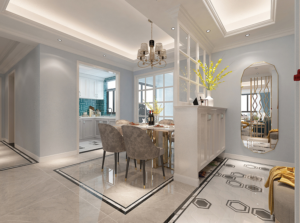
The porch space we see now, the "partition" shoe cabinet, plus the shoe stool and the whole body mirror to make the space function complete, and also increase the convenience of the space.
Another perspective of the porch is to look at the perspective of the living room. There is also a hook on the shoe stool, which greatly facilitates the change of the entire entry and exit door.
Dining room
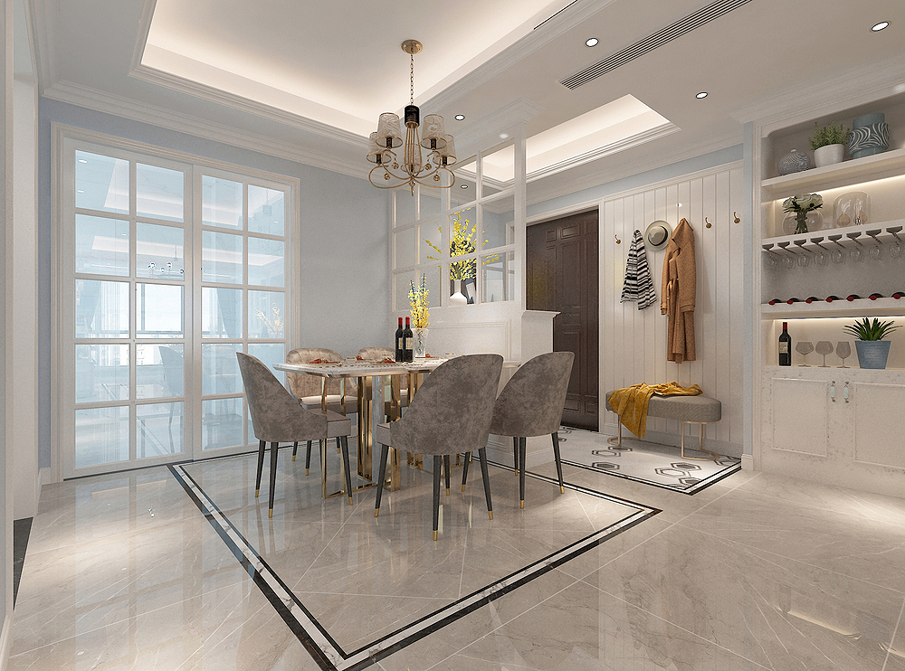
Behind the porch shoe cabinet is the restaurant space. There is a circle of waves on the ground. You can just "circulate" the dining table and chairs.
It is actually very suitable to install chandeliers on the top of the restaurant. This will make the restaurant feel more and more atmospheric.
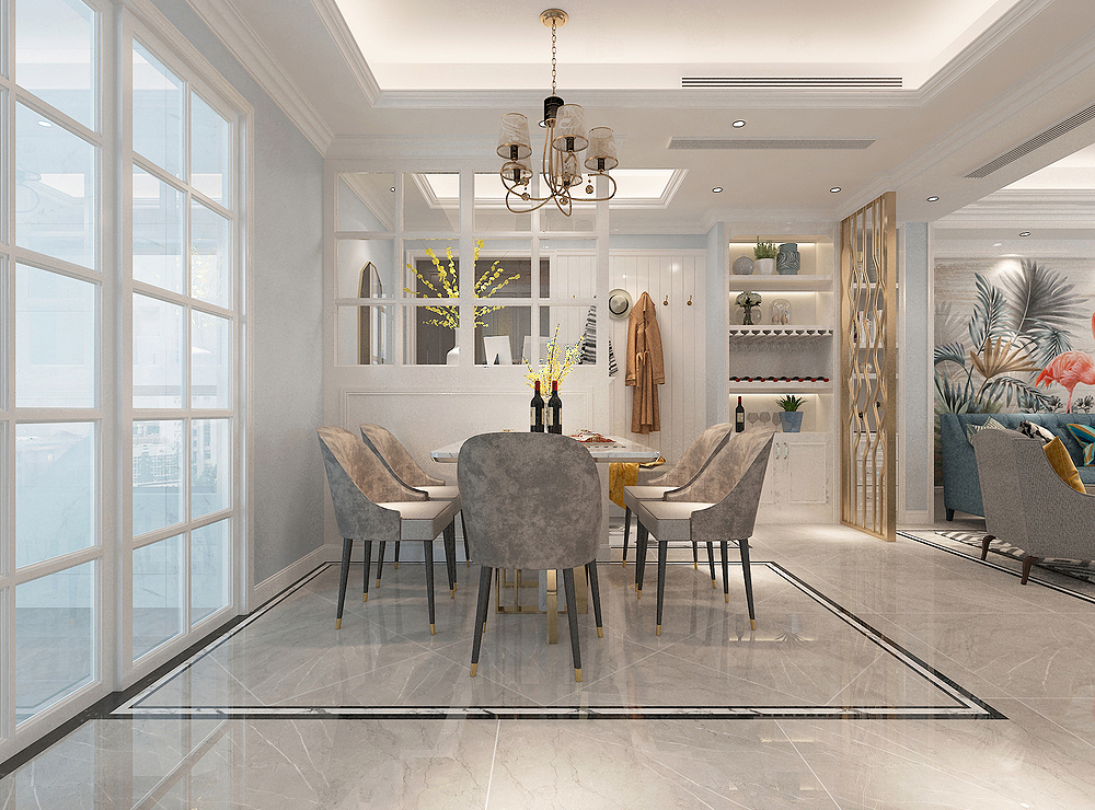
Another perspective of the restaurant is facing the position of the shoe cabinet in the porch. Three seasons, three meals a day.
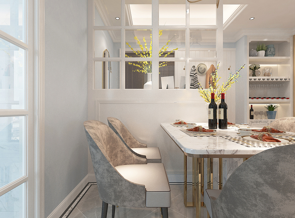
The local diagram of the restaurant can clearly see the material of the "partition" shoe cabinet and dining chair.
kitchen
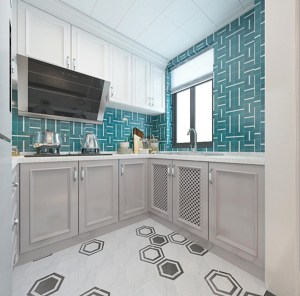
The open kitchen makes life feel very ritual, and eating is very fragrant.
Class follow: kitchen lines for setting, cutting vegetables, cooking, and inheritance. There is no design on the countertop, in fact, if it is designed, it will be more convenient and easy to use.
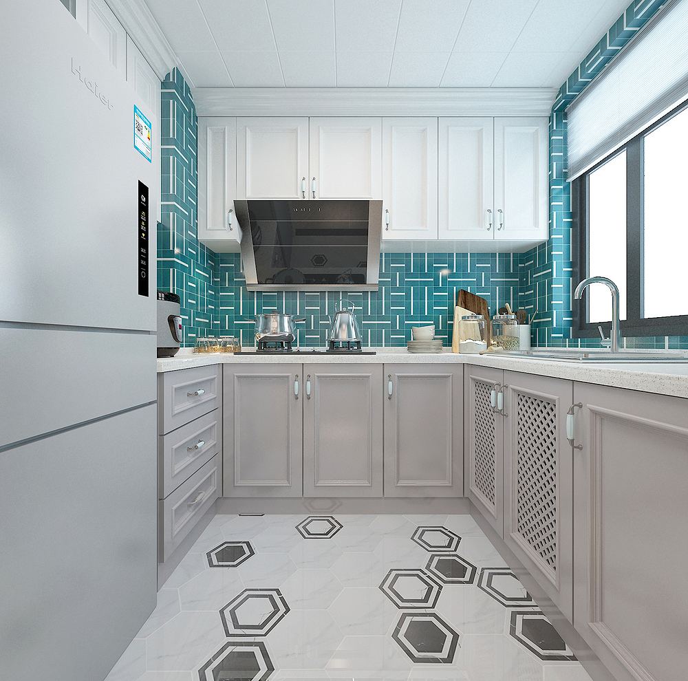
The kitchen's face -to -face angle has no choice of integrated stoves, but the traditional range hood is used.
living room
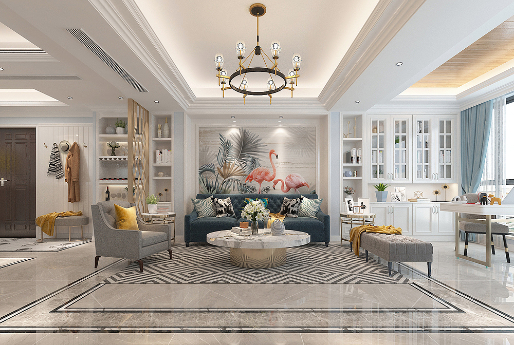
Now I see the perspective of the TV wall of the living room. The design is simple and clean, easy, natural, and comfortable.
The simple lighting, the murals, and the sofa of the fabric in the space are intertwined with a warm atmosphere, making the family's artistic conception more comfortable.
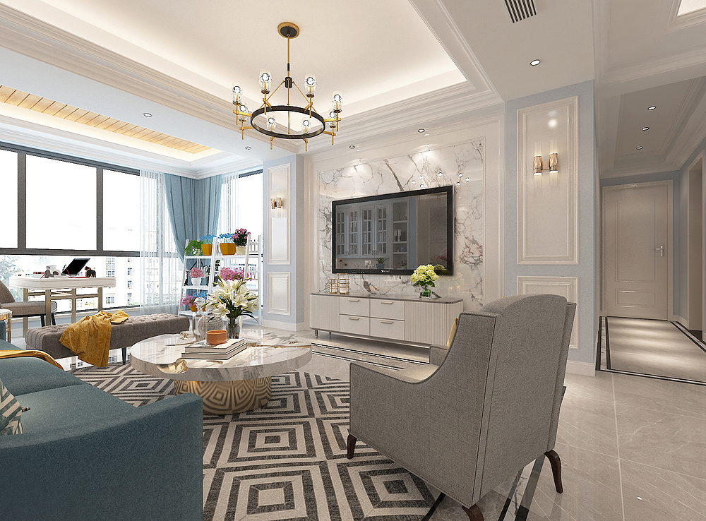
In the middle of the TV wall is marble, with simple lines on both sides. The entire shape wall shows a beautiful feeling. At the same time, it also has a fresh meaning to light up the entire space atmosphere.
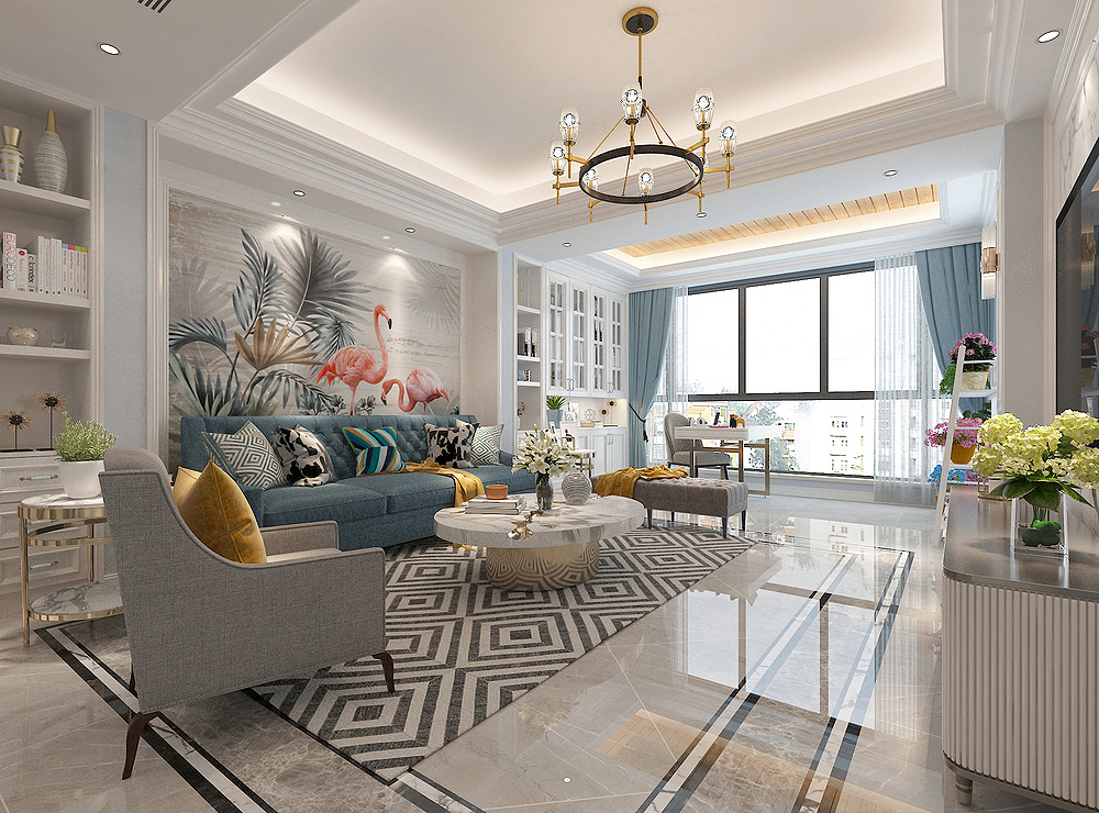
The source of the ceiling is very rich. It not only contains a hidden light band, but also an embedded spotlight, and the chandelier is added in the middle.
Leisure Balcony
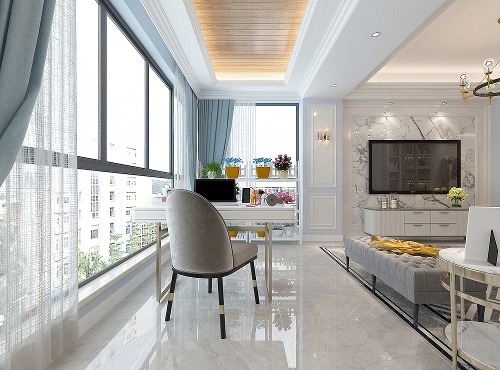
The large living room next to the living room is transformed into an open study space. The living room is spread directly in tiles to create a conjoined visual effect.
The desk is placed in the middle, usually you can work here, and you can counsel children to study here.
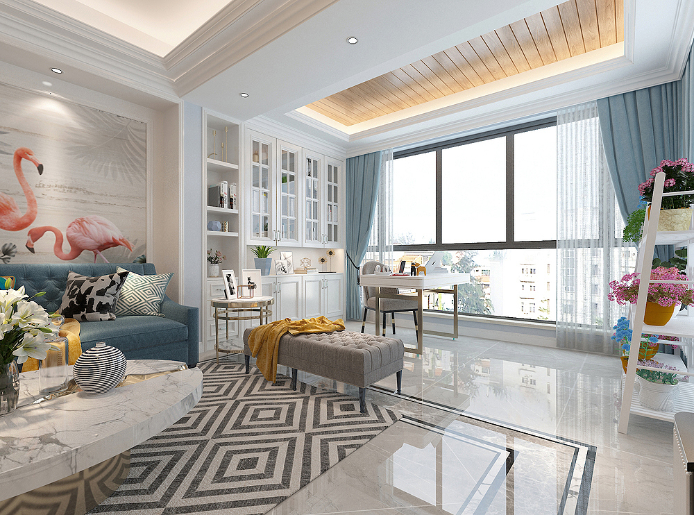
Both sides of the balcony were used. On the sofa wall, a set of cabinets were made, and the other side was placed on the other side. Some potted green plants were particularly mood.
master bedroom
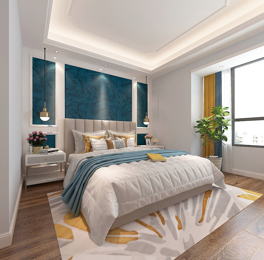
The background of the master bedroom bed uses blue murals, plus the embellishment of the wall plate, a little simple shape.
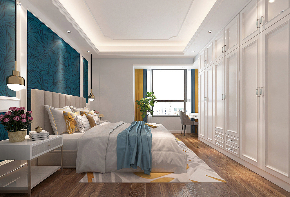
At the end of the bed, the wardrobe was covered with a wall to the top, and it extended to the bay window. The makeup table was designed with the position of the bay window. With the help of light, it was conducive to daily use.
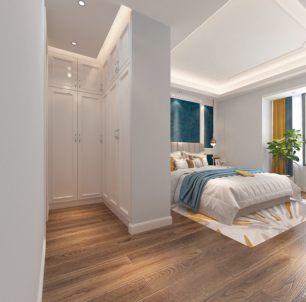
There is also a small cloakroom in the master bedroom. It just blocked the main guard's door and master bedroom, and made a good treatment in Feng Shui.
- END -
Sanfu Tianzheng hydrangea, remember "6 things", do not do well, yellow leaves, rotten leaves, and not blooming
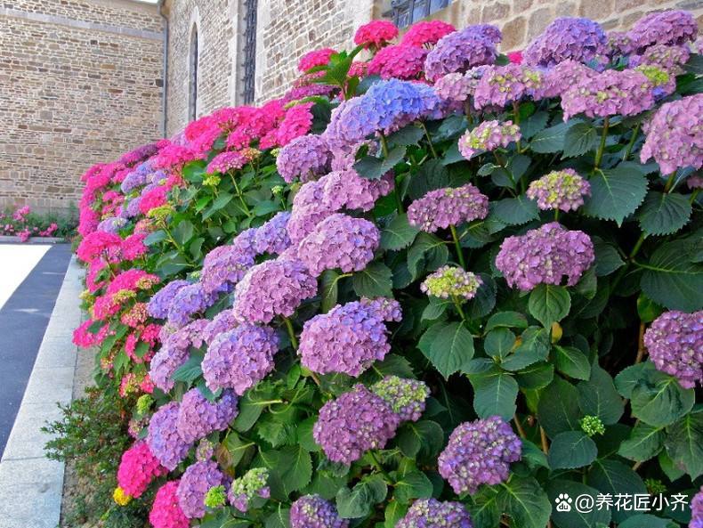
Now that you have entered Sanfu, the hydrangea you raised is still growing normall...
Examination Gong Ji · Exploring Qingdao Hard Technology ⑧ | Yi Lai: Seeing the "wisdom" high point and leading intelligent lighting
