The American mixing style is really warm. After watching it, there is a feeling of regret pretending to pretend early. I like it
Author:Shangpin Meishe Time:2022.08.08
The house should not be too "rigid" to live, there must be a warmth, and the atmosphere of home.
In fact, choosing a modern and American mixing style is particularly suitable. Don't believe you look down.
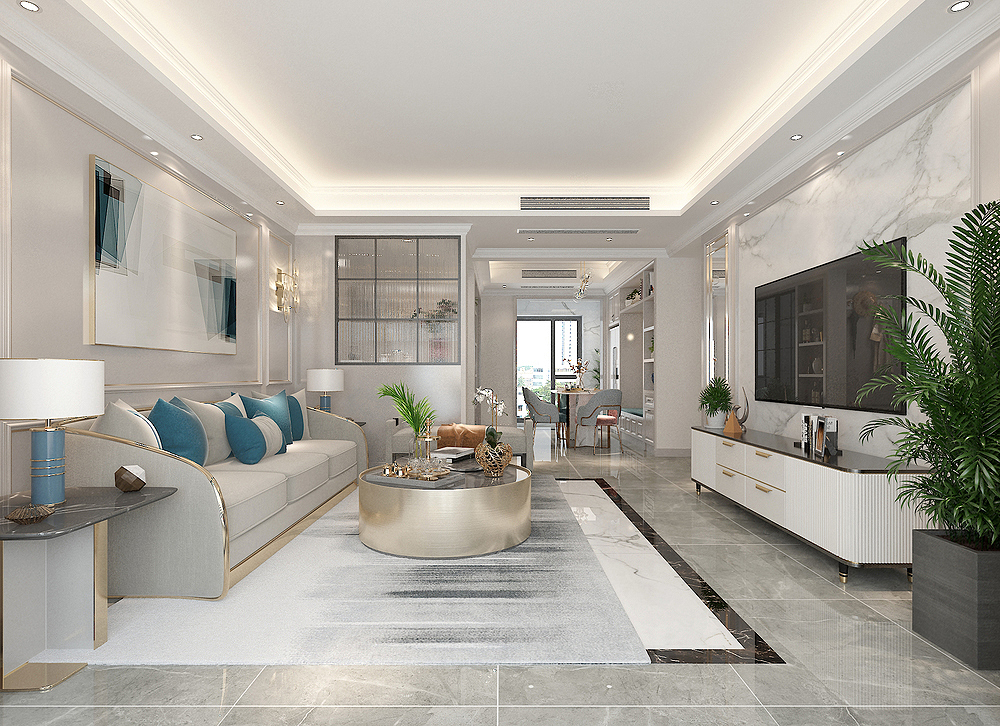
Design introduction:
Decoration style: modern American mix and match style
Actual area: 125 square meters
Space pattern: three bedrooms, two halls and two guards
Designer: Qianliying Designer
Project location: Changsha Qingxichuan
Decoration cost: half -package budget cost 12W
Apartment diagram
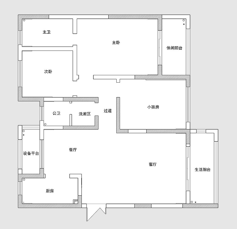
The structure of the house is clear and clear, and there are more load -bearing wall structures. In fact, the safety of this structure is still better, hehe.
There is no porch to enter the house. This is the worst. Come in is nothing, and the privacy is much worse.
There is also the area of the living room and restaurant unevenly distributed, which is not reasonable. The living room space is large, but the area of the restaurant is too small.
Layout plan
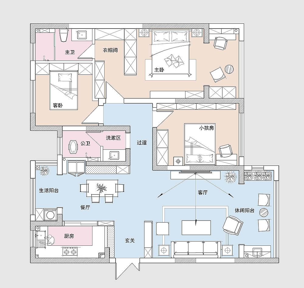
In order to increase the private sense of the living room, the right hand side of the household also made a set of cabinets by the location of the living room, which symbolically obstructed, and also played a role in increasing the sense of privacy.
The restaurant space is small. It is used as a deck to make wine cabinets and placed the dining table. This space utilization is higher, it is more convenient to use, and it will not be crowded.
The sliding doors next to the living room and the restaurant were dismantled to keep the permeable effect in the home.
Other spaces are basically unchanged, and the layout is designed in accordance with the original structure.
Porch
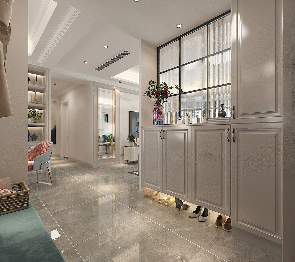
The porch relying on the living room is a set of "partition" shoe cabinets. The shoe cabinet has some uneven shape treatment. If it is a tablet, it will appear too monotonous.
So I still make a little styling, which will look delicate and beautiful.
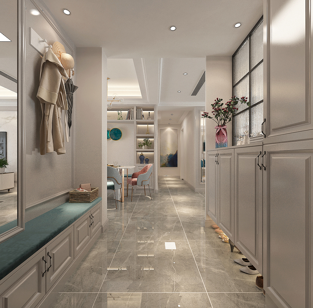
There was a long shoe stool on the left hand side of the household, but there was no problem with three people.
On the shoe stool, a row of hooks were decorated, and the hats, clothes, umbrellas that went in and out of the door every day were very convenient.
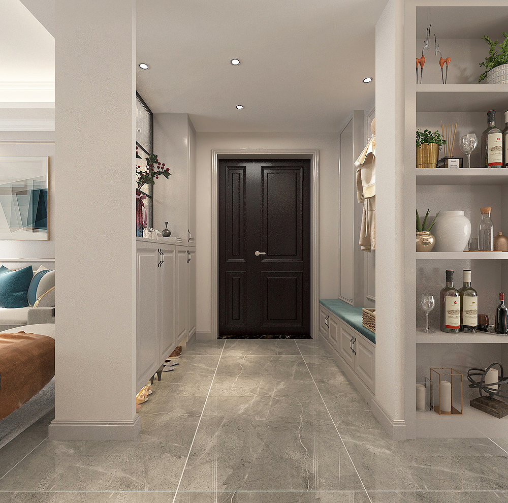
Another perspective of the porch is facing the door of the household, with a few shot lights on the top surface, and it feels like the stars embellish.
living room
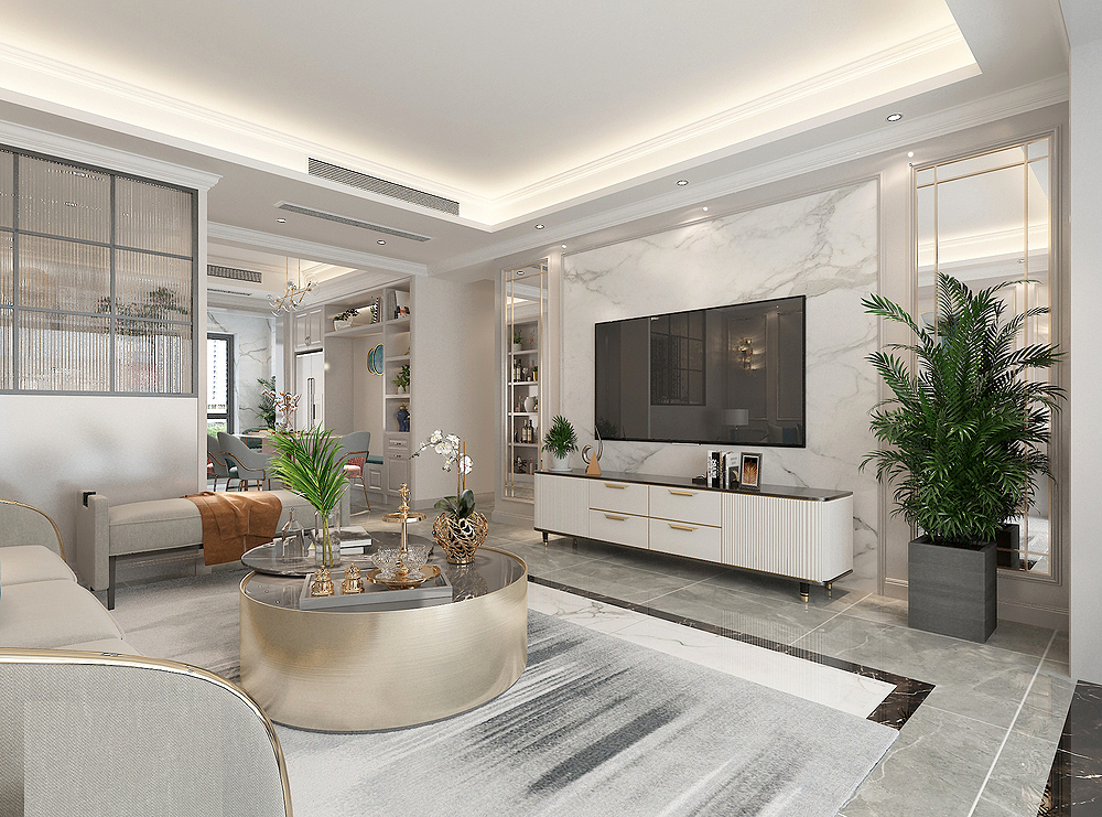
I personally like the overall shape of the TV wall of the living room, and it looks very warm. The PU lines are increasing the matching.
Silver mirrors on both sides have been paired with metal lines, which helps increase the visual effect of space.
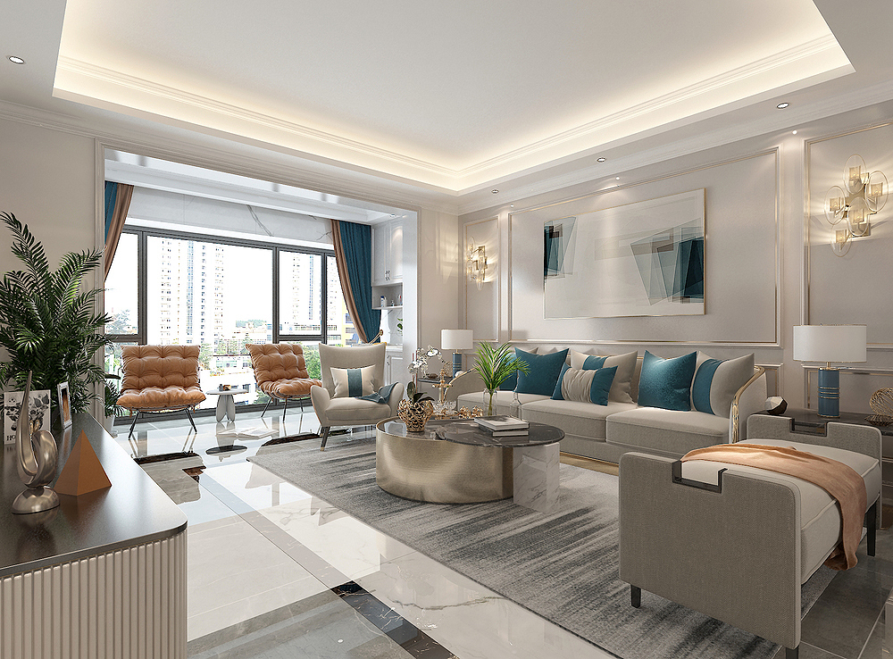
The sofa wall also uses the combination of PU lines and metal lines, and "lights up" the entire space, becoming the focus of the visual.
The fabric style used in the sofa is more warm than the cortex.
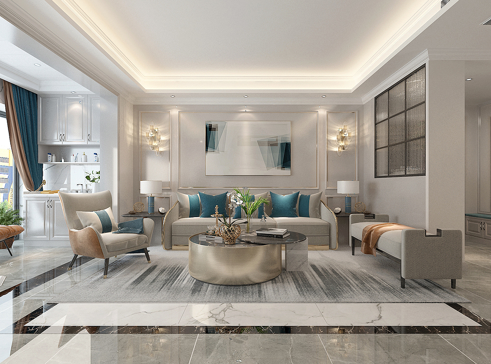
The top surface of the living room uses a more popular lightless lamp design at the moment. The lamp source mainly relies on the lamp bands and embedded lights hidden in the ceiling.
The main lamp will not be better, because the main light is too easy to accumulate ash, and it is easy to fall off.
Leisure Balcony
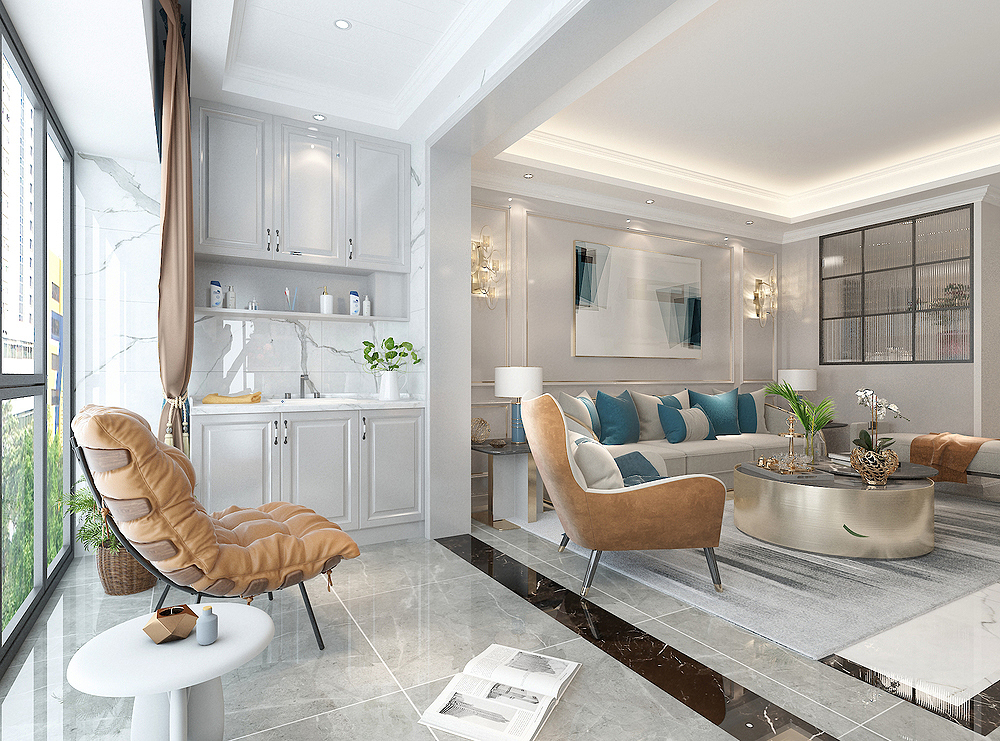
It is defined as a leisure balcony next to the living room. As the name suggests, it is mainly leisure.
A set of tea cabinets at the door of the balcony sofa, which is very convenient to wash hands and washing fruits here.
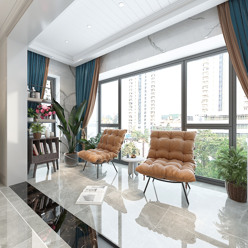
The balcony feels very casual, with casual lounge chairs and flower stands. The entire space is full of leisure.
Give everyone a "pastoral" scenery.
Dining room
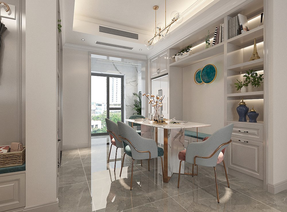
The restaurant space is small, so choosing to make a card is the most suitable way. Not only does it have more storage space, but also the restaurant can ensure that it is not crowded.
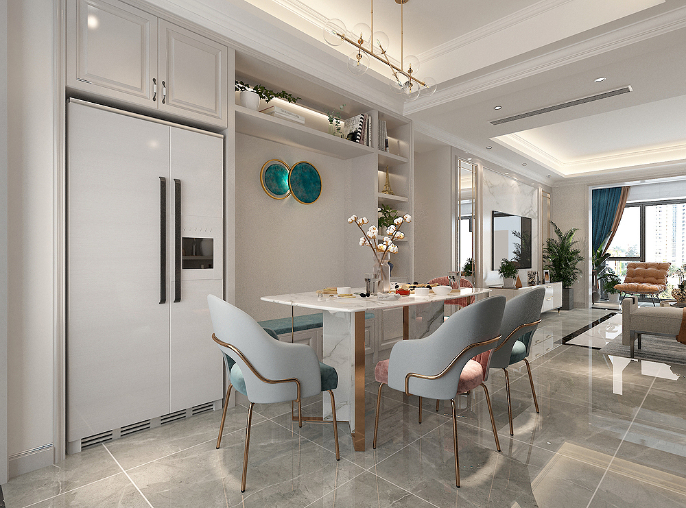
The restaurant wine cabinet is also embedded in the refrigerator, which looks particularly overall.
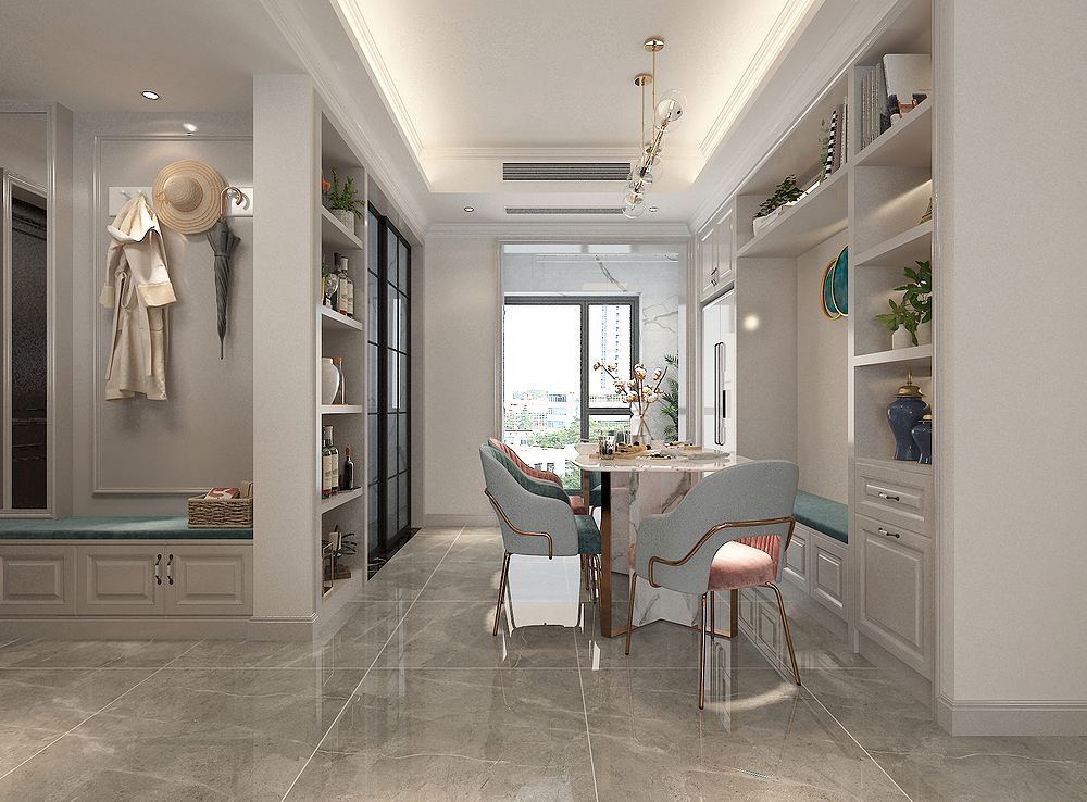
On the other side of the restaurant, a group of display cabinets are filled with bottle and cans, all kinds of decorations, and the entire space is very exquisite.
life balcony
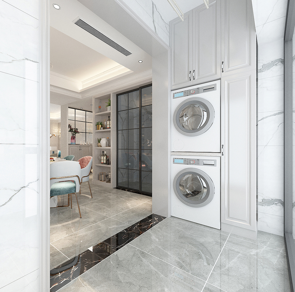
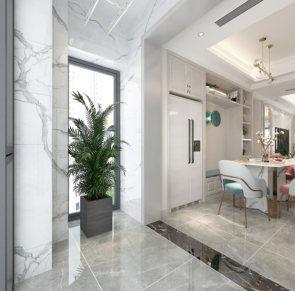
Life balcony is mainly washing clothes and drying clothes. The reason why you choose not to push the door is to ensure the indoor transparent effect.
master bedroom
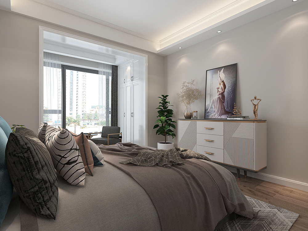
The background of the master bedroom is not made of cabinets because it is not enough.
There is no choice to place the TV at the end of the bed, and there is no hanging TV. A painting is simply hung to play a decorative role.
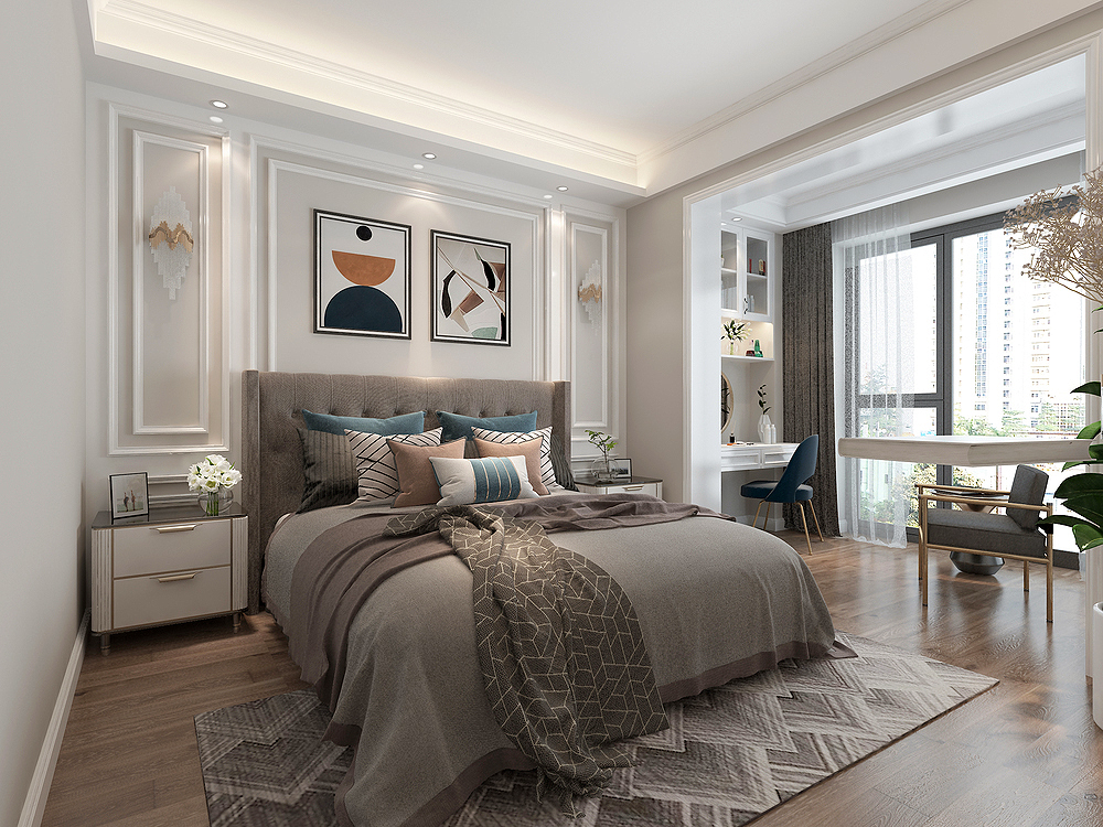
The head of the bed is mainly lines, showing the exquisite side.
The hanging paintings in the middle, and the wall lamps on both sides are all the beauty of the entire bedroom.
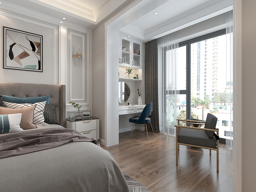
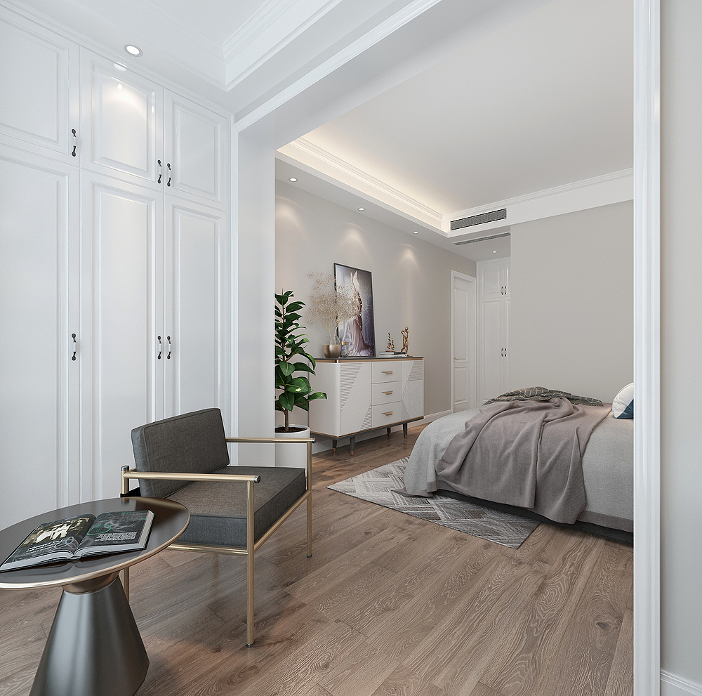
The balcony space of the master bedroom is also equivalent to the dressing area of the female owner.
This can not only satisfy the heroine's dressing, but also lie here quietly to enjoy the sunlight.
- END -
Is it true that the charger will not explode for a long time?

Many people are used toConnect the charger on the plugI haven't pulled it down a f...
Ten years of spring breeze to help go to sea (extraordinary ten years 2)

In the past ten years, with the high -speed development of my country's external e...