Multi -identity | Experience details of station B product design!
Author:Everyone is a product manager Time:2022.07.05
Editor: As one of the video platforms that seize a large number of young users, what are the places worth disassembling and reference in functional design and user experience design? In this article, the author summarizes the design details of station B from the perspective of netizens, web users, and development users. Let's take a look!

This time, I will analyze the details of Bilibili product design according to different audience users. Let's take a look at the design extensions of the design of B.
Foreword
As we all know, Station B is a comprehensive video community that is equal to a two -dimensional, ghost animal, learning, entertainment, etc. Nearly 82%of users are generations Z (a crowd born in 90-09), and they are also a generation who grows under the Internet.
The size and activity of the user continues to be high. In addition to the strength of the product side, the experience perception in the design is also contributed. At the same time, learn from the extraordinary places in order to understand the design power points.
The more you look down, the more surprised you, there is always a detail design you don't know.
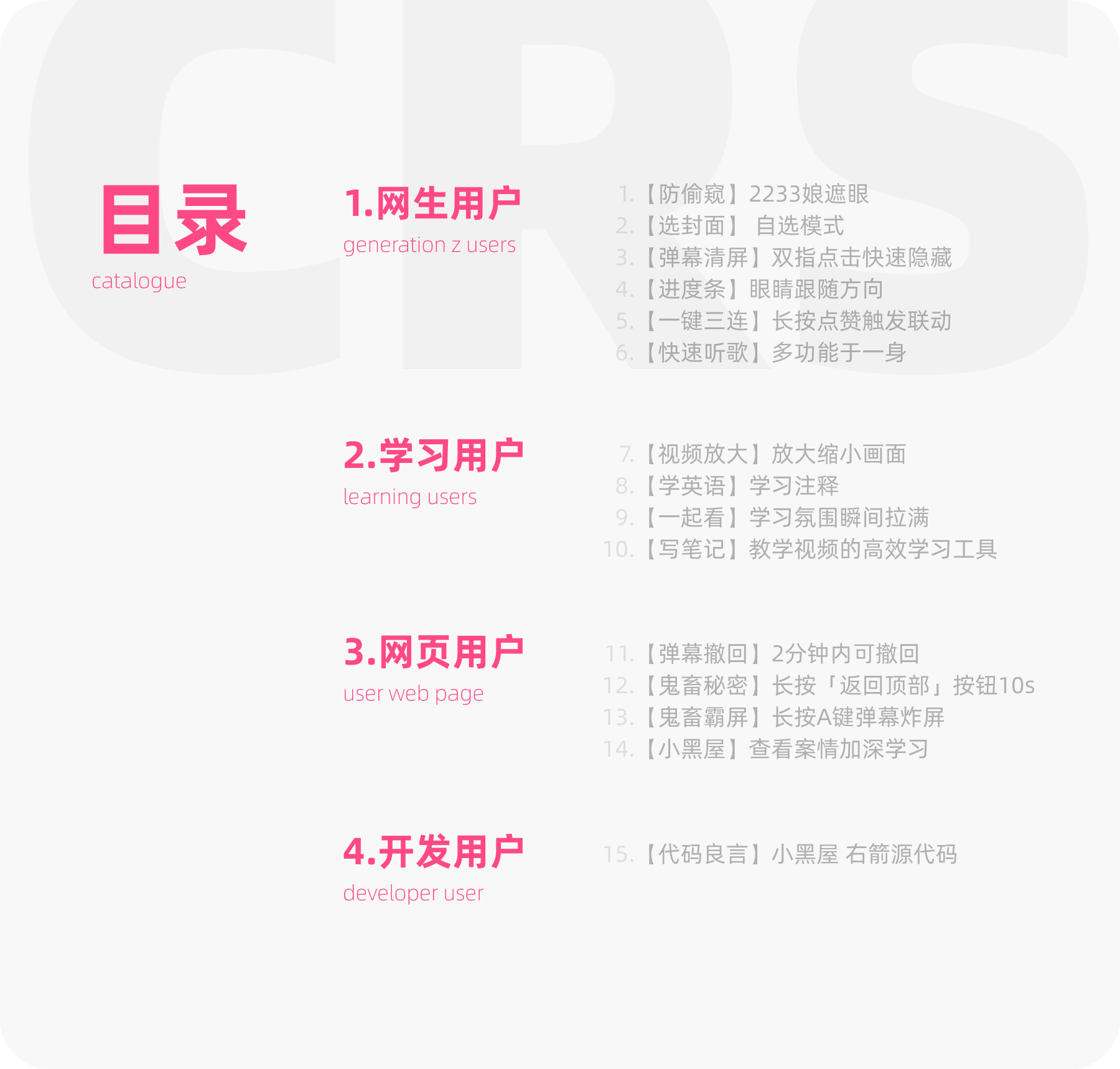
1. Net student users
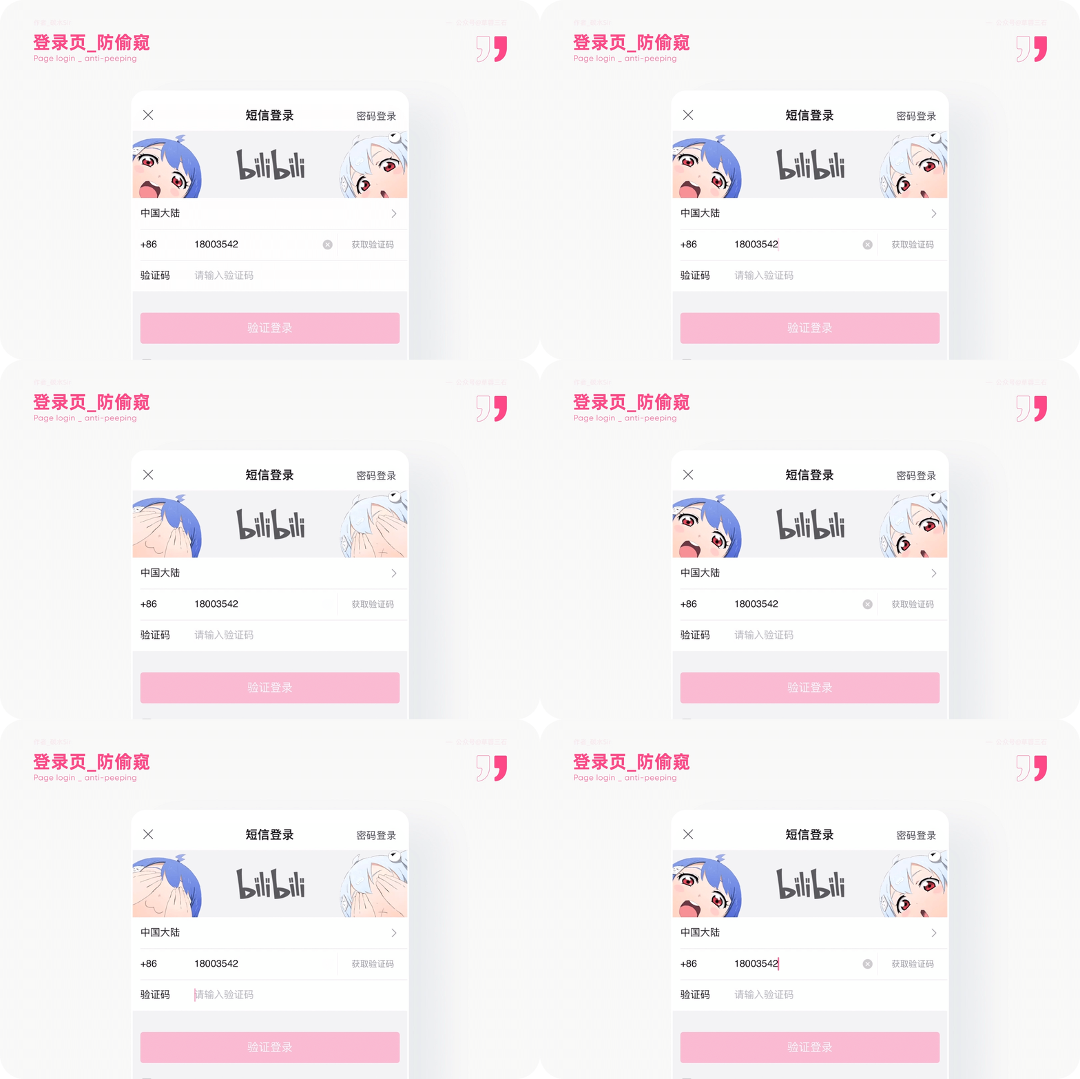
1. [Anti -Volging] Login Page -2233 Mother Covering the Eyes
1) Use scenarios
If you are familiar with the pages that can't be. The login page is a page that each user is probably to enter the page except the homepage. How to give users a security perception and enhance product memory points.
2) Design thinking
Design goals: improve the security perception of users when logging in to station B.
Design solution: When the user enters more sensitive information such as the verification code or password, the 2233 mother will cover the eyes, implying that the privacy information will not peek. Strengthen station B's emphasis on security privacy and enhance user trust.
At the same time, station B's brand IP2233 is reflected in childhood to adult products. When the user logged in to the registered account, the 2233 mother of the child Q version was presented in front of her, implying the vision of the 2233 mother's future accompany and growing up. This is the second meaning.
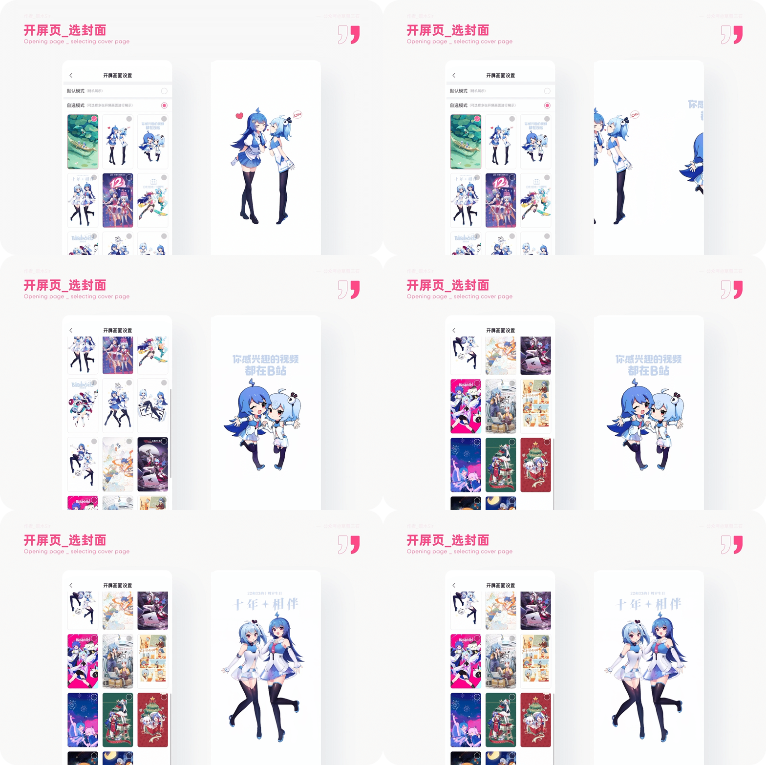
2. [Selected cover] Open the screen -optional mode
1) Use scenarios
As a video community that develops a two -dimensional, users are intimidating for product brands. However, the two -dimensional content has gradually been replaced by the diverse ecology so far, and the proportion of categories has gradually become smaller, and the emotional memory of old users is reflected there.
2) Design thinking
Design goals: Enhance the spread of brand IP, allow users to enjoy a richer opening page, thereby satisfying user emotions.
Design solution: In "Settings"-"Open Screen Settings", you can randomly display or customize the selection screen. A total of 20 pictures are provided for users. There are a few classic pages. When users choose a specific picture, they can not only strengthen the IP memory point, but also reflect the value of the product's importance to users.
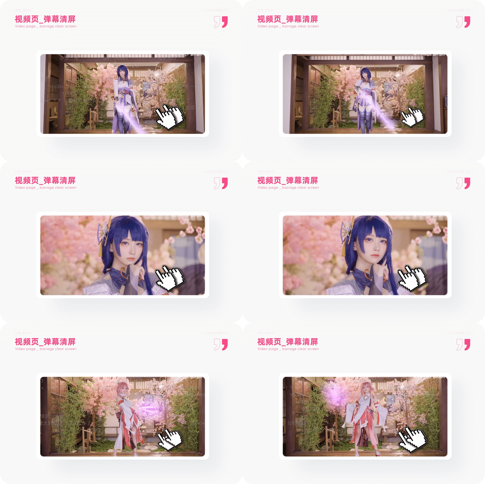
3. [Barrage Clear screen] Video page -Double -point clicks quickly hidden
1) Use scenarios
The barrage B is notorious. When the barrage enthusiasts watch a hot explosion video, it is likely that the barrage is dominated by the screen. Although the atmosphere is full, there will be to block users to view what they follow, so as Miss a wonderful moment. How to solve?
2) Design thinking
Design goals: Optimize the convenient operation of the barrage switch and give users a high -quality interactive experience.
Design solution: On the video playback page, the regular switching barrage method is to click the barrage button in the lower left corner. If you want to be more convenient, you can double -point the screen to trigger the switch barrage function. Compared with the conventional "first click the screen" and "then close the barrage", the dual -pointed click screen is more efficient, although more finger operation learning costs High, but this hidden interaction will greatly enhance the viewing experience.
Today's product functions are continuously stacked. Sometimes common functions must be used to enter 3 levels to use. Why not change the idea and use multi -finger interaction to enhance the user's operating experience. It may be a good experience upgrade.
4. [Progress Bar] Video page -Eyes follow the direction
1) Use scenarios
In addition to the empty state and interface elements, a product gives user brand perception in the video page and increases interesting experience.
2) Design thinking
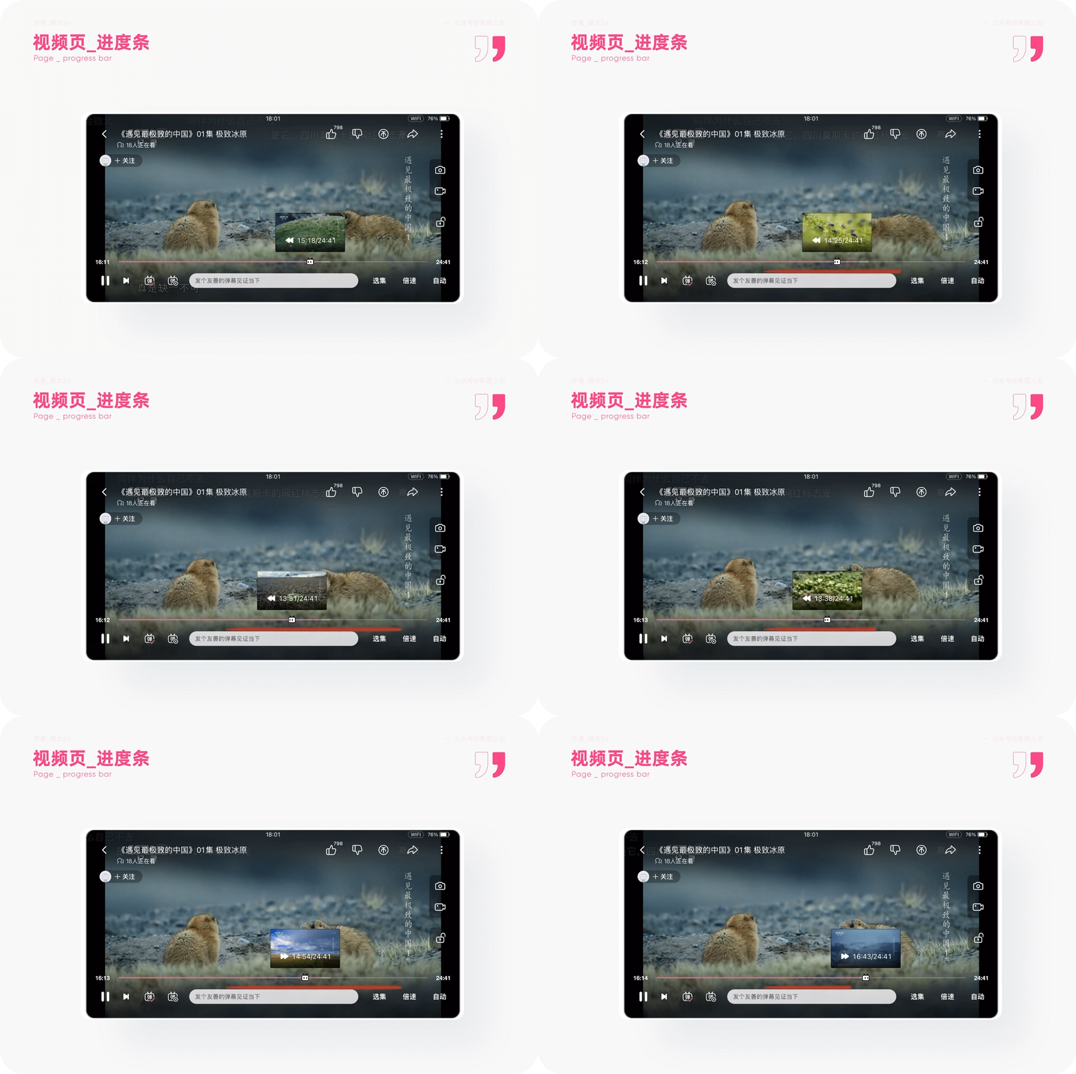
Design goals: Improving the fun of the video page progress bar, thereby strengthening the brand B of the station B.
Design solution: In the video page, when you drag left and right when you make the video progress, the eyes of the indicator icon of the progress bar will move left and right. It is very interesting. The interactive design of the IP combined with the progress bar makes the original single form interesting.
Of course, there are more than one style of the progress bar, and there are many videos of Easter eggs with different styles. Go and find it. (By the way, I also found the micro -setting of the progress bar when I recently used [Youku]. have a look).
5.
1) Use scenarios
One -click three companies' earliest birthplace, maybe you know this feature at this time.
2) Design thinking
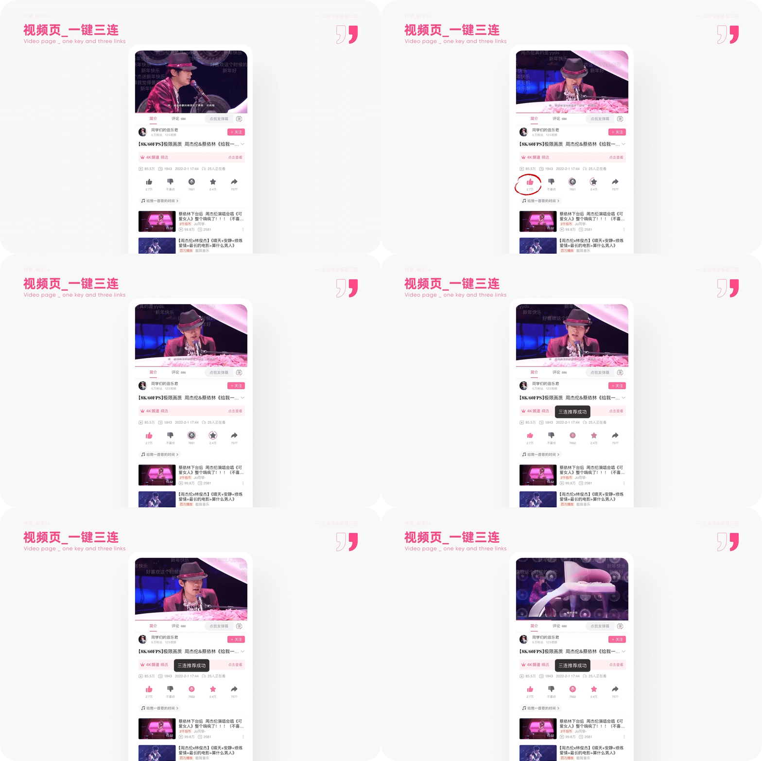
Design goals: Improve special feature points in homogeneous products, and strengthen the one -button and three -link function of the product.
Design solution: When browsing the video page, see the super favorite UP main video, so excited to want one -click three consecutive consecutive, you can press and hold the likes button. After walking, the likes, coins, and collection are completed at the same time. This is the activation function of one -click and three companies. Not only that, the mobile terminal, the web page, and the next "writing notes" can be triggered by one -click and three -link function. The unique function of the product is full.
6. [Quick Listen to Songs] Video Switching -Why Bay your next song listening software is a listening song software
1) Use scenarios
I want to listen to Zhou Dong’s song, there is no Netease Cloud Music, QQ music has to pay again, so uncomfortable ~
2) Design thinking
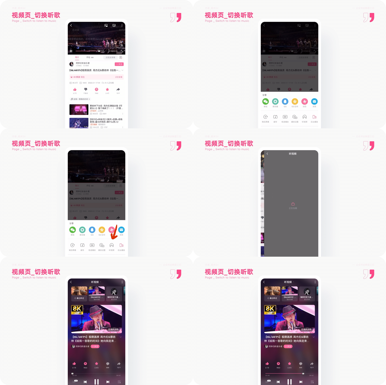
Design goals: Solve the video barrage intervention when listening to the song, switch the video to the music mode, and focus on listening to the song.
Design solution: In the video page, click "More" to select "Listening Video Mode". The current video will be switched to a music page. Isn't this a music software? Commonly used cycles, the previous one, and the next features are all available, collection, comments, and reposts. Don't be too great.
Because station B is the uniqueness of UGC (user production content) and PGC (professional production content) video platform, he will not worry too much about infringement. No wonder there are more users in the Z generation in station B. One product, which meets the use of multiple scenes and people. No wonder it can capture the hearts of the people. It has its reason.
Second, learn users
1. [Video amplification] Double finger movement -zoom in and reduces the picture
1) Use scenarios
When you study with station B, it is difficult to see the details on a small mobile phone screen. How to solve it?
2) Design thinking
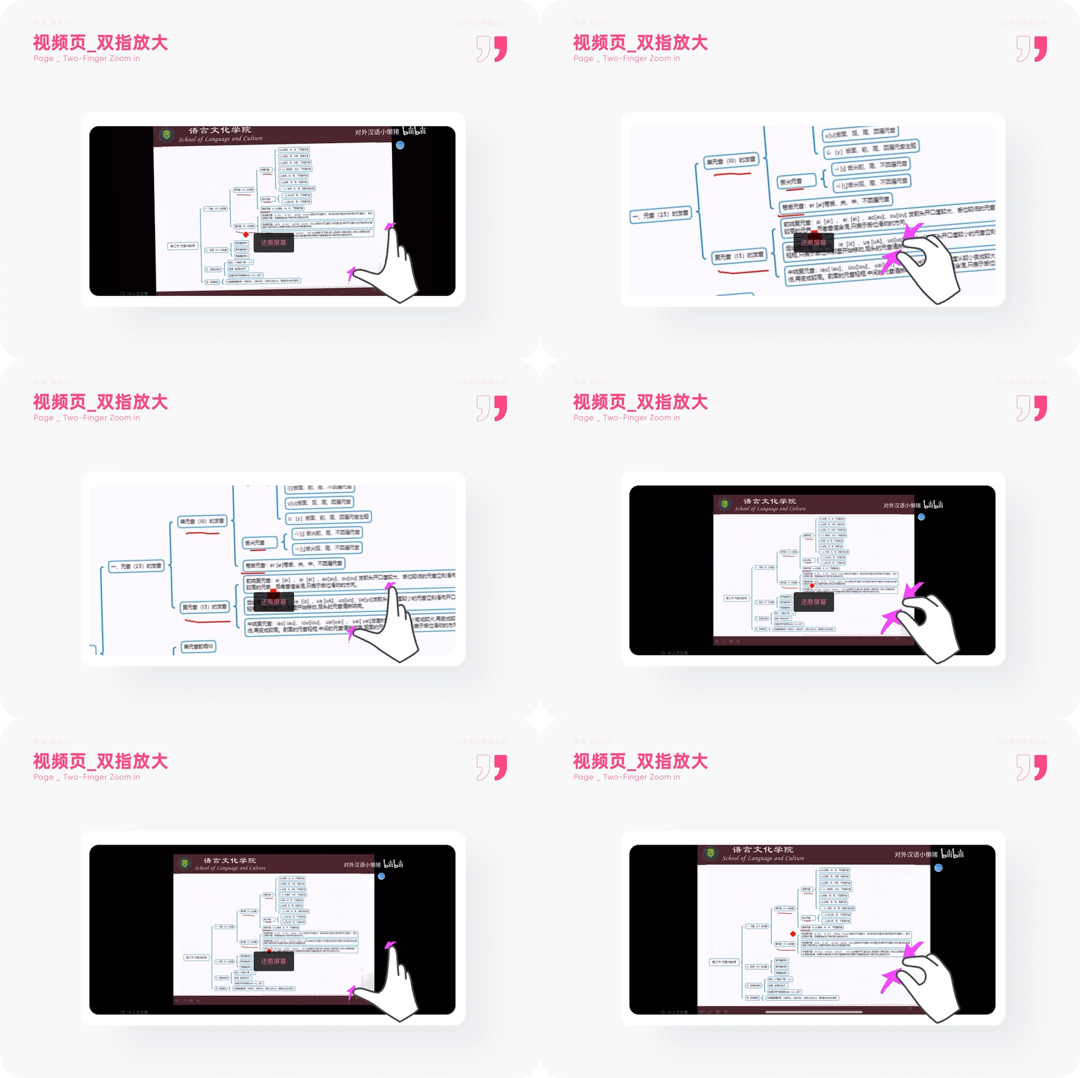
Design goals: Improve the effect of details and exhibitions, let users see specific information, and improve learning efficiency
Design solution: In the video page, in addition to the double -finger clicks above to trigger the barrage switch, you can put the video with double finger stretching, of course, you can also pinch and reduce the video. When the original video size is changed, there will be a "restore screen" button at the bottom. Click to quickly correct the video. It's not fast to use ~
2. [Learn English] Old Friends -Learning Notes
1) Use scenarios
Do you still learn English while watching English movies. Although this is a way, you have to translate in third -party translation software when you do n’t understand words or grammar, and the efficiency is greatly reduced.
2) Design thinking

Design goals: Improve music learning efficiency, increase real -time English analysis in the video, and help fast learning English.
Design plan: In the "Lao You Ji", users can enter the English learning column by clicking on the left "Learning Music". Each conversation of the actors and the time of appearing are clearly listed. Duan dialogue can also be learned for words or grammar that do not understand in the current dialogue. It is simply the gospel of English -speaking people.
3. [Look at] Shopping Hall -The learning atmosphere is instantly filled
1) Use scenarios
Scenes such as brushing station B, watching videos together, chatting together, etc. may only exist in reality. Is it really?
2) Design thinking

Design goals: solve the sense of blocking B station in different places, and enhance the happiness of brushing drama to learn together anytime, anywhere.
Design plan: In the video page, click "Watch" into the screening hall. You can create a new screening hall by yourself, or you can enter the screening hall of others. Feel ~
4. [Write note] Note function -efficient learning tool for teaching videos
1) Use scenarios
Also watching video learning. When you only have a mobile phone around you, you need to take notes. Do you still switch records between the apps through memo and other forms?
2) Design thinking
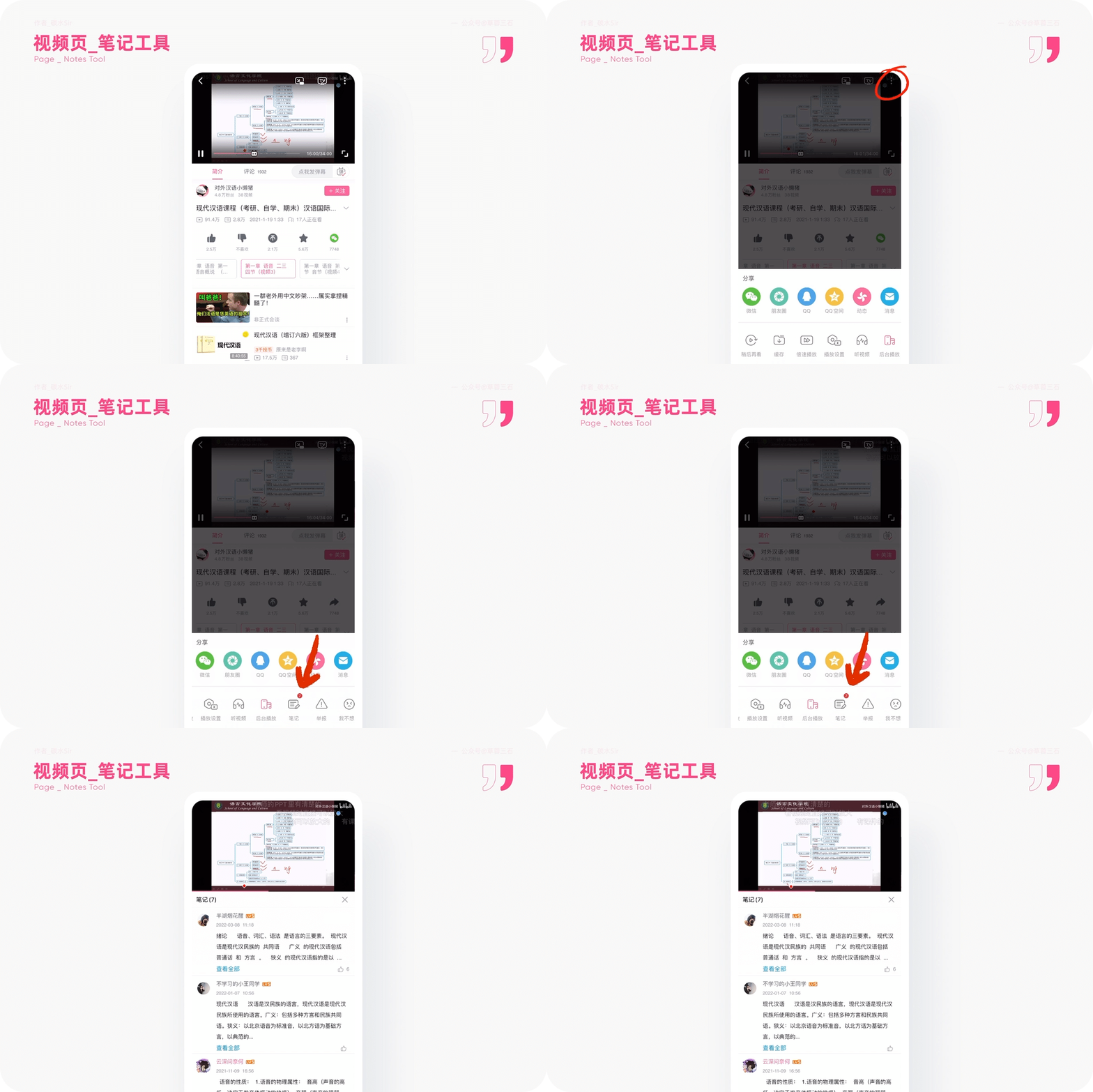
Design goals: It is difficult to record key knowledge when watching the video, improve the efficiency of record notes, and thus learn efficiently.
Design solution: In teaching videos such as public classes, you can solve the pain points of the recorded video by clicking "More" to find "Notes". Not only that, you can also view the contents of other users and can interact with one button and three companies. It has two -way learning. It is simply not great. You can copy it with one click after the note, paste it to your knowledge base, and solve the problem of content migration. Users who study at station B may wish to try it soon ~
3. Web users
1. [Barrage withdrawal] Cancel can be withdrawn within 2 minutes -avoid error injury
1) Use scenarios
Station B is a barrage network. In many cases, the watchmakers' minds of the barrage will bring the watchmaking speech at random, which will bring other users to watch the movie discomfort and platform pollution. How to solve it.
2) Design thinking
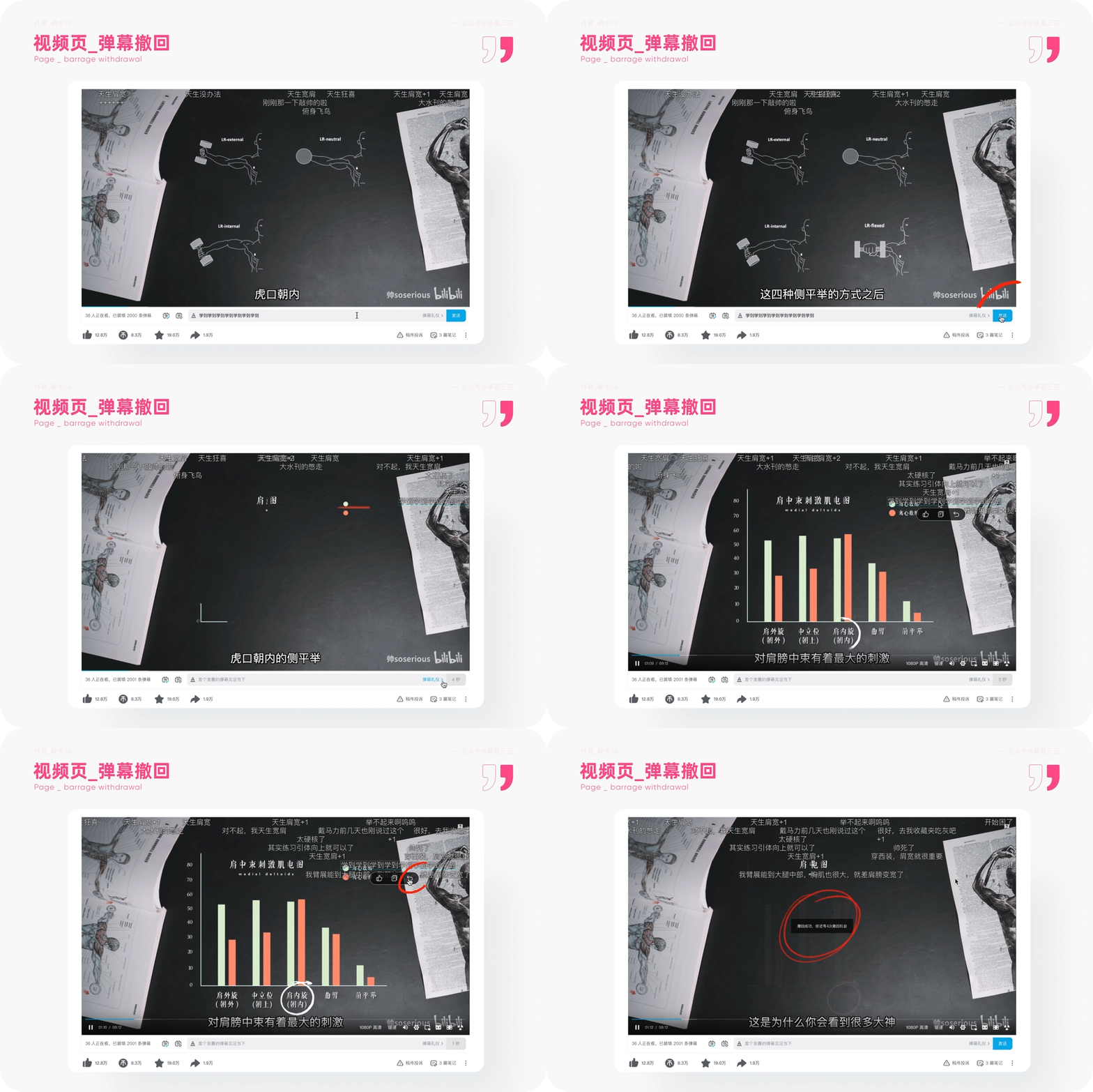
Design goals: Add barrage deletion function to users, thereby enhancing the green speech of the barrage comments and purifying the content of the barrage.
Design solution: Send a barrage in the video page. Users can see their barrage in the video, the mouse enters, choose to withdraw, pay attention to only withdrawal within 2 minutes, and only 5 times a day can be withdrawn 5 times a day. Barrage. The purpose is to prevent users from frequent withdrawal. You can click on the barrage list to find your own barrage. Long press will appear with withdrawal options. Click to withdraw.
2. [Ghost Animal Secret] Web Page Ghost Animal District Press the "Return to Top" button 10s and enter the corresponding letter to enter the classic ghost animal area
1) Use scenarios
People are always interested in curiosity, especially under the premise that they don't know. 2) Design thinking
Design goals: Increase the function of the barrage of the ghost animal area and enhance the exposure of such eyes videos.
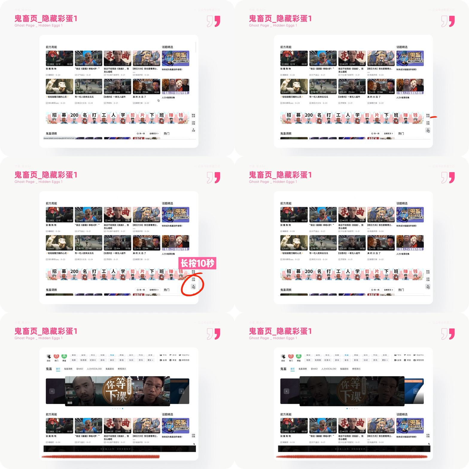
Design solution: On the Ghost Animal District Channel, long press the back of the top button in the lower right corner of 10s, which will activate the black input list at the bottom. The copywriting reads: "Try to enter the letter and find the secret of the ghosts ..." Take you into another mysterious space.
3. [Ghost Animal Domains] You will have another egg waiting for you under the head search of the ghost animal search
1) Use scenarios
The guidance of copywriting will inspire users to try to try.
2) Design thinking
Design goals: Guide users to input random letters and improve egg interactive gameplay.
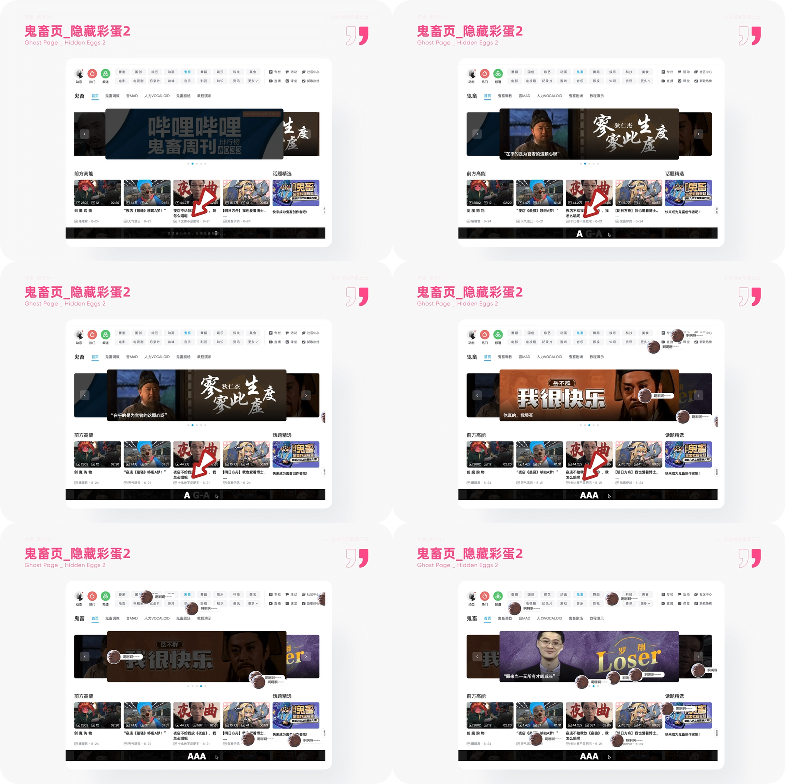
Design solution: Enter the English letters in the search box randomly, and there will be a prompt to enter the letter. When you enter the car and return, a classic word barrage will appear on the webpage. If you long press AAAAAAAA ..., the web barrage will continue to appear with sound effects, which is very ghost. When you are curious about a certain barrage avatar, you can click to enter the video page and browse video. At the same time, you can also communicate with your partners who come in in the post -comment area. It is very lively.
4. [Little Black House] Understand the rules -View the case deepened learning
1) Use scenarios
When the video and the comments are uploaded on the station B and the comments are not controlled and institutional education, it will bring the risk of losing users.
2) Design thinking
Design goals: In order to establish a good audiovisual environment and user experience, standardize the content of the product.

Design solution: In the center of the community, in the small black house, you can view the case of the user of the small black house, and the severity of the case is restricted by the severity of the case. Compared with the system specifications of the long article, this practical case is better. Let users understand the platform rules and prevent it from being closed into the small black house.
Fourth, developer users
1. [Code Liangyan] Source code of the right arrow of the small black house -Jinshi Liangyan
1) Use scenarios
The programmer is on the pages of the small black room and wants to jailbreak to check the code.
2) Design thinking
Design goals: Inform programmers, developers' small black houses are not only used to standardize video users, but also for developers and programmers.
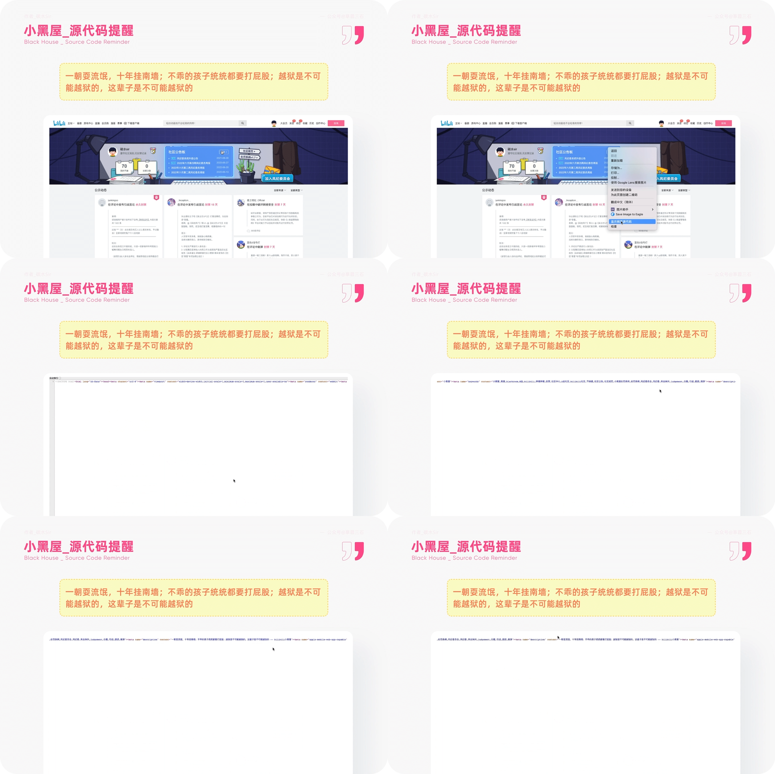
Design solution: On the "Little Black House" page, right -click "Display the Source Code of the Web Page". In the middle of a line of code, you will see a sentence: "One time a hooligan, ten years hanging the south wall; Ass; jailbreak is impossible to jailbreak. It is impossible to jailbreak in this life. "The very funny language makes it easier to be serious. At the same time, it enhances the guidelines of the small black house and allows the user B users to do a guidelines to follow the guidelines. Good users.
5. Conclusion
Designers have to find beautiful eyes. Beauty is not only vision, but also a good experience process. Don't let users think, this is pursued by each designer.
Carefully recording product details, understanding the thinking behind, is also a way to continuously improve your logical thinking and expression ability.
The details of the product details are over, click the original link to see more, then we see you next time!
references:
B Station 2022 The first quarter financial report: https://mp.weixin.qq.com/s/ctzbvbqpqxcv2_xagdq
Mikufans barrage video network: https://www.bilibili.com/read/cv14244675/
Advertiling: https://mp.weixin.qq.com/s/831jx19aq8cfi_wu7rqubwww
Shiqu Research Institute: https://mp.weixin.qq.com/s/buzovle8bylqjafrcmm4ag
#Columnist#
Carbon SIR; WeChat public account: Cao Rong Sanshi, everyone is a product manager columnist. The person in charge of one more product design is good at designing details and insights.
This article was originally published in everyone's product manager. Reprinting is prohibited without permission.
The question map is from UNSPLASH, based on the CC0 protocol.
- END -
"Flying on the ground"!1000 kilometers per hour!丨 "Go to the Future" Cloud Open

quickFrom foot to wheelsFasterFrom land to the skyHuman desire for speed has never...
Walking in the front of the new bureau 丨 "Three Ten Top Ten" see Actions ②: Fortune to the top ten industries to see Qingdao
On June 21, the BOE IoT mobile display port device Qingdao production base structu...