Maybe, your mistakes are designed
Author:Everyone is a product manager Time:2022.06.13
#This article is produced by the product manager's "Original Incentive Plan". When a mobile phone pops up a advertisement, you obviously want to turn it off, but accidentally click on the jump, so you are forced to enter another software. Such mistakes happen several times a day, and users are even used to it. However, everyone's common mistakes may not be caused by users, but pre -designed by the product.

The screen of the mobile phone is too small to accurately clicks.
As early as many years ago, when we just started using keyboards and mouses, click the button on the wrong keyboard. The mouse pointer was pressed on the left button without moving, and it often happened.
It is even more common to evolve to the touch screen of today's mobile phone.
When we use mobile phones every day, we don't know how many errors will happen, click the wrong button, and click the advertisement.
Similar experiences, everyone has encountered and happened every day.
We have long been used to it.
But if you are accustomed to the coincidence, is it a designed routine?

1. There are natural defects on the problem of error touch on mobile phone touch screens
Looking at the current mobile phone operation method, compared with keyboards and mosics, there is indeed a greater error risk:
1) From the perspective of the area, the size of the mobile phone cannot be compared with the keyboard. The size of each button is a lot worse
If your fingers are thicker and you want to press a virtual button, the edge of the fingertips falls on the next icon first, and it is easy to happen.
2) The virtual buttons on the mobile phone screen have no clear dividing line
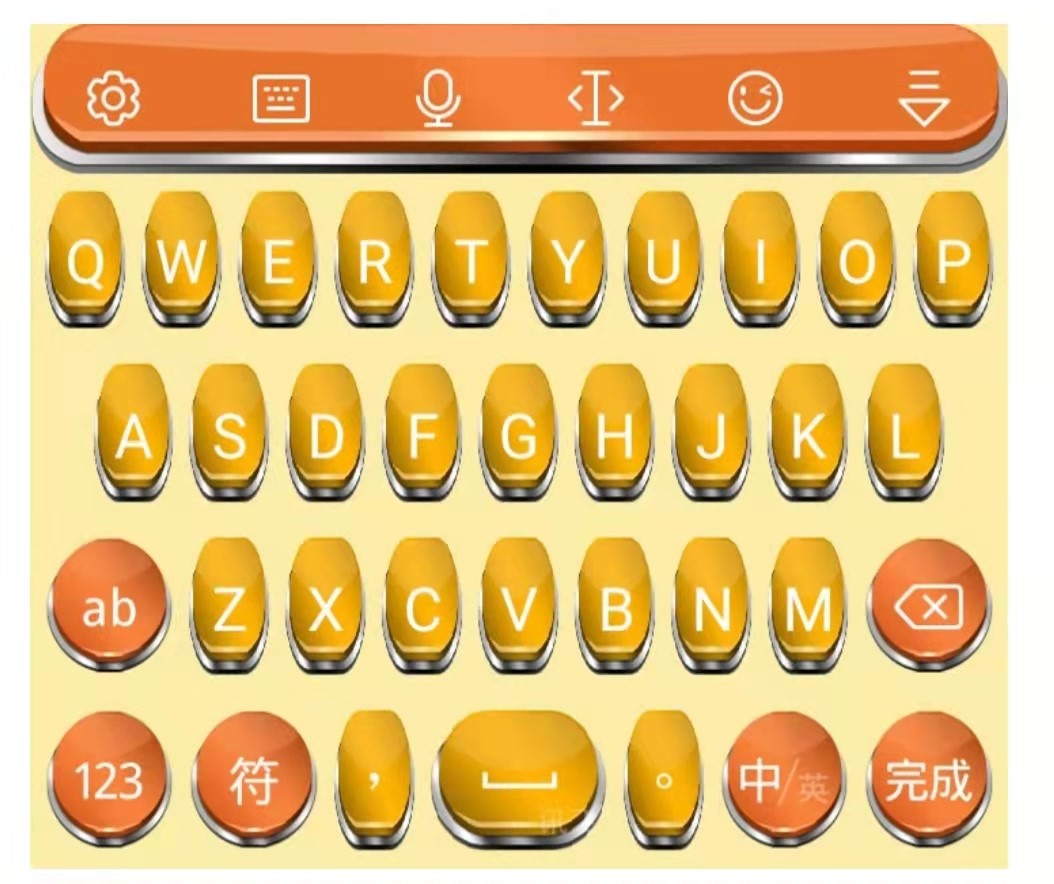
Many virtual keyboards now simulate into 3D. Although there are a little physical keyboard, it is not helpful for the problem of error.

Because it cannot bring the finger touch of the button.
Using the physical keyboard, not only the FD and J key signs, but when we put our hands on the keyboard, we know which fingers we correspond to which button. It is also that each button has a clear touch dividing line. Even if the position of our fingers falls is somewhat deviated, we can also judge whether we pressed on the button or pressed between the two buttons to avoid error problems.
3) When using the physical keyboard, the keyboard is placed on the table, and the hand does not need to provide support for the keyboard
When using mobile phones, people often control their mobile phones with their hands. Regardless of one -handed grip or holding hands, the edge of the screen may be touched by the palm.
Especially when holding a one -handed grip, when using the thumb to click, not only the fingertips will touch the screen, but the fingertips also have a high chance to fall on the screen.
4) When using the mouse, get feedback before pressing the button
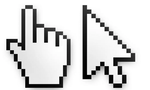
When we want to click a certain icon on the screen, we must first move the virtual pointer controlled by the mouse on the screen to the target position, and then click. This process of moving and stopping can help us confirm whether we have reached the position that should be clicked.

There is no pointer on the electronic screen, especially the current electronic screen. Is it right? You can only know after clicking.
5) The key position of the keyboard and mouse is fixed
Although the positions of different brands, the positions of the keys, and the position of the keys are somewhat different, after a period of use, muscle memory will write down their position, and the error rate will be significantly reduced with familiarity.
On the screen of the mobile phone, the position of the buttons on many pages is extremely dynamic. It is difficult for people to achieve efficient muscle memory after being familiar.
These defects exist in congenital. But this cannot be said that the keyboard mouse is always a better man -machine interaction than touch screen.
Second, it seems to have been designed
With the continuous development of technology, the screen operation accuracy is improved, and the problem of mistakes should be increasing.
Moreover, even through AI, you can further eliminate the problem of error.
However, in the eyes of many people, the status quo does not seem to be the case.

People even have a feeling, and now it is easier to mistake ads!
Business is profitable, if it is said that it can bring greater business value. Then, practitioners may temporarily put down the user's experience and let them touch them from time to time.
1. Misidity and misunderstanding
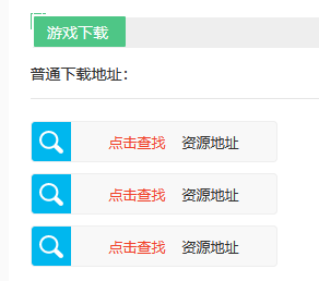
If you often download software on the Internet, you will definitely hit this kind of problem: there are N multiple download links on one interface.

But there is often only one link that can lead to the software you want to download.
The other link points went in, either jumping to the advertisement page or directly downloaded the spam software.
Looking at the current mobile phone, such misleading also exists.
In the software store, you think you just click to view, and it has already started downloading.
In the news software, you click on the title of interest, thinking that you will jump to the specific article page, and the result will directly jump to another app that contains this content.
2. Reflection error
There is also an error method to challenge people's reflection of nerves.
When you just enter a page, you can see the button you want to click, and you are ready to click. As a result, the page suddenly popped up a advertising picture from the top, pushing the button you wanted to click to a lower position, and your fingers were clicking on the pop -up advertisement.
The same is true of random screen ads. After watching a video, turn off the screen for a while, and then open the screen, you habitually slide the screen and want to turn out the next video. But at this time, a full -screen advertisement appeared, getting directly to your sliding behavior and entering the advertising page.
If you open it every time you open it, there will be advertising if you are fixed, and people may not be easily touched. And when this advertisement becomes random, people sometimes get used to opening the screen, and the advertisements that jump out will become more caught.
3. Shake and touch
Nowadays, most of the apps include shaking function.
And this shaking function is the hardest hit area.
When you walk on the road and watch your mobile phone, you occasionally encounter a step and take a big step. The body shaking may be passed on to your hand. Turn to the page you don't want to go.

Or I am tired of watching my mobile phone, I want to change my body posture, one turns over, and it has started.
Even when you are older, there are some Parkinson problems, and you may have the function of shaking.
4. Lie error
The above error method is just a misleading. If you pay more attention, you can reduce the probability of error.
But there is another mistake, you can't avoid it: you are clearly right, but you are transmitted to the wrong page.
Really in the click and feedback, I moved my hands and feedback.
In contrast, other methods can be called a routine. This means is naked fraud.
We can't distinguish who is doing this.
After all, as long as there is restraint, don't let the probability of "error" increase too much. Even if people who are suspicious, it is difficult to verify their doubts.
In the huge market, some people will do this, which is not unusual at all.
Third, why deliberately design it?
As early as ten years ago, in various ways, it was not a rare way to make a visitor error.
At that time, the smartphone had not yet reached the battlefield, and the webpage was the main battlefield of netizens.

At that time, there was no effective pop -up window interception method. Just open a website casually, and there were countless pop -ups.
Maybe, if you click on the blank position of the page, you touch an invisible pop -up window. Maybe, if you click on the link you want, you touch the invisible pop -up window suspended on the link. Maybe, you click the "X" in the upper right corner of the pop -up window, but you can't close the pop -up window at all, but more pages pop up directly. Whether it was at that time, or now, deliberately creating a mistakes of cracking on the window was favorable.
1. Create opportunities
In the past, for its own websites, if you touched the pop -up windows and buttons, the visitors will be led to the customer service consultation page and product description page to create more opportunities to contact users.
Some people who have not intended to continue browsing and consulting products may find new interests after turning to a new interface by mistake, or stop browsing and start to communicate with customer service directly, then it is better than browsing, no clicks, People are more likely to provide value to the website.
You know, the traffic funnel of the website is also very similar to the operation of "pulling new, promoting, retention, transformation, and self -operation". There are not many viewers who can enter the website, and there are fewer people who can generate clicks and consultation among visitors. Through mistakes, the user directly introduces the consultation page, which is equivalent to saving the intermediate link and reducing the traffic losses that may bring in the process.
Now, such value still exists. If an app intends to push a new feature, but the old user has no interest in or understanding for the time being, you can bring users into the page of new features to create a chance to meet in this way.
Or the payment function of the product, and the short -term promotional activity, not only the most obvious position on the page, display related pictures, but also directly to let users enter the details page through the error method.
You must know that from the logic of traffic funnel, with the help of various means, every time it helps users across one stage, it means that users have a greater chance of transformation. After all, users who can enter and use products have potential paid intentions.

2. Reform data
Even if the wrong button does not lead the user to the product's own paid function, it can also have a lot of benefits.
For products with a certain traffic and attracting advertising, if you use clicks to count, each click is income.

Even if the user is touched by mistake, even if the user accidentally shakes the phone, it will be counted as a real click, which can make the ads spending a fee.
The number of times we click on the mobile phone screen a day, more than a thousand times? Even if it is only restrained, the chance of users to touch advertisements is increased by 1%. That also means that only one user can contribute more than ten times, and click the cost behind it.
In this case, the bitter is advertising. Users who jump into advertisements due to mistakes have a low probability of related intentions, which is a typical invalid traffic. But this part of traffic needs to pay real gold and silver.
3. Mistake
If it is a rare thing, it is a fatal blow to the user experience once or twice more mistakes.
But those who want users to make mistakes, the reason why they dare to design induction behaviors, depended that users have long thought that they have been touched by mistakes.
In the previous article, we also talked about the natural defects of the mobile phone touch screen on the problem of mistakes.
In this case, while inducing the user's mistakes, as long as the chance of avoiding the error is increased too much, the user can tolerate it, and it will not produce the feeling of jumping in the past.
I even rationalize this matter by myself: Did the palm of my mobile phone just exposed to the edge of the phone?My fingers are too thick, and it is easy to make mistakes when typing.Did I get rid of it just now?Didn't you click on the position I want?... The moment no one could jump back to click, see what happened at the time.
No one will be careful when playing with mobile phones, focusing on every click.
Therefore, the only feeling that people can produce is nothing more than: how to make mistakes again.
There are many ways to accumulate for more than ten years, and few users have accused users.
Do you think businessmen do such a business?
#Columnist#
Mo Yan, everyone is a columnist, online marketer, and psychological counselor.Good at consumer behavior, text communication, marketing and other fields.
The original published in this article is a product manager, and reprinting is prohibited without permission.
This article is produced by the product manager's "Original Incentive Plan".
The title map is from Unsplash, based on the CC0 protocol
- END -
Can humans be positioned echo?You can learn in 10 weeks

Science Fiction Network June 23 (Qin Yingying) According to BGR reports, when you ...
Thinking about the function of "Enterprise Micro Customer Group" in SaaS products

Enterprise WeChat is a high -efficiency office platform for the Tencent WeChat tea...