N way of prompt information
Author:Everyone is a product manager Time:2022.07.01
Editor: This article focuses on verification rules and prompt information to help novice B -end experience designers quickly understand the trigger rules and precautions of the prompt information, and use complex cases to help merge. Welcome friends who are interested to read and share together.

Strong business, high content complexity is a typical feature of TOB products. When users need to enter a large amount of data information in the product process, the complexity of the business itself will greatly increase the entry cost.
As an experience designer, it is our duties to help users quickly complete their jobs through system guidance and verification prompt information. Let ’s take a look at how to do the complex verification prompt information:
1. The necessity of reminding the existence of information
The prompt information is the carrier of the information feedback between the system and the user, informing the user's current operation, reducing operational losses, and guiding the user to do it.
The prompt information is part of the feedback component, which is a feedback component, but does not include all feedback components. Because the information needs to be prompted only when the content is reported and blocked.
1. Why is the verification rules of B -end products complicated?
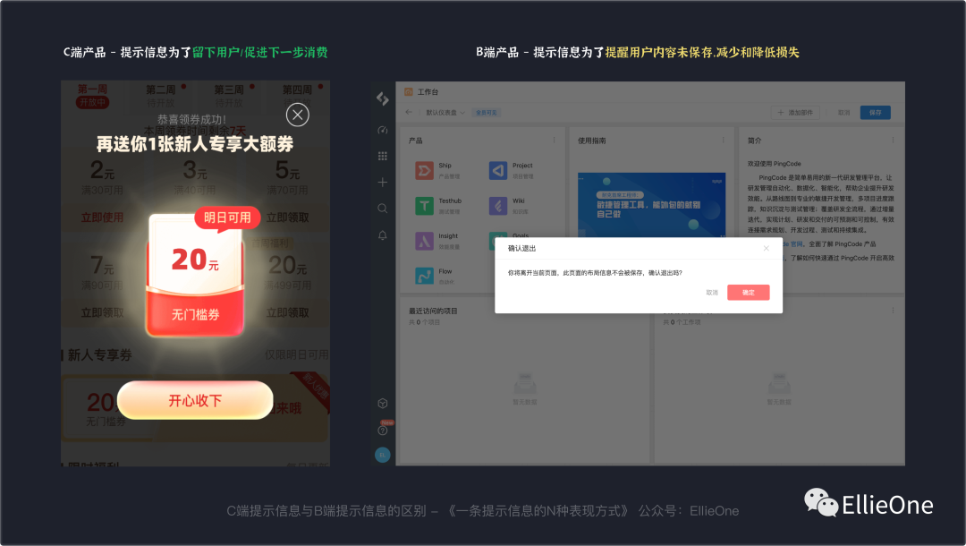
In addition to the prompts of the C -end product, the prompt information also plays the role of soothing users, and the appropriate emotional design helps to retain users.
The B -end prompt information will only be displayed if necessary. Do not prompts not to prompt as much as possible, and do not give users an additional "burden" to improve work efficiency and use efficiency is our goal. Therefore, the design of prompt information needs to be cautious, and cautious things will inevitably accompany certain complexity.
2. Common verification rules
The prompt information is divided into systemic tips and verification prompts. We only explain the verification prompts this time.
The prompt information follows the verification results, which is also a kind of information feedback.
3. Basic principles
Information verification is generally divided into front -end verification and back -end verification. For example, the front -end verification is like we log in to the mailbox, enter the password, and the subjective judgment is correct, but the input error is input after being submitted. If the system's compulsory requirement is the 12 -digit password, you only enter 11 digits, then the prompt: "Please enter the 12 -digit login password" is the front -end check, and the prompt after submitting: "Account or password error" It belongs to the back -end verification.
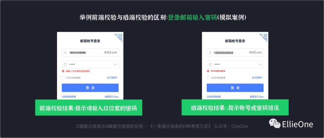
Common front -end verifications are: field verification, compulsory item verification, completion verification, product business data verification, and so on. For example, fill in one digits less, the required content is not completed, and a total of three steps have only two steps.

When the product business data verification is placed on the front end, most of them are because there are too many verification content. If you want to reduce the pressure when you test the data of the back -end school, put some simple business functional verification on the front end. But here should pay attention to communicate well with the front -end engineer, not all content is suitable for verification at the front end.

The back -end verification involves the verification content of the user information confirmation and business data confirmation.
Common, for example, the time when we submitted claims in the insurance compensation cannot be submitted to the date of the accident. The data in this area is stored in the back -end database, so the back -end data is required to verify the verification results.
4. The order of prompt information
The basic rules of the verification steps are the previous verification, and then the back -end verification. After the basic content is completed, the complex information is verified.
The following three cases will appear before the display prompt information will be corresponding:
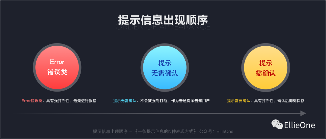
(1) ERROR error class
It has strong interruption. If the error content is not modified, it cannot continue to be submitted for the next stage, so the ERROR class is first reported and prompted.
(2) Prompt that no confirmation is required
It will not be interrupted, but it will be notified as a general reminder. For example, when we check the user identity information, we will judge the verified content based on the type of documents provided by the user. If the user fails to fill it out, it is necessary to prompt that the user must enter the document information to edit other content.
(3) Prompt that confirmation needs to be confirmed
It is interrupted. At this time, the prompt message must give the user a clear prompt and submit the content of the impact after the preservation or confirmation. Because it is interrupted, you need to be cautious. But there is no need to be afraid of hands, the prompt must be prompted to grasp this level.
The order of front -end verification and back -end verification prompt information is basically the same: ERROR error class -prompt to confirm & prompts that no confirmation is required, but the front -end cannot call complex data. It is the content information saved by the database.
2. Three types of situations and performance forms of verification prompts
The prompt information after verification is generally accompanied by the user's entry information page (one of the three principles of interaction: there is feedback after operation), and the entry process is divided into entry and submission of the check. No need to confirm two situations. The following is the three forms of the two forms of the two:
1. During the entry process, it is prompted that no confirmation is required
When the information is entered, some small errors can give users a simple prompt. For example, "you need to enter your ID information to view your user data." At this time, a global reminder does not need to be interrupted with pop -ups and bubble cards.
(1) Prompt that feedback components that are not required to be used
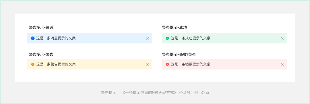
① Warning prompts
Basic definition and use rules: show information that needs attention, suitable for short warning prompts. There are two cases that are triggered or systematically triggered by users. The warning prompts have four styles, with background colors, and the color can be more attractive, so the content of warning prompts is generally higher than the global prompt. Why: The content of the warning information needs to be confirmed by the user. It will always show in the form of non -modular display and will not disappear automatically. The user needs to click to close it. (According to the needs of business products, 3S will also disappear, depending on the plot)
② Global Tips
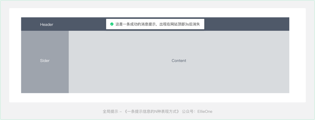
Basic definition and use rules: "lightweight" global feedback triggered by the user's operation. Disappear in 3 seconds by default
When to use: It is used to provide feedback such as success, warning and error, and will not interrupt users' operations.
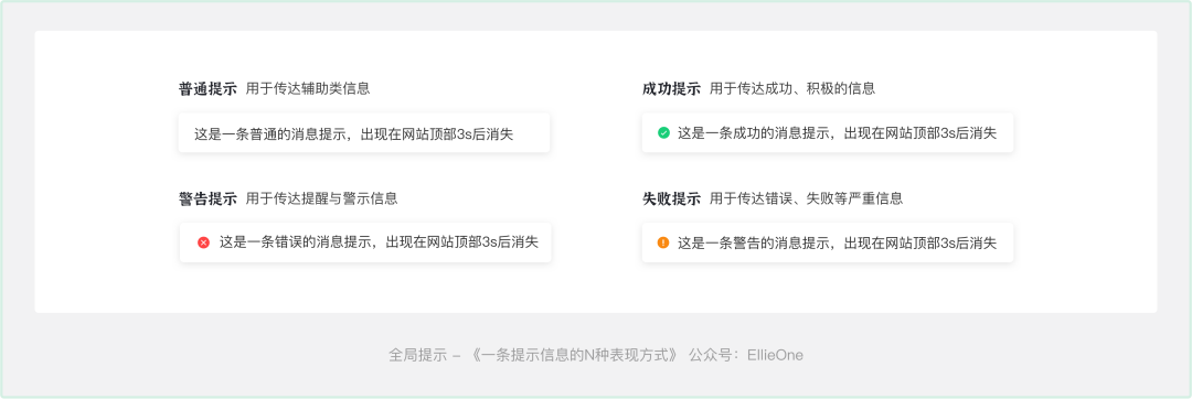
Display position: Costy at the top of the page
2. During the entry process, it is prompted to confirm
For example, the "delete" button in the list, the user may accidentally click. At this time, give a bubble card and confirm it for the second time.
For example, the user is about to leave the page, but when the modified content is not saved, the user confirms the second time to reduce the loss of misunderstanding.
Reasons to be confirmed: reduce the content of user misunderstanding, operation linkage, and affect the next process of users.
(1) Prompt that the commonly used feedback components need to be confirmed
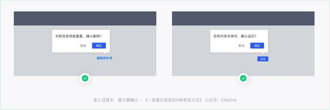
① bubble card
Basic definition and usage rules: Click to trigger, pop up the bubble -type confirmation box
When to use: The bubble confirmation box is a light feedback method, and the content of the carrier is relatively small. Mainly used for secondary confirmation operations. Compared with a more conventional dialog box confirmation, the bubble confirmation box is lighter in form, smaller interference, and the control of the control is more convenient.
Display position: Follow the content display, there are 12 directions to choose from

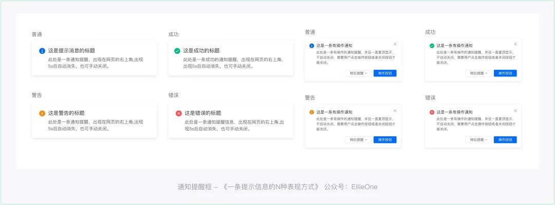
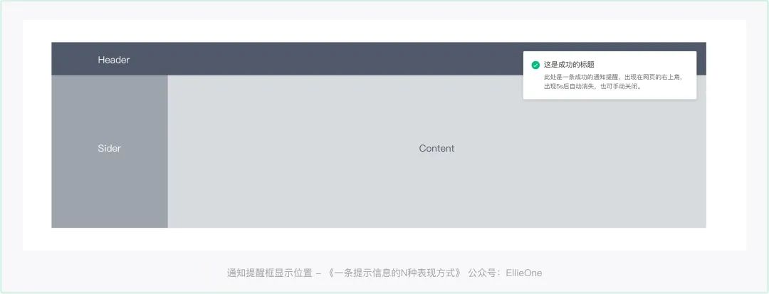
② Notification reminder box

Basic definitions and use rules: It is used to feed users important warning prompts and notification messages.
When to use: Generally used for system -level notifications, you need to attract users to pay attention but do not force users to deal with. When the message appears, the user can choose to continue the current operation, or you can choose to handle the current message. Because it is a system -level notice, the display position does not need to follow the operation, just display it at the specified location.
Display location: upper right corner of the page
③ dialog box (pop -up window)
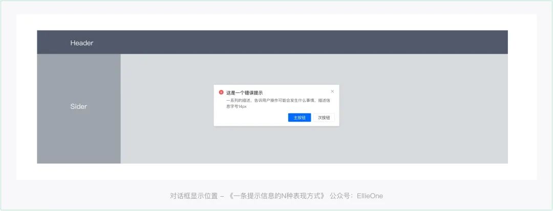
Basic definition and type: The dialog box is a floating layer of a modular form. After the current page is opened, it carries related operations. Because the user's current task process will be interrupted, it needs to be used with caution. It is generally used for fast and does not require frequent operation tasks to meet the user's execution operation without leaving the current page.
There are three types of dialog box: function dialog box, confirmation dialog box, message prompt dialog box.
Function dialog box: involved the entry of the platform content, the information is more complicated, and it will accompany steps and feedback.
Today we are mainly talking about feedback related to information, that is, confirm the two types of dialog box and message prompt dialog box.
When to use: requiring users to respond immediately, notify the user's emergency information, and confirm the user's decision to use it time.
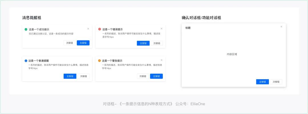
Show:
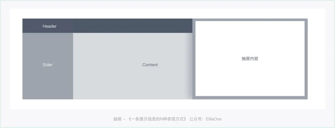
④ drawer page
Can the drawer page also carry prompt information?
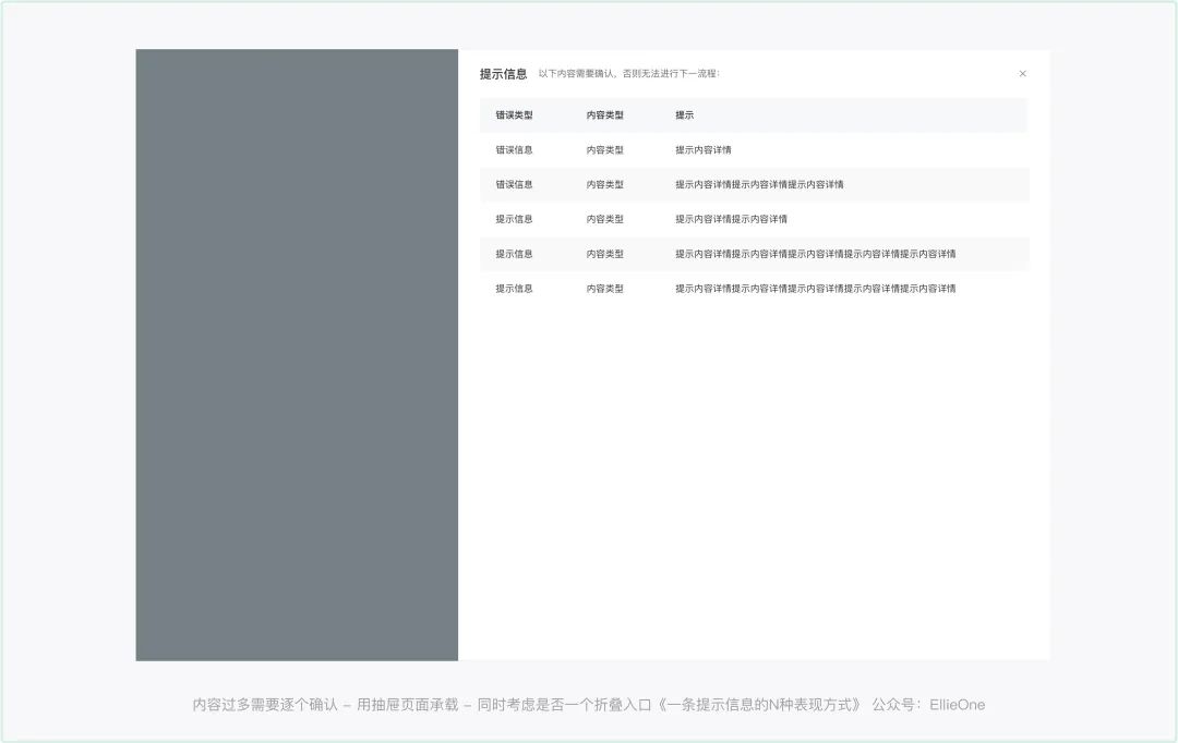
That's right! Sometimes a task is submitted due to the complex correlation of the business, triggering a variety of verification prompts. The pop -up window can no longer satisfy our content. We need to use the drawer page to carry a large amount of prompt information, and accompanied by classification and different prompts. The final case will be specific.
3. Phase submission, prompt to confirm
The submission is successful, and a pop -up window (dialog box) clearly informs the user that it has been successfully submitted. If necessary, draw pictures to cultivate users' operating habits and perception of the brand. But this is only used for multi -step entry or a large amount of information enrollment. Simple entry does not require such a "magnificent" submission feedback.
The submission failed, giving a clear error cause and error guidance. If the number of errors is large and there are many types, classification display can be performed.
(1) Staged submission, prompt to confirm the commonly used feedback form

When the merchant settled in shrimp skin, it is necessary to fill in information about personal identity, shop details, and fill in and submit it in steps.
Of course, this is just a relatively simple form. I believe that many B -end employment partners have seen ultra -long forms. When the form is too long, the system submits more prompt information.
Therefore, the following explains are three common stages of submission, system feedback prompt information type:
① When only one item needs to be verified and modified -single information -dialog box
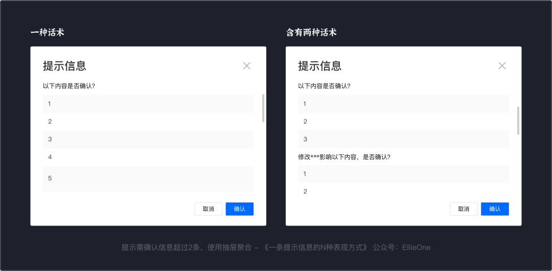
② Trigger a content of more than one item requires a check -multiple information dialog box aggregation

Use summary to help users confirm all prompt information, such as [Specific modification content description, a sentence that can be customized] modify the following content, is it confirmed?
③ Excessive content need to be confirmed one by one
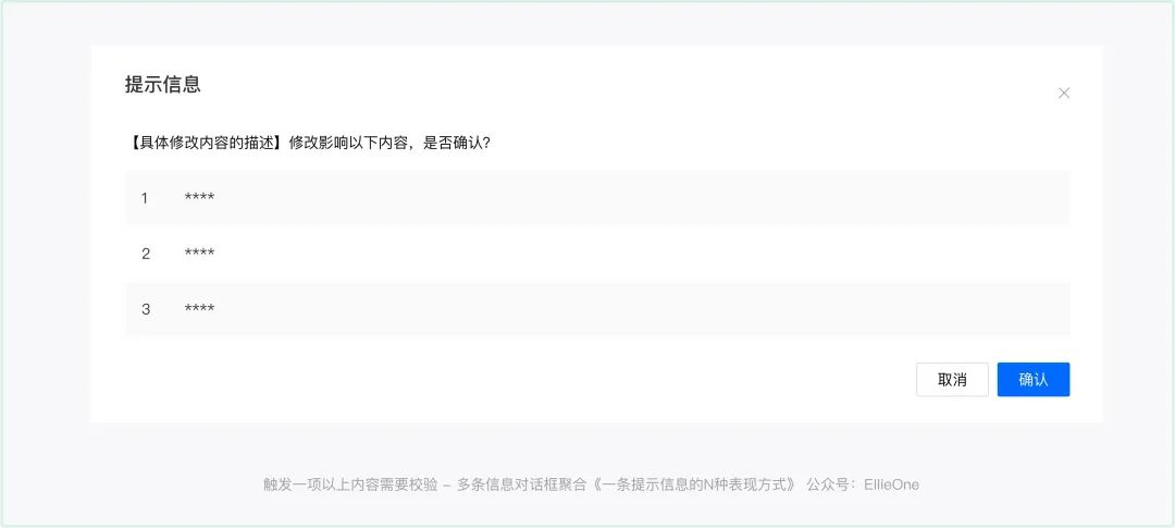
According to business demands, there are 2 points of experience details need to be considered:
If there are too many content, the user needs to check them one by one. Sometimes it is impossible to confirm it at one time. It can give a folding entrance so that the user will confirm it again, but the user will give the latest verification information every time. Yes, decide according to business needs
The above is the feedback component commonly used in the prompt information.
1. Lightweight

Regarding lightweight, I have to mention right and non -modal reminders. So what is the difference between modal and non -modal?
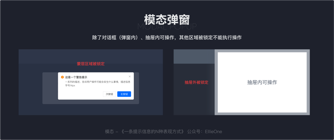
(1) Model
In the process of completing the task, the interface will appear to interrupt the user's operating behavior. The user must take the initiative to click to perform the next step. This is the modal pop -up window.
① advantages
Modular pop -ups usually can better obtain the user's visual focus, and guide users to complete their needs through the contents of the content and the main level of the button. Essence
Common modal pop -ups include dialog boxes, action bars, drawers, etc.
② Disadvantages
The modulus is a form of interruption. The process of interrupting the entry of users is very "impolite", which will cause users to dislike it. Do not use it if necessary. Non -necessary.
(2) Non -modal
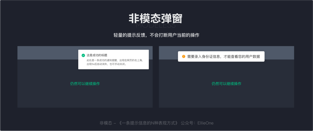
Compared with the modal pop -up window, the non -modular prompt is relatively lightweight. After triggering, it will be presented in a non -obstacle. It will not interrupt the current operation of the user. It is mainly for users to give users instant feedback. Later state.
Advantages: Non -mode pop -ups do not force user operation. According to the importance and willingness of the feedback, it can automatically disappear within a certain period of time, or it can wait for the user to disappear after operation.
(3) Common non -modular mode
The bubble cards, global prompts, and warning prompts we mentioned earlier are common non -modal tips.
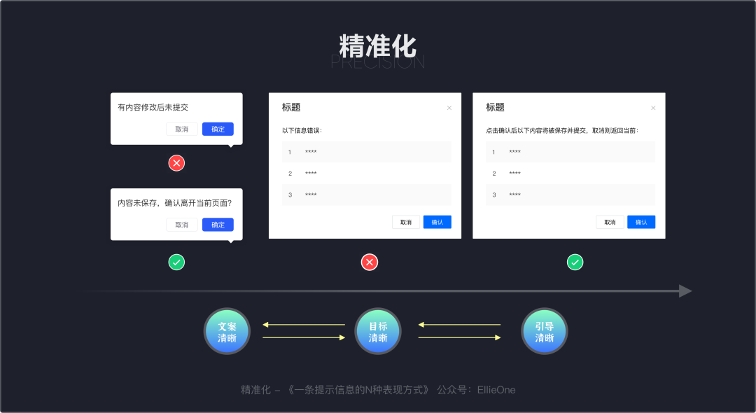
2. Precision
(1) Clear copywriting
The guidance copy must be clear and effective, and the user cannot understand for a long time.
(2) Clear goals
We need to help users to complete the goals and give the "friendly" goals directly.
(3) Clear guidance
For complex business scenarios, the "novice guidance" formula has a directional tip to help users understand and facilitate user operations.
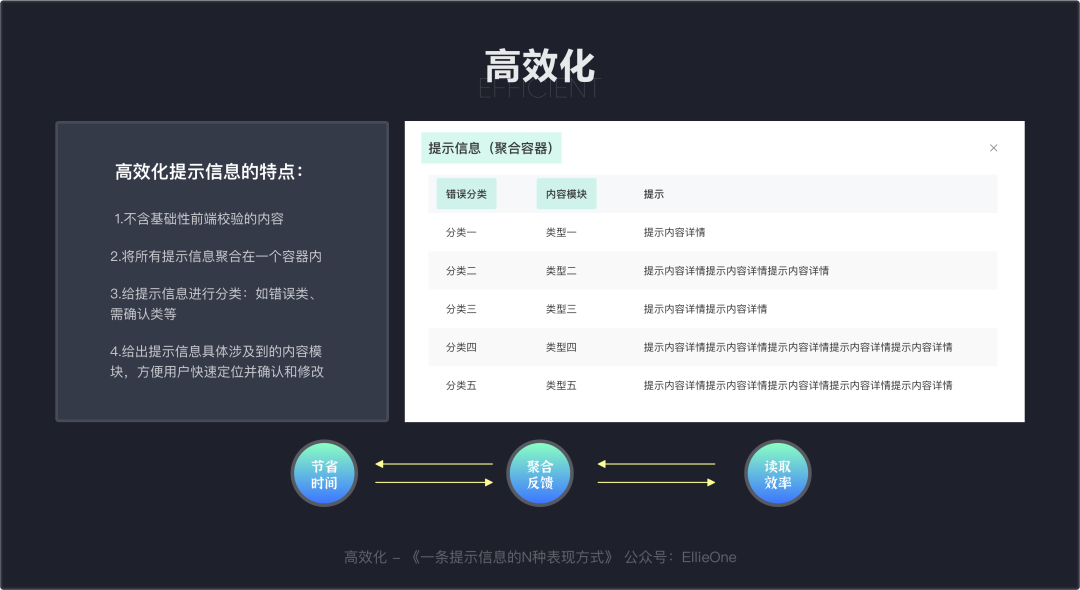
3. Efficiency
(1) Save time
The content that can be checked at the front -end verification should not be placed in the back -end verification, and the feedback time of the back -end verification is reduced.
(2) Polymerization feedback
It can be reminded that the content should not be distinguished by multiple feedback components at a time, which will make the "dazzling" be unable to recognize.
(3) Reading efficiency
Those who can be classified and clearly clarified must be given, so that users can quickly locate the error area quickly.
Fourth, complicated cases with practice
Having said so much, it may still be a bit embarrassing. I have a complex case below to take everyone to disassemble.
Case introduction:
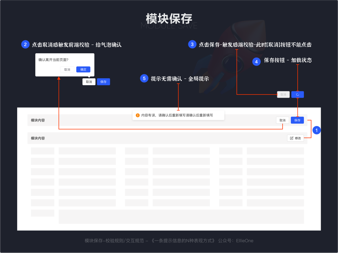
Business characteristics: process -oriented business, involving multiple operating roles, superimposed content characteristics: complex forms, involving content linkages, "led one and moving the whole body" involving modules: page entry, triggering editing attitude enrollment, drawer entry 1. Module preservation-verification rules/interaction specifications
Click "Modify" to activate the content of the module. The content can be viewed from only to view. When the content can be edited. When the content is modified, click "Cancel" to trigger the front -end verification to give users a feedback from a bubble confirmation to inform the user that the content is not saved. Click "Save" to trigger the back -end verification. The back -end verification takes time (generally not exceeding 5s). At this time, "saving" becomes "loading state". "Feedback to users
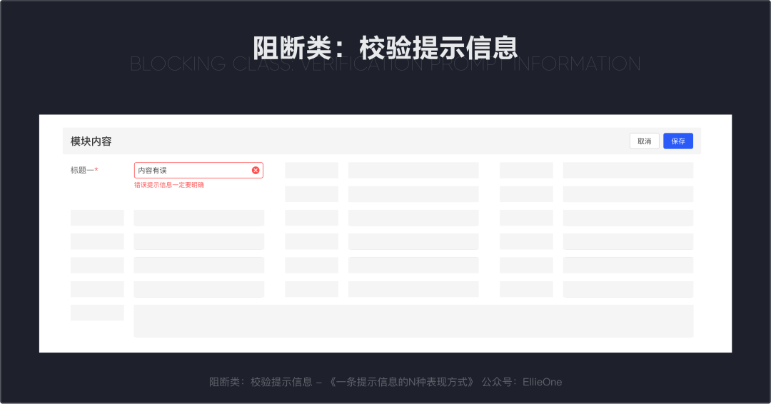
2. Blocking class: verification prompt information
Block: It is not correct to continue to perform the next process. At this time, our prompt information should give a clear guidance prompt.
3. Dettar submission/preservation-verification rules/interaction specifications
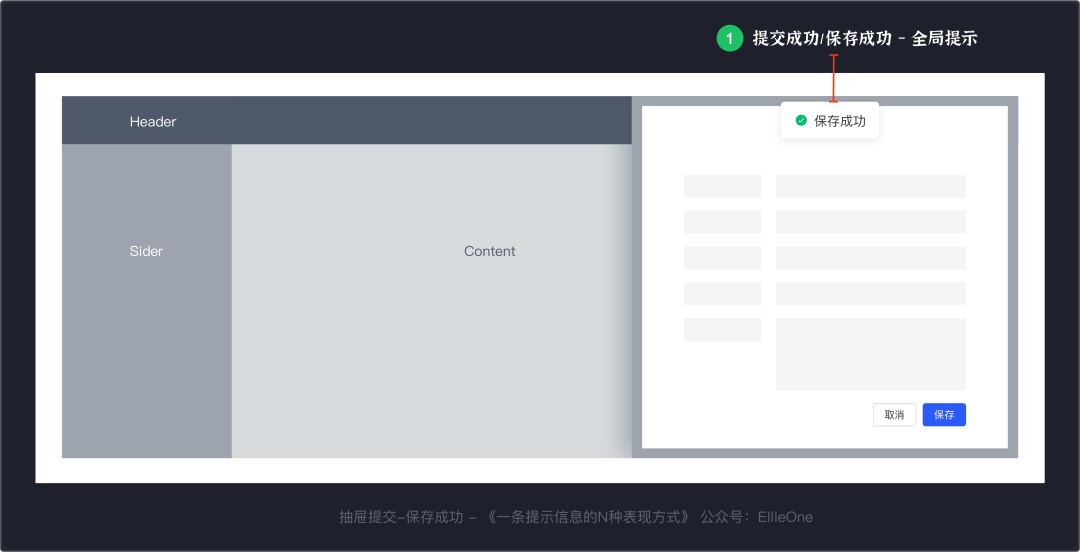
When entering the information and submitting or saving with the drawer page, there are generally two results, success or failure. The feedback of successful preservation is relatively simple. Let's not talk about it.
Successful/preservation success: Close the pop -up window and give a global reminder
There are two cases of submission failure:
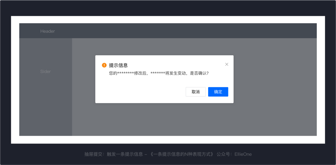
The first case: The error is verified, and the second situation is submitted after the modification is required: no error message, but some content modification will change the linkage change, and the user needs to confirm it to save. When there is only one prompt information, use a dialog box to display:
If it is prompted to confirm more than 2 information, use drawers to aggregate. Help users make decisions through information classification and professional words.
4. Page submission/preservation-verification rules/interaction specifications
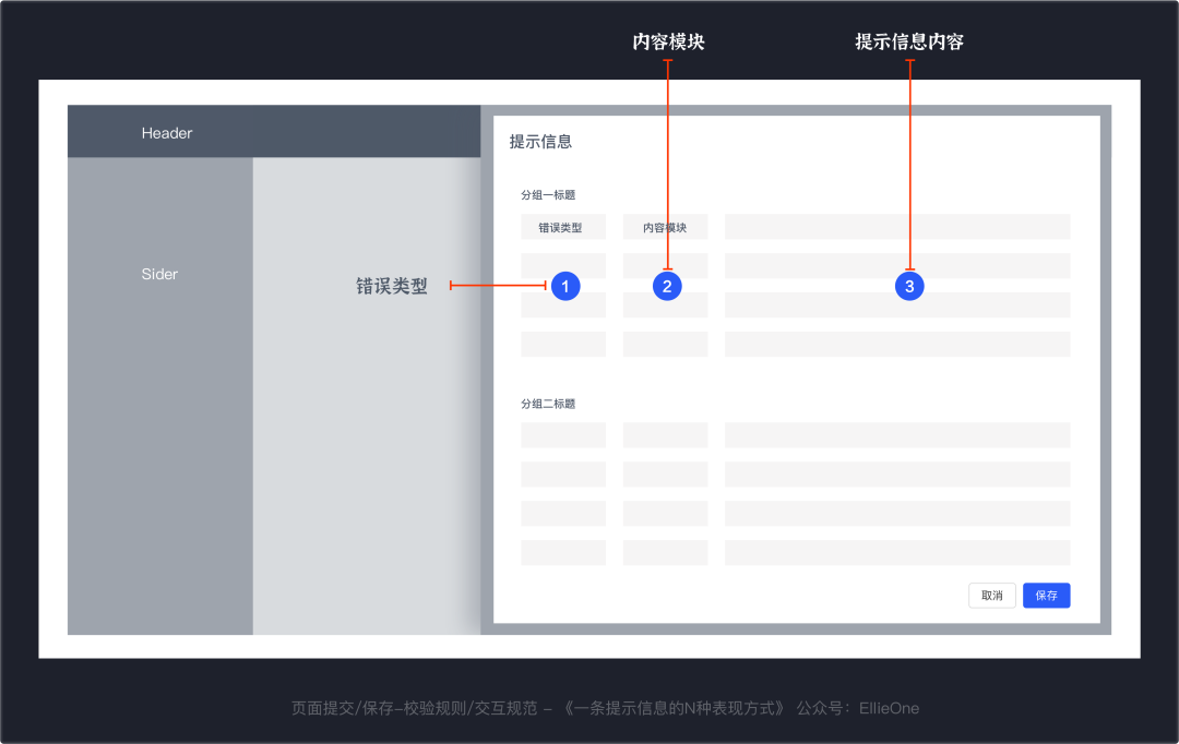
The entry information exceeds one screen. When saving and submitting, if more than 2 or more error information and prompt information are triggered, we will display it with the drawer page. Still classification of error types and content modules.
Error type: ordinary prompt, required confirmation of content modules: basic information, account information, payment information, etc. The specific module prompt information content involved during enrollment: Copywriting and words are as simple and easy to understand as much as possible. A degree of influence reading
Five, article summary
The charm of the B -end interactive experience lies in "solving problems, improving operational efficiency, and reducing work costs."
Just like we may think of the "very simple" prompt information and verification rules before, we can find so many details of the details in discussions with product managers and front -end friends.
Below I tried to summarize the article in 3 sentences:
The sequence of the verification: the back end of the previous end.Prompt rules: blocking classes first; prompts that no confirmation may occur at any time; prompts need to confirm that they must appear.The prompt information appears after the verification, combined with business needs, and using feedback components with higher operating efficiency, it is not necessary.This article was originally published by @ellieone. Everyone is a product manager. Without permission, the question is prohibited from reprinting.
- END -
The "very fierce" of the financing of financing

Edit | Yu BinProduced | Chaoqi.com Yu See ColumnRecently, the quasi -unicorn compa...
Qingdao played the "combination boxing" of the industrial Internet to benefit enterprises

Qingdao Daily/Guanhai News, June 16th. In recent years, under the wave of digital ...