Weijia: The context in the interactive experience is agent
Author:Everyone is a product manager Time:2022.06.27
Edit Introduction: In daily life, we can always see that the same layout in the product has some subtle differences. What do these subtle products do? The author summarizes some of the contexts in the interaction experience, and share with you the subtleties of these products.

Although daily fragmented thinking and life discovery, fragmented thoughts are not enough to write a complete structure. These interesting but fleeting discoveries may be a very interesting thing if it can be recorded.
01 Hema Xiansheng -Cuice of Avocado
Friends who have experienced avocado buying experience will definitely have such confusion. How can I judge that the fruit is familiar?
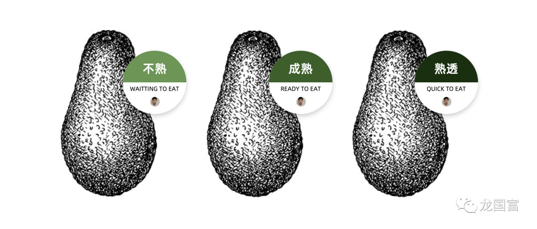
In Hema Xiansheng, the labels of avocado will be marked with the words "unfamiliar", "maturity" and "mature" through three colors printed with green, brown green and dark green, and inform consumers maturity.
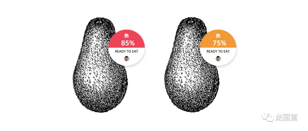
Recently, I have a new discovery of Hema Xiansheng. Among the cooked avocado, Hema Xiansheng will tell you which avocado is more familiar and which is more familiar. When choosing, you will give you a notification through the label. For consumers who love butter fruit, you can also buy it easily.
My thinking:
Everyone hopes that they can make rational decisions, but in an uncertain environment, people will always make favorable judgments due to lack of experience or perception during the decision -making process.
By visualization and numericalization of avocado maturity, Hema raises this decision -making ability of customers due to experience or cognition. Increased the reliability of customer decisions, and also prompted customers to decide faster according to their needs.
In addition, Hema goes further on the basis of "unfamiliar", "maturity" and "maturity", and more accurately telling customers that for the same cooked avocado, which can be eaten first (85%), and Which one can be eaten later (75%).
This kind of numerical expression in avocado maturity will activate customers' perception of numbers, produce "85% mature today, 75% can be put on the day after tomorrow, it will not be bad ..." Essence Customers unknowingly have an interpretation of the situation after buying avocado, this overflow effect will directly affect subsequent consumption behaviors.
To understand a brief understanding, at this time, the customer's decision -making is no longer based on the balance of the maturity of avocado, but rely more on the situation that has been substituted.
02 Immediate App -Expand and close
When using an instant app, the small detail of "unfolding and putting away" was so cleverly hit me. Its interaction and traditional "unfolding and closing" logic are different.
When the user posted more than a certain number of words, the text that exceeds the text will be folded, and the user can click on to start viewing the remaining content.

Traditional approach: It will put away the end of the dynamic content, which means that when the user reads it, you can choose to fold up again.
Immediate approach: It will put away the lower left corner of the dynamic content, which means that when the user does not miss it, you can choose to fold again at any time.
My thinking:
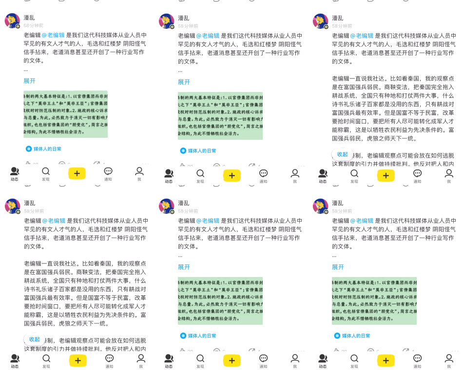
For me, a dynamic content click "Expand" is largely attracted by the content exposed before, and wants to see more.
However, after "unfolding", you will find that some dynamics are just exciting or title parties at the beginning. If you read a few words, you don't want to read it anymore. Before the user wants to say whether to slide the screen to watch its choice, compared to the traditional approach, the APP tries to prevent users from starting this alert mechanism. "".
For example, I went to the cinema to watch a movie and started to be attracted by the trailer. After watching the plot, I found that the plot was procrastinating. In the past, you needed to think about the psychology of "get up and leave" and "endure the end of the watch". Struggling between games.
If there is a "dissatisfied free refund channel" in the cinema, you will not be restricted by the silence of silence, and you can make more free decisions you want to make.
03 Immediate APP-External Popular Message
The small universe app is my most commonly used podcast, none of them, first of Amway.
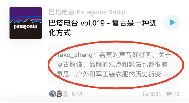
On the small universe app, you will recommend some selected selected podcast programs for you. You will leave a message through the external audience to attract you to choose. "Others say yes, do I have to listen to it?"
My thinking:
In the small universe APP, the cost of listening to the newly recommended program is too high. When you do n’t know how to judge which show is good or bad, the audience ’s popular messages will greatly affect your judgment. The impact of this external information is convenient, and you, you will be attracted by this effect, subscribe to one after another after another.
In fact, you are affected in all aspects of life. For example, if you plan to buy a car's car, but when you heard a friend's bad evaluation of the brand, you have not yet tested the test drive, compared with other brands, and give up the brand.
However, these are all information that you have never experienced or verified. In this process, you are just passively receiving friends and brands to instill the good to you, or think that you need and should have it.
This is called "fresh activity effect" in psychology, and people will pay too much attention to evidence that is more fresh and easier to extract from memory.
The vivid and vivid cases are easier to extract in memory, and they will give too much weight. At this time, people will habitually mobilize the "system one" and allow the intuitive thinking mechanism in the brain to play a role. This is particularly easy to commit " Evil bias "error. It is not to say that you have to resist this effect, but to keep a soberness before making a decision, so that you will not lose the ability to distinguish.
04 Zhihu -Turn on Push Notice
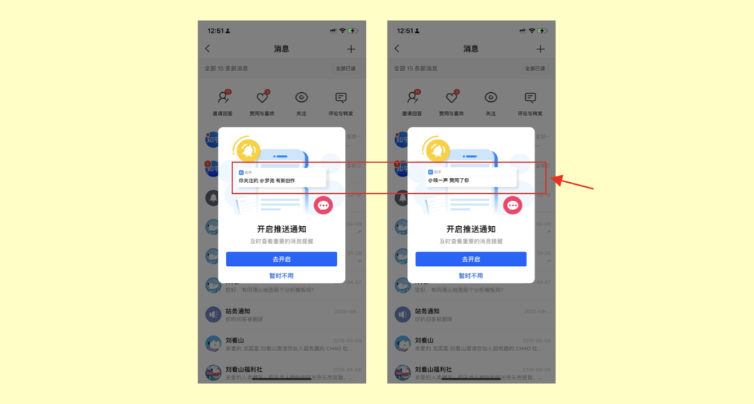
I found that Zhihu's pop -up window for pushing notification permissions did very differently.
The picture above is the interface I intercepted Zhihu. In the interface, you will see the information of "@xxx has new creations" and "@xxx agree with you". In the process, let me start Lenovo, If the notification permissions are not opened, I will miss the information of these people.
My thinking:
When the user uses the APP for the first time, it is not allowed to push notifications to become the habit of most people.
In the practice of knowing, I realize the value of social attributes in products. People are the sum of social relations. In social activities, various links will inevitably produce people. This link is an important factor affecting people's actions.
When obtaining the notification permissions, it is an effective way to influence the action from the link relationship. For example, the person you pay attention to create new content. If you don't want to miss it, authorize notice! Your article is approved. If you don't want to miss it, authorize notice! You send messages to your friends. If you don't want to miss the reply, authorize notice!
This sense of context associates your social relationship. Each information echoes your psychological state and is related to you. It will make you look forward to and satisfied. All this responds to the call of behavior.
05 French Library-0 Book boat
You only need to prepare a trash can and cushion, cut the top of the trash box into two halves, and wrap the edges to completely smooth. Put the cushion into the box, and one appears in the French library "BOOK BOATS -Shuzhou".
This ingenuity allows every active child to be a quiet "love reader".

My thinking:
This design reminds me of a story. Doug Dietz is a nuclear magnetic resonance designer. Once he went to the hospital to observe the use of the instrument and found that a little girl was scared by the inspection of the instrument cold. Later, I learned that there were nearly 80% of pediatric patients. Take a sedative to do MRI.
For a long time, Doug is proud of its own design and believes that it can save people's lives. But it turns out that this machine also brings great fear to children.
Later, DOUG went to Stanford University to study and redesigned the experience of the MRI. He turned the MRI into a pirate ship. During the inspection, he told the children: Okay, you have to sneak into this pirate ship now. Otherwise the pirate will find you.
The result was amazing. Children taking sedatives dropped from 80% to 10%. This gamified design experience makes the children's inspection experience full of interest and story, allowing children to enter the set situation, even in the face of the disease, it can completely keep the children happy, full of curiosity and exploration desire.
BOOK BOATS -Shuzhou also moved me like this. Designers are designed for different users. For children, sometimes they only need to "squat down". Standing from the perspective of children to see the world, carefully observe the behavior characteristics of children. Through the design, if you tell the children what you want to convey, you can always be for the children. Create a new world.
06 Shanghai Blood Center -Ultraman linkages recruiting blood donors
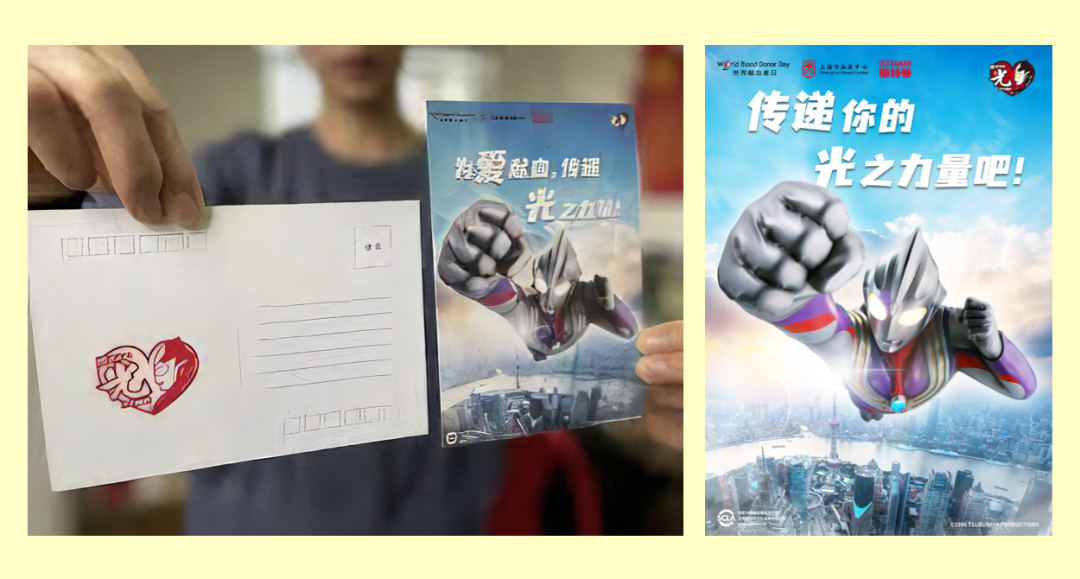
This is an activity recruited by the blood donation activity of Shanghai Blood Center. The recruitment work is whether a caring person who has experienced blood donation before asked if he is willing to participate in blood donation again.
This activity is very interesting. One of the experiences of blood donation had an intermittent blood donation before, but he was the first time he received a call from the blood station. He asked the other party why he contacted himself.
The staff of the blood station said, "Blood station asked us to call the people who participated in the Ultraman last year, and felt that you would be more willing to donate blood again, and stood up when people need it."
My thinking:
People do not have absolute selfless dedication, nor absolute indifference and ruthlessness.
Under the concept of mutual help of humanitarian spirit, the invitation of Shanghai Blood Station justice allows people to gain a sense of identity of blood donation, so that blood donors can truly feel that their blood donation can save others' lives, voluntarily join the free donation of blood donation Come in.
07 Adobe - Spectrum color system
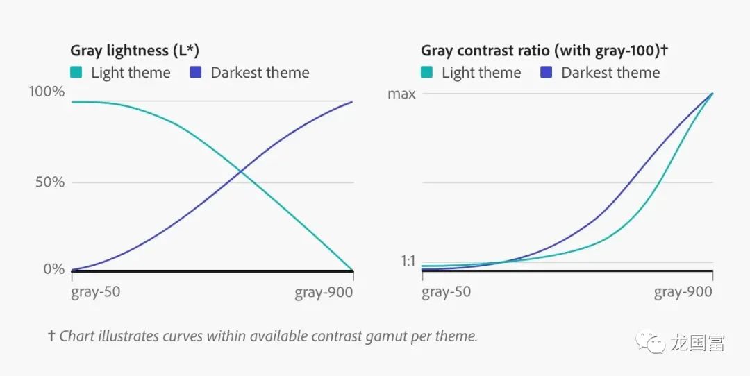
Adobe's Spectrum color system has three themes: light -colored (light), dark (dark), and the darkest (darkest). In the past, when the light theme was converted to a dark theme, it was simply flipped by the contrast.
In many years of practice, the designers of Spectrum have found that WCAG contrast (mathematical measurement difference between the brightness differences between the object and other nearby objects) and the perception contrast (how the difference between the brightness between the object and the background is perceived). Realizing that the dark theme requires a more unique method to achieve color perception.

Their solution is to calculate the target contrast (when one color is generated by the color tool, the contrast required between the two colors) as the percentage of the contrast can be available for each theme. It means that the color is not default to be pure black or pure white by default, but a percentage conversion of the color value contrast. It matches the model of human eye feelings and generates the contrast that people can perceive. For those who are difficult to distinguish between certain colors ("color blindness"), they can also increase highly saturated colors to allow them to obtain color perception and distinguish.
My thinking:
For Adobe, the global huge volume and diversified user base, improving the enterprise -level design system is an extremely difficult thing. It is necessary to worry about the dynamic balance of various user group vision, color and perception, so that the color is more easy to be understood. , Use, ensure the accessibility of color.
Color is a sensor that we perceive the world and perceive changes. The interactive experience function and aesthetic combination, color is the most expressive and influential part of the interactive experience.
Through people's visual systems, a series of psychological mapping can be activated, which evoked users' different emotions and feelings about themes. From the light mode to the dark mode, through experimental verification, the consistency, comfort and readability of the visual experience of the dark mode and the general mode are ensured.
Among them, SPECTRUM's cognitive insights on the large -scale user group in the dark mode, found that the color human eye perception and user psychological expectations that may be contrastable, which is extremely admired by me.
At the end
The interactive experience is a complicated and continuous design process. In this process, there is no optimal solution. Only by continuously substituing a more diverse contextual perspective can we continue to explore and move forward on this road.
There is no end to pursuit, which may be the most wonderful state for experience designers.
Reference materials:
[1] The impact of digital effects on consumer behavior and its psychological mechanism-https://journal.psych.ac.cn/xlkxjz/article/2018/1671-3710/16710-26-980.shtml
[2] What does fresh activity effect mean? -https://www.getit01.com/p20180126827139275//
[3] Reinventing Adobe Spectrum ’s Colors.-https://adobe.design/stories/design-scale/reinventing-spectrum-S-COLORS
#Columnist#
Long Guofu, public account: Long Guofu, everyone is a product manager columnist, a master's degree in engineering. Deliven for lifelong learning and self -improvement, share information, viewpoints and personal opinions in the fields of user research, customer experience, service science.
The original published by everyone is a product manager, and the reprint is prohibited without authorization.
The question map is from UNSPLASH, based on the CC0 protocol.
- END -
One thousand yuan virtual anchor, live broadcast hope of small companies?

Edit Introduction: There are thousands of good -looking skin, and the homogeneous ...