How to design the editing function?——The commonality behind the diversity of editing functions
Author:Everyone is a product manager Time:2022.08.24
Edit features are a very important feature for users. Products can allow users to customize editors and hand over the right to choice to them, which is conducive to the diversity of the product. Is there a common design behind these editing functions? Let's take a look at how to trigger, how to show, and how to save.

Recently, a simple product survey was made for the editing function, and then I was surprised to find that there are more than a dozen editing functions on the market. From the perspective of quantity, the reason for the editing style is that the corresponding business is the corresponding business. Diversity.
But if you jump out of the business level and look at these editing functions from the product level, is there a common design behind these editing functions?
Maybe we can explore from the following three aspects: how to trigger? How to show it? How to save?
1. How to trigger
When using a certain product, the most common page status of the page is "View State". Compared with this conventional state, "editing state" is a unconventional state, and this unconventional state trigger is Need a front interactive operation.
As part of the editing function, this interaction operation itself does not have much logical correlation with the page content. In the actual use process, it is easy to be used as interference items to affect the current reading progress of users.
So how should we design this front interactive operation to give users a better experience?
"Clarify the priority of reading experience and editing needs": "
"Viewing State" and "Edit State" are not a state of opposite each other. On the contrary, these two states can coexist, and the order of priority through demand can help us determine the proportion of the interaction of the trigger operation to ensure the current current Balance of user reading needs and editing needs.
1. Hover state
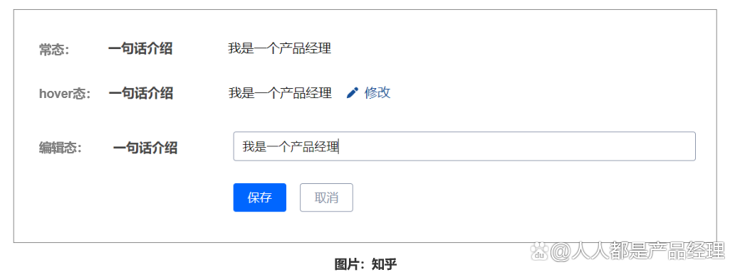
In the conventional state, the page is just a simple copy display. When the mouse hover is above the content, the corresponding content of the "Edit" button will be displayed. After clicking, the current field can be switched to the editing state.
Obviously, for the trigger method of Hover's state, its biggest advantage is: "return the right to the user to the user, the user can actively select the hidden of the button according to their own needs, so that it can greatly reduce the front front of the front. Interactive operation has the impact on user reading experience.
The disadvantages of hover state: "The trigger method is not easy to find, resulting in the editing function is ignored."
Hover's minor trigger method is returned to the user, but the specific trigger process needs to move the mouse to the specific content, and for this operation, there will be no corresponding prompts on the page. This is easy to cause, and the editing function is completely forgotten.
Opinions and suggestions:
If the field that needs to be edited is more important, or the user is more likely to edit the current content, the editing trigger method of the hover mode is not recommended to use it if there is simple editing needs, and the edited field is not very important, so for users to users, then for users The fluency of reading experience can consider this trigger method 2. External explicit state

In the conventional state, the editing button is directly displayed. The same level as the page content. After clicking the button, you can enter the editing state. This external explicit trigger method is also very obvious.
Advantages: reduce user use path
The button shows that the user does not need to perform the mouse hover and click the editing button to enter the editing state, so that the user is easier to reach the editing state, and the entire process is simple and efficient.
Disadvantages: Interference reading progress, increase user reading understanding costs
Edit button and page content do not have much logical relationship itself. The editing button is an interference information for the user "reading".
The existence of interference information will increase the cost of reading and understanding of users and interfere with user reading progress.
Opinions and suggestions:
If the content of the current page, the user has a high probability editing. It is recommended to use an external explicit trigger method. If the content information of the user needs to be edited is more important, it is recommended to use the explicit trigger method. Use 2, how to show
After selecting the trigger, click the corresponding button to switch to the editing state, and how should this editing state be displayed?
1. The current page

After clicking the editing button, the corresponding fields in the page switch to editing state, and the switching of general fields can be divided into two types, single fields and multi -field, but whether it is a single field or multi -field, the common point is on the "current page on the current page "Switch on the state.
Edit on the current page, users can easily check the context information very conveniently to ensure the coherence of the overall editing process. However In this way, the scope of editing can be restricted, and users cannot give users a more complete editing experience.
Opinions and suggestions:
Try to select a single -field editor or less editor fields for reading and viewing a certain requirements. You can use this editing display method. If the content edited is more important, it is not recommended to use this editing style 2. Popular/floating layer.
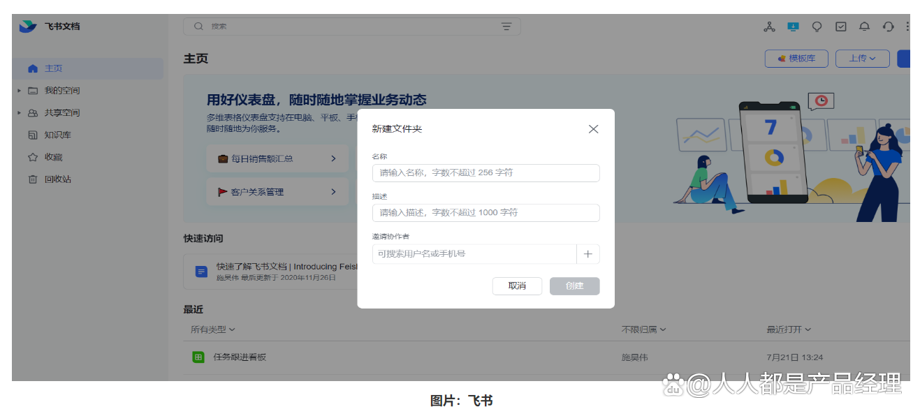
After clicking the editing button, the display style of the editing state is presented in the form of pop -up/floating layer. The biggest feature of this display style is to jump out of the original page and show the information to be edited in the form of "intermediate state". And this "intermediate state" display also creates the advantages and disadvantages of this style. advantage:
Carry more information:
The pop -up/floating layer is equivalent to opening a new space on the basis of the original page. The information increase brought by the new space is more than the amount of information on the original page. The form of window/floating layer can carry more information.
Focus on user attention:
After clicking the button, the pop -up window/floating layer appears. At that moment, all the eyes and attention of the user will be forcibly focused on the pop -up/floating layer.
Support more complicated editing functions:
In order to maintain unity in the page of the page, we can only support simple editing modes such as text editing
The display form of pop -up window, due to the ductility of its space and the relative independent content of content
You can support some more complicated editing modes, such as: attachment upload, picture upload, etc.
Disadvantages: cause more serious sense of splitting to users
Edit State, as a unconventional state, switch between state, it is easy to affect users
The display style of the pop -up/floating layer is the jumping out of the original page on the basis of the original page.
Suddenly appearing in front of the user, and it is not the content and state of the user's habit
It will inevitably have contradictions with the current state of use, break the current state of the user, and thus produce a sense of splitting
Suitable scene:
The edited information is an important information, and the content edited by the user's attention is required. In terms of quantity, there are certain requirements edited. There are certain requirements in the editing form. 3. New page
After clicking the mark button, the current page will refresh or open a new page. The core of this display method is to put the content in a new space for editing. This new space can be seen as a pop -up window/ The enlarged version of the floating layer, so the display of this new page inherits the advantages of pop -ups/floating layers, and has been improved to varying degrees in terms of quantity and quality.
However, corresponding to the advantages of improvement, the shortcomings of the pop -up/floating layer are also amplified by the same proportion. Whether it is the new page or the self -refreshing of the page, it has doubled Increased.
Because of this way of display, it will not only interrupt the user's current reading progress, but even cut off the entire reading process to cut off the user's connection with the previous page.
Applicable scene:
Editing a large amount of data (such as adding an article, creating a new data table, etc.) with more interactive logic (such as: the content of the edited includes text, drop -down box selection, attachment upload, picture upload, etc.) 3. 3. How to save
After the editing is completed, there are two need to be preserved. There are two popular preservation methods on the market.
1. After the focus is lost, save it automatically
Without saving buttons, users can click on anywhere. As long as the current editing status is out of focus, the current editing state will be automatically exited. At the same time Quantity "is suitable for the" HOVER State "mentioned above.
Applicable scene:
The information of the editor is the information of a single field -the editor of the multi -field, it is easy to appear that the editor has not yet been edited. Due to the errors and exit the editing status, users need to click to enter the editing mode again. The information cannot be too important information 2. Click the button to save
After the editor is completed, click the saving button to exit the editing state, and save all the information edited by the current editor. This preservation method is more formal than the loss of focus saving. Users need to click the fixed "Save" button to save.
The biggest feature of this way of preservation is "certainty". Users can clearly know where to save information, and this method is more interactive with users. Essence
Applicable scene:
Multi -field editing list Edit the entire page edit pop -up window/floating layer editor quotation literature:
Chestnut Design Meow: "Page Edit contains so many details, how to make the editor experience smooth" liz sauce: "B -end product design details: Edit function" This article is published by@小manager. Reprinting is prohibited without permission.
The title map is from Unsplash, based on the CC0 protocol
The point of view of this article only represents the author himself, and everyone is the product manager platform that only provides information storage space services.
- END -
The first performance of Xiaomi Group since its listing.

On August 19, Xiaomi Group (01810.HK) released the financial report in the first h...
Tesla Shouzheng's "True Body" is on the China International Industrial Design Fair. Can you imagine that the backplane "steel plate" is "one piece"?
The Yangtze River Daily Da Wuhan Client August 5th (Reporter Li Jia Correspondent ...