Make packaging design for brand "visualization"
Author:See Hunan Time:2022.07.28
With the rapid development of the commodity economy, market transactions have further expanded. For goods, packaging does not simply exist as the functions of storage and protection items. Realize the elements that are indispensable for commodity value and added value.
01
Let the packaging with brand "visualization"
Whether it is product sales or brand promotion, the mission given by packaging is becoming more and more important -to give the product unique personality through targeted visual images, attracting the attention of the audience. More importantly, packaging can constantly spawn the desire to buy to consumers. This feature is also valued by brand enterprises, making the entire packaging design industry become more prosperous, and it is not uncommon for the price design fees of nearly one million packaging.
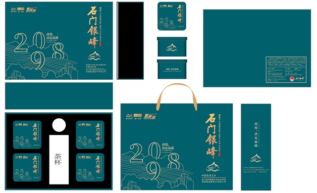
△ Wuquan Biguan Packaging Design Picture (Drawing: Yuan Yuan)
The "Wuquan Bi" Shimen Yinhan and Shimen black tea tea leaves from "Hunan Roof 2098 High" and "Shimen Mysterious North Latitude". After professional design of packaging last year, the sales volume increased sharply, and it also crushed with the absolute advantageous power. , Win 2021 "Tea Zu Shennong Cup" famous green tea gold award.

△ 2021 The 13th Hunan Tea Industry Expo site
In contrast, some companies' product packaging is still using popular packaging in the packaging market, which seriously weakens the image and "brand force" of "regional brand".
Packaging, as a silent salesman, can tell their respective truths and stories. However, if the packaging only pays attention to the functional presentation of the category characteristics, and the systemic thinking of lack of related brand spirit, it is impossible to leverage the brand memory assets formed by consumers' minds, nor can it allow the brand and products to empower each other.
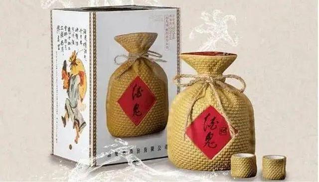
△ Figure Yuan Wine Merchants Network
The packaging design of alcoholic wine breaks the routine. It is only used as an old sack cloth for packaging. It is also quite stylish. This very prominent feature made it recognize at a glance in the ocean of the same category.
Whether it is on the picture or shape, as an important corporate marketing weapon, packaging cannot lack the effective presentation of brand symbols. The unique creativity of the lack of overall considerations of the brand will continue to dilute the brand impression. Only by improving the brand's "visualization" to treat packaging design, inherit the commonality of personality, and effectively repeat brand symbols can we strengthen consumer brand memory.
02
Let the packaging meet the "plasticity" of the product
In the field of packaging design, the Internet shows a variety of carefully designed atmospheric/beautiful/creative packaging. When shopping, the scene on the shelves in the supermarket is another "makeup".
The most typical is the packaging of honey and agricultural products. The style of the supermarket and the Internet is exactly like two different times and different aesthetic diverse universes. Because, the same product should show different packaging appearance in different channels.
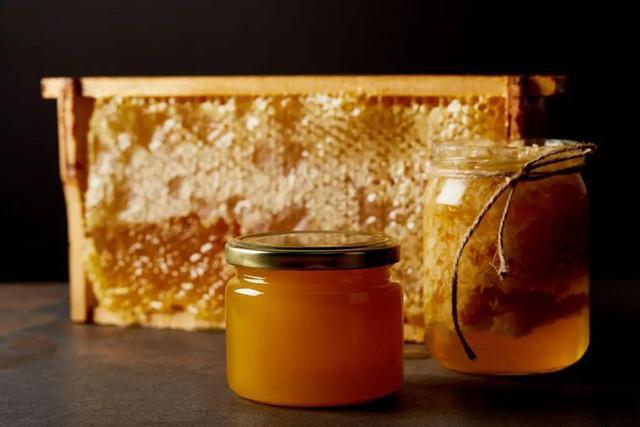
△ Figure source public account gallery
The reason is that, first of all, the newly started brand can only find a large enterprise that has not yet covered or weaker, and obtains a single breakthrough. The more accurate choice of the packaging design of this naturally forms niche; new brands online and in the supermarket will also have targeted differences.
Secondly, in different sales scenarios, the packaging of the product carries different cognitive missions, and the focus of its functions is also deviated. Online, can be attached to selling copywriting, product details, small videos, etc. Packaging is not the only brand carrier. And offline supermarkets can only be displayed by packaging. In the limited shelf space of less than 0.1 square meters, it is streamlined to grasp the eye. Small packaging needs to tell consumers "who am I" and "why do you buy me" ... Mowing

△ Picture Yuannong Financial Network
Therefore, in terms of difficulty and attention, it is relatively easy to design packaging for pure online products. It is easy to be more simple because it is more concise. The responsibility is not overwhelmed by packaging. The brand even has the spareout to consider adding some intimate designs to the after -sales usage scenario, such as the three -squirrel -comes with a fruit -band, so that consumers can feel the brand's consideration.
03
What are the offline packaging?
First, the brand name should be conspicuous. The most significant element of offline packaging must be its product name/brand name. It should be enlarged as much as possible in the packaging design, and it can be seen clearly from far away. The packaging itself is an advertising position. The brand name is the most important and most important key in this advertisement. It emphasizes that brand names hope to create brand awareness, or let the brand endorse the product.
Secondly, the color should be integrated. Although the large font is effective, it will be better if it is used with "color". For a long time, colors have played an important role in consumer recognition. For example, when you see red bottles and cans, you will think of Coca -Cola, and you think of IKEA. Color attributes are rooted in human genes. If the packaging is reflected in this corresponding relationship, it will play a positive role in product sales.
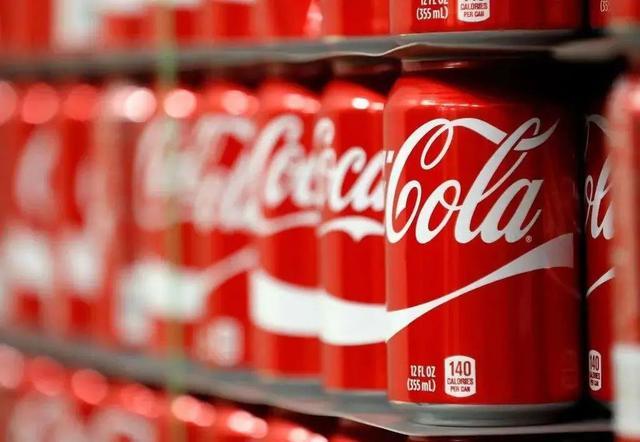
△ Figure source Coca -Cola official website
Third, enlarge the "reason for purchase". In offline shopping scenarios, the product packaging needs to bring its own purchase reasons. If calcium has the function of alleviating fatigue, when consumers pass by the shelves aimlessly, they suddenly see calcium tablets. Thinking of the recent busy back pain, they will temporarily cause purchase demand, so packaging should trigger such purchase needs.
Fourth, use product photos. Taking ice cream as an example, the entire picture of the online packaging is beautiful and abstract, and in the offline packaging, the physical photo of the ice cream is the focus of the composition, which is very prominent. Because there are pictures and texts online, but offline, packaging is your only opportunity to present. △ Figure source Demon Du Du Eat Team
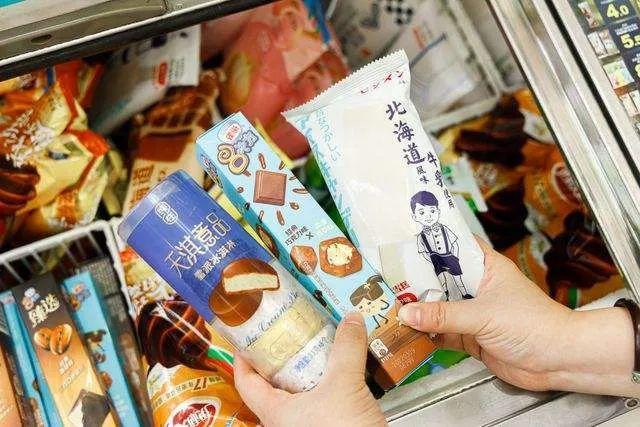
Fifth, enrich every packaging surface. Some packaging, in addition to making full use of the front, other places like to use the simple and high -end techniques of blank, the information is empty, in fact, it is a waste of this "advertising position". Offline, if you want to make the information transmission more efficient, you must use each side, so that no matter which side is exposed, you will not miss the brand communication.
△ Figure source China Wind Tea Packaging Design Appreciation

Sixth, optimize the packaging "touch". As a silent salesperson, offline packaging, the packaging on the shelves in supermarkets and shopping malls has an experience of one dimension on the line -touch. Consumers can touch, seeing various details by macro seeing product value and comfort, and enhancing the possibility of purchase. Offline will also pay attention to whether it is easy to carry.
04
Conclusion in this issue
It is not easy to make a packaging and can drive the sales of the packaging, nor can it cover all by relying on these, but we should always have a belief: let the packaging design with brand awareness, let the packaging design as a brand as a brand "Visualization" empowerment.
Article Source: Brand Hunan Public Account
Editor in this issue: Liu De
Part of the content: He Zuo brand, brand alliance
- END -
Financial "Gan Rain" turns into the spring breeze for ten years and adheres to the agriculture and rural areas

Financial Gan Rain turns into the spring breeze for ten years and adheres to the a...
Changde: Financial services help the development of the real economy

Changde City provides medium- and long -term funding support and exclusive credit ...